


See listing of Recent and Most Popular articles on the Home Page
 Loading requested view...
Health & Wellness
Category: News & Current Events / Topics: COVID-19 • Crisis • Dying and Death • Disease • History • News • Statistics
COVID-19 Numbers for January 2021
by Stu Johnson
Posted: February 6, 2021
An updated look at the COVID statistics comparing the U.S. to the world (in a new visual format)…
Putting the COVID-19 pandemic in perspective (Number 7)
See a list of all of my articles related to COVID-19
This series was spawned by my reaction to reporting on the COVID-19 pandemic that focused on raw numbers. Big numbers are impressive, even frightening, and hard to comprehend. Rarely have we been given a context that helps lead to better understanding of the numbers or how to make comparisons between the U.S. and the rest of the world. This series has turned from occasional pieces to a monthly summary setting the U.S. numbers in global perspective. This analysis is based on data from worldometers.info, which monitors 215 countries. From those, I focus on details for 21 countries that have appeared in the top-10 of worldomenters metrics since I started more detailed tracking in September 2020.
Report Sections:
• January at-a-glance
• The Continental View • USA Compared to Top-5 Countries
• COVID Deaths Compared to the Leading Causes of Death in the U.S.
• U.S. COVID Cases versus Vaccinations
• Profile of Monitored Continents & Countries • Scope of This Report
January at-a-glance
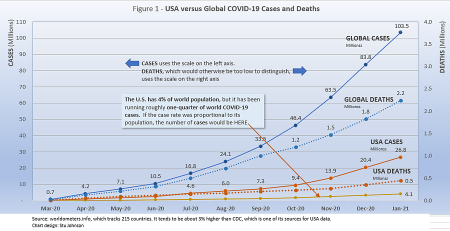
- COVID-19 continued to spread at a rapid rate around the world, with reported cases growing 24% in January, breaking the 100-million mark. Deaths increased by 23% to 2.2-million.
- It was a year ago this month that the virus was officially acknowledged by China. It actually began in December 2019, as described in this week's Frontline program on PBS, "China's COVID Secrets," which investigated the "gulf between what Chinese scientists and officials knew in the early days of the coronavirus outbreak and what they told the world." The World Health Organization would not label its spread as a pandemic until March 2020). Some of China's secrets continue, as sources I use for tracking COVID-19 statistics have not shown reliable updates. Despite the fact that many areas have experienced devastating impacts, particularly on their health care systems, the global level of cases remains remarkably low, at 1.3%. In contrast, the Spanish Flu pandemic a century ago is estimated to have infected 25% of the global population over a two-year period.
- The U.S. continues to lead the world in the number of reported cases and deaths, maintaining the unfavorable distinction of having one-quarter of world cases with only 4% of global population. Figure 1 shows how much lower cases would be—at about 4-million by now—if they were proportional to the global population.
- The feared post-holiday surge was evidenced in varying degrees, primarily in Europe and North America. The U.S. continued at the elevated pace that began in the fall, while Germany, UK and other parts of Europe showed more evidence of a surge in numbers.
- This month, I am switching to a graphic format for these updates (instead of detailed tables and text), which I trust you will find helpful in grasping significant points of interest each month.
The Continental View
While COVID-19 has been classified as a global pandemic, it is not distributed evenly around the world.
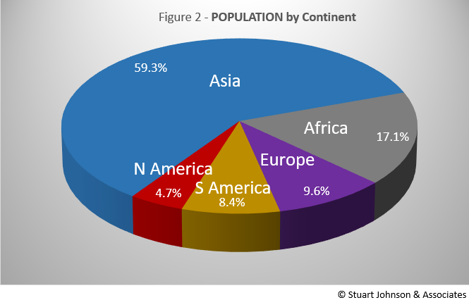
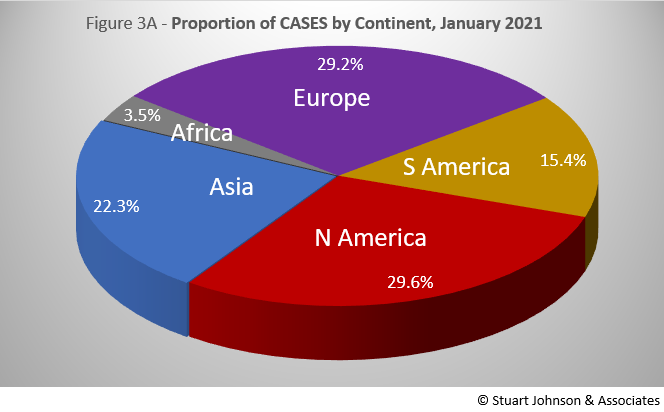
Asia accounts for nearly 60% of the world's population (Figure 2), but only 22% of COVID cases—affecting only 0.4% of its population—in January (Figure 3A). In fact, where Asia and Africa combined represent about three-quarters (76.4%) of the world's 7.8-billion people, Europe, South America and North America account for roughly three-quarters (74.2%) of cases (Figure 3A) and 79.2% of deaths (more details below).
By the numbers alone, it is true that Asia is nearly equal in number of cases with Europe and North America. That is where it is important to remember the huge difference in proportion. That lack of proportionality is what led me to start analyzing the COVID numbers. The high numbers of the U.S. (indeed a cause of concern) were being made even worse by being compared with individual European countries. Even though Europe has twice the population of the U.S., it would still be better to compare the U.S., with its fifty states, to Europe, with its constituent countries.
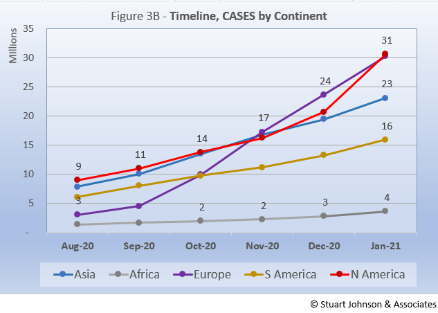
Figure 3B shows a fairly steady increase in cases for Africa, South America and Asia. In contrast, Europe, which had been on the low end through the summer, began to escalate in September, with a nearly straight-line climb, surpassing North America in November and continuing on to 31-million cases in January. North America was pretty close to Asia in number of cases through November, moved ahead slightly in December (but at that point being surpassed by Europe), then shot up in January to catch up with Europe, presumably showing a noticeable post-holiday surge.
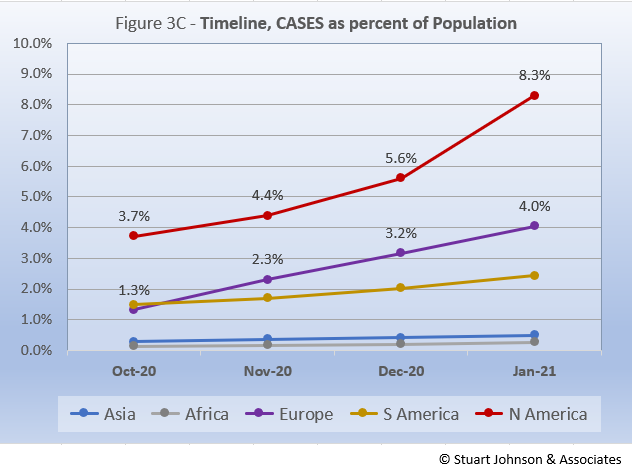
Remembering proportionality, however, North America should not be equal to Europe in impact. Figure 3C, which translates raw case numbers to percentage of population, makes this clear. Now, except for North America, which shows a significant upward move in January, the other continents all show a more uniform increase, with Europe increasing at a faster pace than Asia, Africa and South America.
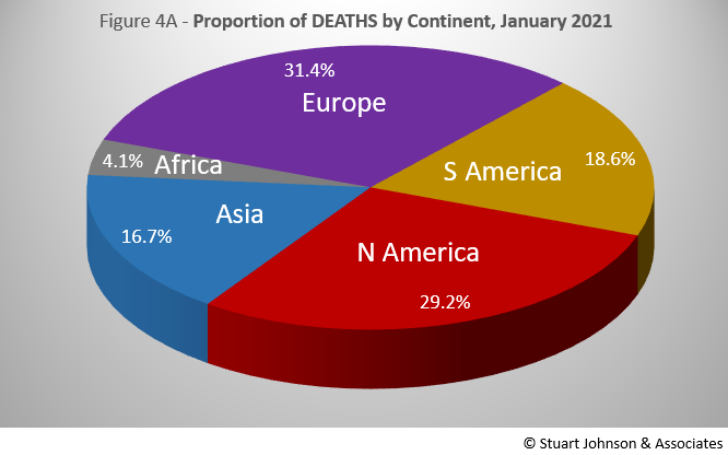
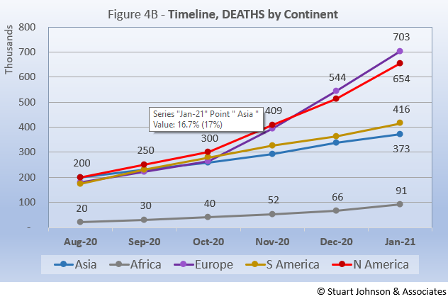
The overall distribution for deaths in January is similar to cases, but South America and Europe pushed the combined total from 74% for cases to 80% for deaths. Here, the distinction between continents over time (Fig. 4B) is quite striking compared to that for cases (Fig. 3B). Africa follows a similar, low path. Asia and South America follow a gradually growing middle track, while Europe and North America nearly track together with an upward turn in October, crossing trajectories in November, ending with Europe at 703-thousand deaths at the end of January, North America with 654-thousand.
Comparison of U.S. to Top-5 Countries
Cases
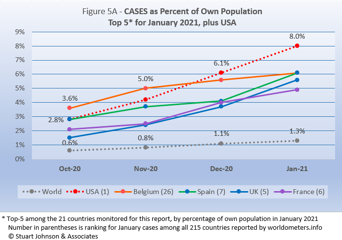
Early on, the small European country of Belgium was leading the world in COVID cases as a proportion of its population (Figure 5A). The U.S. and Spain were nearly a full percentage point lower in October. Belgium began to level off in December, while the U.S. continued climbing, with a slight acceleration in December that continued into January (but not what might be called a surge). Spain was a bit more of a roller coaster—up in November, slowing in December, than rising to parallel the UK in January. France appeared to be headed the same way as the UK, but slowed in January.
One measure that helps show the impact of the number of cases is to realize that
the presence of COVID cases around the world represents 1 in every 76 people. For the top-5 by cases as a percentage of population, however, that means 1 in 20 for France and 1 in 12 for the U.S.
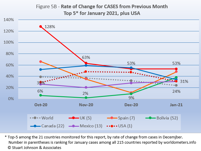
Because the size of countries makes the use of raw case numbers illusory, another measure I find helpful is the rate of change from month to month (Figure 5B). After seeming to have shown more discipline than America, the UK began facing a real surge of cases in late summer and early fall (even before reports of a more easily transmissible variant of the virus), with cases in October more than double (128%) September. It has tapered off since then, but still remains well above the global rate of increase, which dropped from 39% in October to 24% in January. Spain was slowing markedly, then jumped 48% in January. Mexico and Bolivia were both below global increases through December, then joined the top-5, all above global increases for January, with Bolivia reflecting a surge-like increase, while Mexico's was more a leveling off from December. The U.S. started below the global increase in October, moved higher in November, leveled off in December before falling in January, though still at a rate above the global level of change.
Deaths
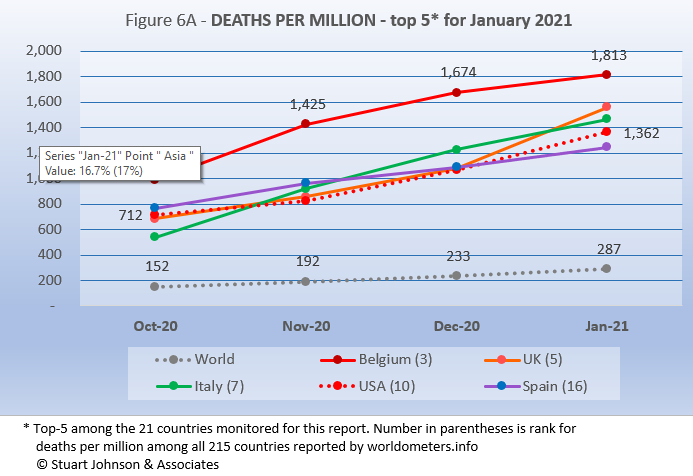
Because deaths as a percentage of population is such a small number, the "deaths per million" metric provides a comparable measure. As Figure 6A shows, Belgium leads the world, though its rate has been slowing as other countries continue to rise. The remaining top-5 for January all tracked in a narrow band, and all at a rate of increase above the global level.
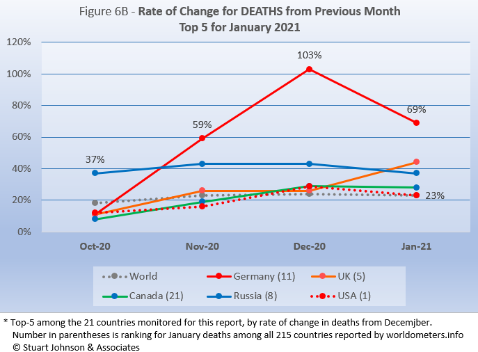
The rate of change in deaths (Figure 6B) shows the serious situation faced by Germany, which saw deaths increasing at alarming rates in November and December, then falling off some in January, but still 25 points higher than the UK. While the UK hovered around global levels of increase through December, it made a noticeable climb in January, with a 44% increase over December. The other top-5 countries in January followed a pattern of rising increases in November and December before slowing in January. The U.S. ended January at the same 23% rate of increase experienced on a global level,
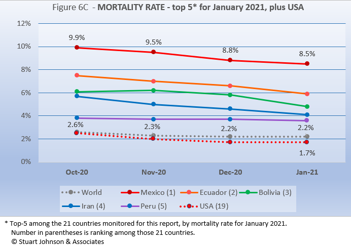
Mortality Rates (percentage of deaths against reported cases) have been slowly declining. This is not surprising as several factors came into play: the ratio of community spread versus outbreaks (nursing homes, similar confined settings) increased, lessons were being learned in treatment, and as testing increased more asymptomatic cases spread the margin of cases to deaths even further.
The top-5 in mortality rate (among the 21 countries I observe) stand out because for the most part they do not show up in other charts and also tend to be low on levels of testing. Mexico is far above other countries in mortality, still at 8.5% in January, well above the global level of 2.2%. Despite being number 1 in number of cases and deaths, the U.S. ranks 19 of the 21 countries studied, with a mortality rate at or below the global level over the past four months.
How real is the threat of death from COVID? That's where successful mitigation comes in. Worldwide, by January 1 in 3,495 people have died from COVID. In the U.S., while the mortality rate is low, because the number of cases is so high, 1 in 737 have died through January.
Tests
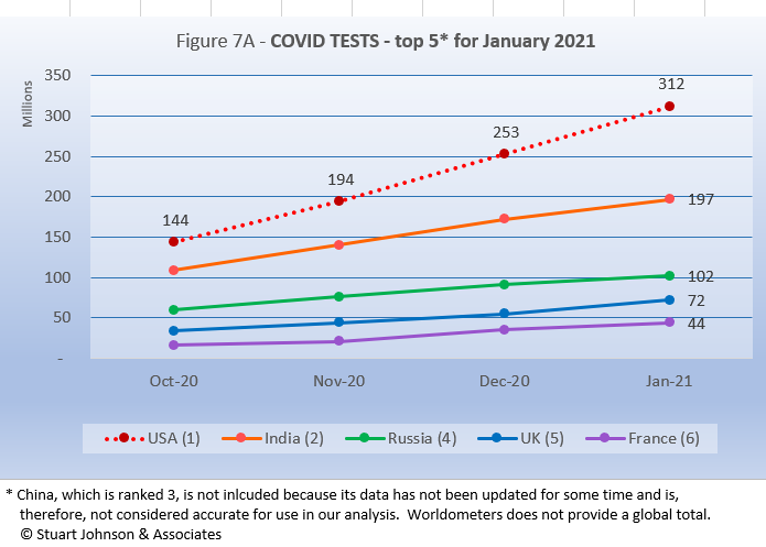
The U.S. is far ahead of other countries in reported COVID tests administered, at 312 million, half again as much as India. These are raw numbers, though, so it is important to recognize the size of the country. It is also the case that COVID tests can be administered multiple times to the same person, so it cannot be assumed that the U.S. has tested almost all of its population of some 330-million.
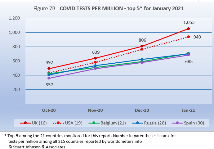
Tests per million (Figure 7B) puts things into better perspective. It shows that the UK has been most aggressive in testing, followed by the U.S., with Belgium, Russia and Spain all around the 650 mark.
Causes of Death in U.S.
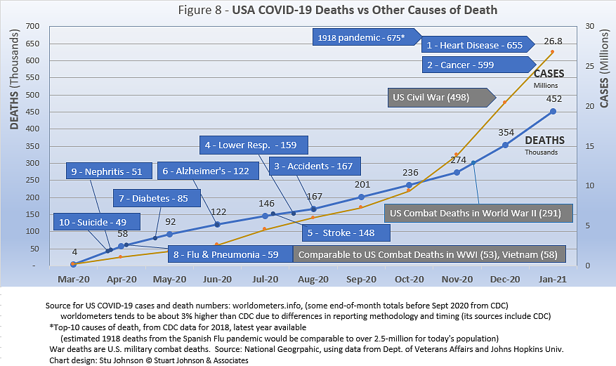
Early in the reporting on COVID, as the death rate climbed in the U.S., a great deal of attention was given to benchmarks, most notably as it approached 58,000, matching the number of American military deaths in the Vietnam War. At that time, I wrote the first article in this series, "About Those Numbers," in which I looked at ways of viewing the data, which at the time of that writing in May 2020 was still focused on worst-case models and familiar benchmarks, like Vietnam. Part of my approach in that article was to put the U.S. COVID deaths on a timeline against not only mileposts like war deaths or significant numbers (i.e., every 50,000 or 100,000), but against the reality of the top-10 causes of death each year, numbers available from the CDC.
Figure 8 shows that the U.S. surpassed the third leading cause of death, accidents (167-thousand per year), back in August. There was a long way to go to reach number 2, Cancer, with 599-thousand deaths in 2018, the latest year available. The U.S. also passed its combat deaths in World War II back in November (291-thousand—though most media outlets focused on a 400-thousand milepost that would include non-combat deaths).
The chart shows a slight leveling off early on, indicating some success in trying to "flatten the curve," but then the pace picked up slightly from August to November, and again into November and January, ending the most recent month at 452-thousand COVID deaths. That makes the next major milestone military deaths from the Civil War, at 498-thousand—still 100-thousand short of the number claimed in 2018 by cancer. We're beginning to hear the specter of 600-thousand dead sometime later in 2021, but the latest "Ensemble Forecast" from CDC suggests this for the immediate future:
...newly reported COVID-19 deaths will likely decrease over the next 4 weeks, with 11,300 to 22,600 new deaths likely reported in the week ending February 27, 2021. The national ensemble predicts that a total of 496,000 to 534,000 COVID-19 deaths will be reported by this date.
Note: As I've referenced in the notes for several charts, the data from worldometers.info tends to be ahead of CDC and Johns Hopking by about 3%, because of reporting methodology and timing. I use it as a primary source because its main table is very easy to sort and provides the relevant data for these reports.
Perspective
The 1918-19 Spanish Flu pandemic is estimated to have struck 500 million people, 26.3% of the world population of 1.9-billion at that time. By contrast, we're now at 1.3% of the global population. Deaths a century ago have been widely estimated at between 50- and 100-million worldwide, putting the global mortality rate somewhere between 10 and 20-percent. It has been estimated that 675,000 died in the U.S.
IF COVID-19 hit at the same rate as 1918, we would see about 2-billion cases worldwide by the time COVID-19 is over, with the global population now at 7.8-billion—four times what it was in 1918. There would be 200- to 400-million deaths. The U.S. is estimated to have had 27-million cases (one-quarter of the population of 108-million) and 675,000 deaths. Today, with a population of 330-millions (a three-fold increase from 1918) this would mean more than 80-million cases, and 2- to 4-million deaths.
However, at the present rate of confirmed cases and mortality while the total number of global cases could approach 500 million or more—comparable to 1918 in number, that would be one-quarter of 1918 when taking population growth into account . .. and assuming the pandemic persists as long as the Spanish Flu, which went on in three waves over a two year period. With a vaccine already in early stages of distribution, the end of COVID-19 could come sooner. Like 1918, however, there could be complicating factors such as the growing number of mutations that are more highly transmissible (but not necessarily more deadly).
Using the global mortality rate of 2.2% in January, total deaths with the above projection of cases, would be over 12-million worldwide, tragic but far below the number reported for 1918 (50-million) with an even wider gap (200 million) when taking population growth into account.
The contrast demonstrates the vast difference in scale between the Spanish Flu pandemic a century ago and COVID-19 now. Key differences are the mitigation efforts, available treatment today (though still leaving the health care system overwhelmed in some areas), and the beginning of vaccine distribution. In addition, in 1918 much of the world was focused on a brutal war among nations (World War I) rather than waging a war against the pandemic, which ran its course and was undoubtedly made much worse by the war, with trans-national troop movements, the close quarters of trench warfare, and large public gatherings supporting or protesting the war.
Vaccinations in the U.S.
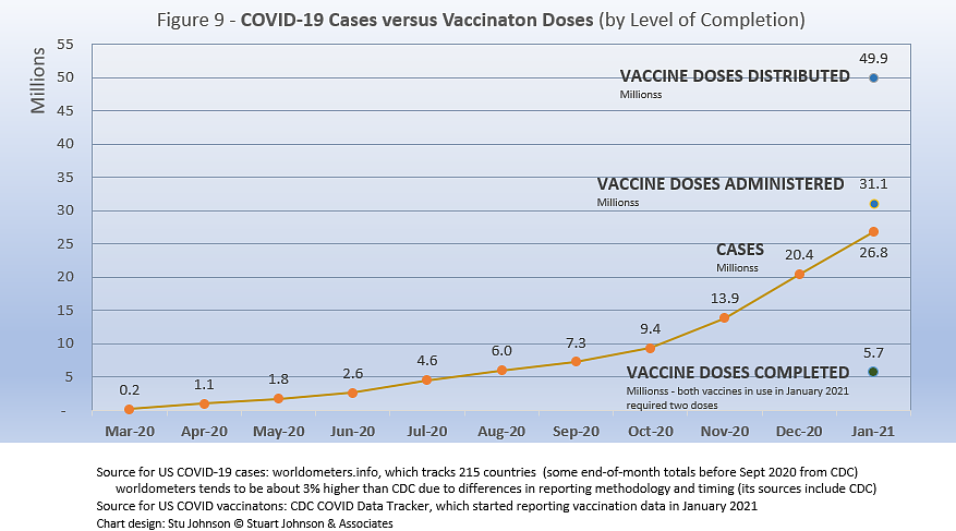
With remarkable speed (it usually takes several years to develop vaccines), two COVID vaccines were granted emergency approval for use in the U.S.—the one by AstraZeneca requires super-cold storage, which limits its deployment. The other, by Moderna, requires cold storage similar to other vaccines. Both of these require two doses, which means that vaccine dosages available must be divided in two to determine the number of people covered. At the time of this writing, Johnson & Johnson was approaching approval for a single-dose vaccine. The numbers in Figure 9 represent the two 2-dose vaccines, reported by CDC as of January 31.
There has been a great deal of anxiety and frustration about vaccine availability. Much of it, I believe, is unwarranted. It is the result of a combination of politics, news reporting focused on highlighting trouble spots (admittedly, even the best journalists tread a razor edge between informing and inciting), and unrealistic expectations among many people fueled in part by social media.
For example, our local paper reported that 1 in 12 people in Illinois, where I live, has received at least their first dose of vaccine. So far, we personally know only three people who have received notice to get an appointment and received at least one dose. My wife and I fall into stage 1B in Illinois, which represents 225-thousand people in our county (DuPage) of 900-thousand. The county health department website indicates it could take 12 weeks to cover that many people. Besides our own health care provider network, we have registered with the county and one drug store chain. All basically say don't call us, we'll let you know. People who are frustrated about not being to make appointments in the future do not understand that the vendors cannot make appointments until they have the supply.
On top of the anxiety already expressed by some in the currently eligible groups, in yesterday's paper the headline reporting progress also contained a question about when the next phase will open. It is one thing to know the sequence of stages, but it can also stoke false expectations to anticipate it sooner than it will actually happen. There is a delicate balance between maintaining hope with the reality that this is a huge and complicated logistical operation that will take time—and it is a global situation that is beginning to raise issues of equity and fairness within and between countries.
In the meantime, even if vaccinated, we will have to continue mitigation efforts until the curve of new cases finally flattens and we can be assured that COVID no longer has a hold on us.
Profile of Monitored Continents & Countries
(Data from worldometers.info).
| Rank | Country | Population | Share of World Population |
Density People per square km |
Urban Population |
Median Age |
| WORLD | 7.82B | 100% | -- | -- | -- | |
| Top 10 Countries by Population, plus Five Major Continents See lists of countries by continent |
||||||
| - | ASIA | 4.64B | 59.3% | 150 | 51 countries | 32 |
| 1 | China | 1.44B | 18.4% | 153 | 61% | 38 |
| 2 | India | 1.38B | 17.7% | 454 | 35% | 28 |
| - | AFRICA | 1.34BM | 17.1% | 45 | 59 countries | 20 |
| - | EUROPE | 747.7M | 9.6% | 34 | 44 countries | 43 |
| - | S AMERICA | 653.8M | 8.4% | 32 | 50 countries | 31 |
| - | N AMERICA | 368.9M | 4.7% | 29 | 5 countries | 39 |
| 3 | USA | 331.5M | 4.3% | 36 | 83% | 38 |
| 4 | Indonesia* | 274.5M | 3.5% | 151 | 56% | 30 |
| 5 | Pakistan* | 220.9M | 2.8% | 287 | 35% | 23 |
| 6 | Brazil | 212.9M | 2.7% | 25 | 88% | 33 |
| 7 | Nigeria* | 206.1M | 2.6% | 226 | 52% | 18 |
| 8 | Bangladesh* | 165.2M | 2.1% | 1,265 | 39% | 28 |
| 9 | Russia | 145.9M | 1.9% | 9 | 74% | 40 |
| 10 | Mexico | 129.3M | 1.7% | 66 | 84% | 29 |
| *these countries do not appear in the details because they have not yet reached a high enough threshold to be included Other Countries included in Analysis most have been in top 10 of one or more categories covered in this report at least one month since October 2020 |
||||||
| Rank | Country | Population | Share of World Population |
Density People per square km |
Urban Population |
Median Age |
| 17 | Turkey | 84.3M | 1.1% | 110 | 76% | 32 |
| 18 | Iran | 83.9M | 1.1% | 52 | 76% | 32 |
| 19 | Germany | 83.8M | 1.1% | 240 | 76% | 46 |
| 21 | United Kingdom | 67.9M | 0.9% | 281 | 83% | 40 |
| 22 | France | 65.3M | 0.8% | 119 | 82% | 42 |
| 23 | Italy | 60.4M | 0.8% | 206 | 69% | 47 |
| 29 | Colombia | 50.9M | 0.7% | 46 | 80% | 31 |
| 30 | Spain | 46.8M | 0.6% | 94 | 80% | 45 |
| 32 | Argentina | 45.2M | 0.6% | 17 | 93% | 32 |
| 39 | Canada | 37.7M | 0.5% | 4 | 81% | 41 |
| 43 | Peru | 32.9M | 0.4% | 26 | 79% | 31 |
| 63 | Chile | 19.1M | 0.2% | 26 | 85% | 35 |
| 67 | Ecuador | 17.6M | 0.2% | 71 | 63% | 28 |
| 80 | Bolivia | 11.7M | 0.1% | 11 | 69% | 26 |
| 81 | Belgium | 11.6M | 0.1% | 383 | 98% | 42 |
Scope of This Report
What we track
From the worldometers.info website we track the following Categories:
- Total Cases • Cases per Million
- Total Deaths • Deaths per Million
- Total Tests • Tests per Million (not reported at a Continental level)
- From Cases and Deaths, we calculate the Mortality Rate
Instead of reporting Cases per Million directly, I try to put raw numbers in the perspective of several key measures. These are a different way of expressing "per Million" statistics, but it seems easier to grasp.
- Country population as a proportion of global population
- Country cases and deaths as a proportion of global cases and deaths
- Country cases as a proportion of its own population
- Cases and deaths expressed as "1 in X" number of people
Who we monitor
Our analysis covers countries that have appeared in the top-10 of the worldometers categories since September 2020. This includes most of the world's largest countries as well as some that are much smaller (see the chart in the previous section).
This article was originally posted on my InfoMatters blog.
Search all articles by Stu Johnson
Stu Johnson is principal of Stuart Johnson & Associates, a communications consultancy in Wheaton, Illinois. He is publisher and editor of SeniorLifestyle, writes the InfoMatters blog on his own website and contributes articles for SeniorLifestyle. • Author bio (website*) • E-mail the author (moc.setaicossajs@uts*) • Author's website (personal or primary**)* For web-based email, you may need to copy and paste the address yourself.
** opens in a new tab or window. Close it to return here.
Posted: February 6, 2021 Accessed 646 times
![]() Go to the list of most recent Health & Wellness Articles
Go to the list of most recent Health & Wellness Articles
![]() Search Health & Wellness (You can expand the search to the entire site)
Search Health & Wellness (You can expand the search to the entire site)
![]() Go to the list of Most Recent and Most Popular Articles across the site (Home Page)
Go to the list of Most Recent and Most Popular Articles across the site (Home Page)