


See listing of Recent and Most Popular articles on the Home Page
 Loading requested view...
Health & Wellness
Category: News & Current Events / Topics: COVID-19 • Crisis • Dying and Death • Disease • History • News • Statistics
COVID-19 Numbers for March 2021
by Stu Johnson
Posted: April 3, 2021
Vaccinations soar, but cases poised for troubling Easter surge. How does the U.S. compare to the world?…
Putting the COVID-19 pandemic in perspective (Number 9)
See a list of all of my articles related to COVID-19
This series was spawned by my reaction to reporting on the COVID-19 pandemic that focused on raw numbers. Big numbers are impressive, even frightening, and hard to comprehend. Rarely have we been given a context that helps lead to better understanding of the numbers or how to make comparisons between the U.S. and the rest of the world. This series has turned from occasional pieces to a monthly summary setting the U.S. numbers in global perspective. This analysis is based on data from worldometers.info, which monitors 215 countries. From those, I focus on details for 21 countries that have appeared in the top-10 of worldometers metrics since I started more detailed tracking in September 2020.
Report Sections:
• March at-a-glance
• The Continental View • USA Compared to Top-5 Countries
• COVID Deaths Compared to the Leading Causes of Death in the U.S.
• U.S. COVID Cases versus Vaccinations
• Profile of Monitored Continents & Countries • Scope of This Report
March-at-a-glance
- COVID-19 continued to spread around the world. After tapering off in February, with an 11% increase over January, worldwide cases turned upward slightly, with a 13% increase for March.
- The pattern for deaths tends to lag behind cases by several weeks, and it is slowing—dropping from a 23% increase in January to 14% in February and 11% in March.
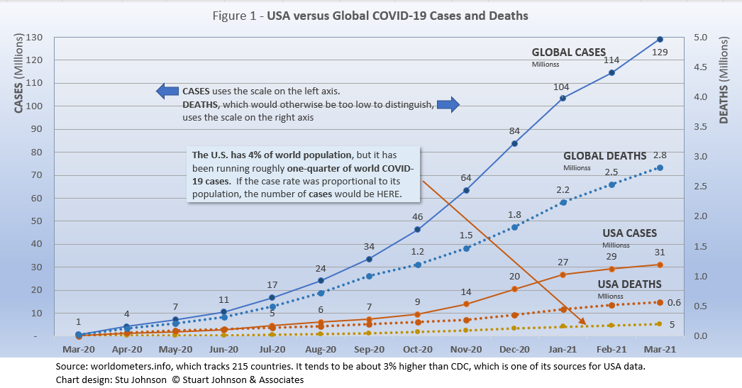
- The U.S. continues to lead the world in the number of reported cases and deaths, maintaining the unfavorable distinction of having one quarter of world cases with only 4% of world population. (It rose from 20.3% in October to a high of 25.9% in January, then moved down again, ending March at 24.1%). The U.S. share of deaths has been closer to 20%—better but still exceedingly disproportionate. Figure 1 shows how much lower cases would be—at about 5-million by now—if they were proportional to the global population.
- While global cases increased slightly in March, the downturn in US cases in February continued into March. Had cases continued at the pace of the November-January surge, we would now be at over 50-millions cases instead of the 31-million reported at the end of March. While deaths accelerated somewhat starting in December, the curve was much flatter than cases, dropping to 8% in March to 564-thousand (below the global increase of 11%).
- With vaccinations now available, the U.S. is moving ahead with remarkable speed. Compared to the cases and deaths curves, the trajectory of vaccinations is rocket-like (see Figure 9). From initiation in January, vaccinations at the end of March had fully covered 56-million (17% of the entire population, including children), with a total of 200-million doses distributed and nearly 154-million doses "in the arms" of adults. Pfizer and Moderna require two doses, Johnson & Johnson (the latest to join the effort) requires a single dose.
The Continental View
While COVID-19 has been classified as a global pandemic, it is not distributed evenly around the world.
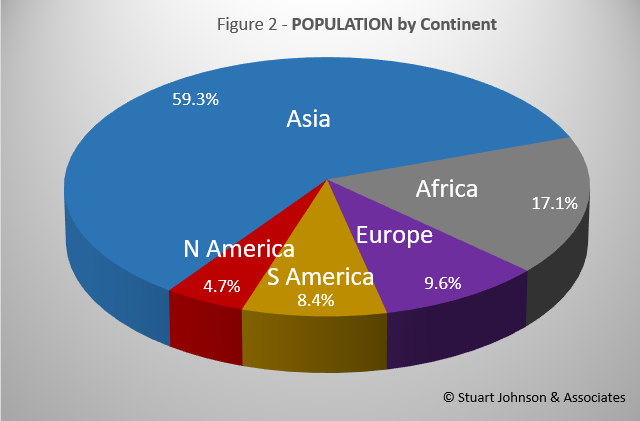
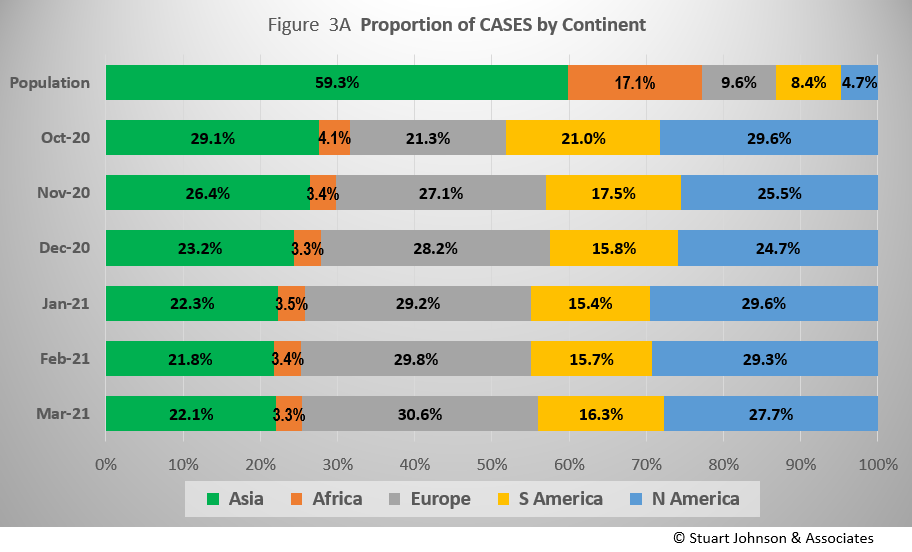
Asia accounts for nearly 60% of the world's population (Figure 2), but only 22% of COVID cases—affecting only 0.6% of its population—in March (Figure 3A). In fact, where Asia and Africa combined represent about three-quarters (76.4%) of the world's 7.8-billion people, Europe, South America and North America account for roughly three-quarters (74.6%) of cases (Figure 3A) and 80.7% of deaths (Figure 4A). The proportion of cases for Europe and the Americas has been stable since January, just short of 75%, but that is up from 65.9% in October.
By the numbers alone, Europe is in the lead at 40-million cases at the end of March, followed by North America at 36-million and Asia at 28-million. It is important to remember the huge difference in proportion of world population between the continents. That lack of proportionality is what led me to start analyzing the COVID numbers. The high numbers of the U.S. (a genuine cause for concern) were being made even worse by being compared with individual European countries. Even though Europe has twice the population of the U.S., it would still be better to compare the U.S., with its fifty states, to Europe, with its constituent countries.
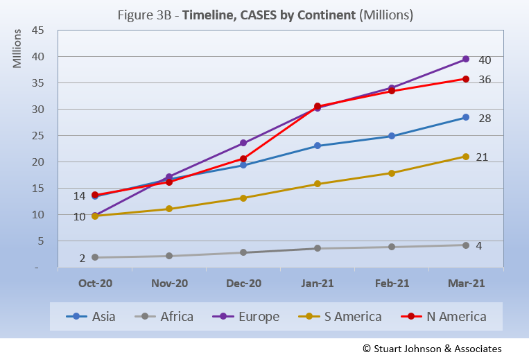
Figure 3B shows a fairly steady increase in cases for Africa, South America and Asia, with the latter two showing a slight up-tick in March. In contrast, Europe, which had been on the low end through the summer, began to escalate in September, with a nearly straight-line climb, surpassing North America in November and continuing on to 40-million cases in March. North America was pretty close to Asia in number of cases through November, moved ahead slightly in December (having been surpassed by Europe in November), shot up in January to catch up with Europe, then settled into a slower pace than Europe in March, ending with 36-million cases.
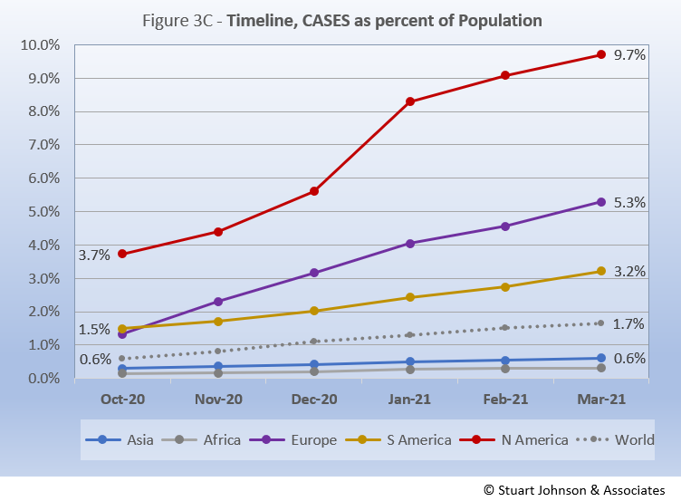
Remembering proportionality, however, North America should not be equal to Europe in impact. Figure 3C, which translates raw case numbers to percentage of population, makes this clear. After a sharp rise in January, North America slowed its growth, but still ended March with nearly one-tenth of its population with reported COVID cases, nearly double the proportion of population as Europe. Starting on a par with Europe in October, South America has pretty much split the difference between Europe and the Global level. Asia and Africa continue at a pace well below the global rate, which hit 1.7% of population in March.
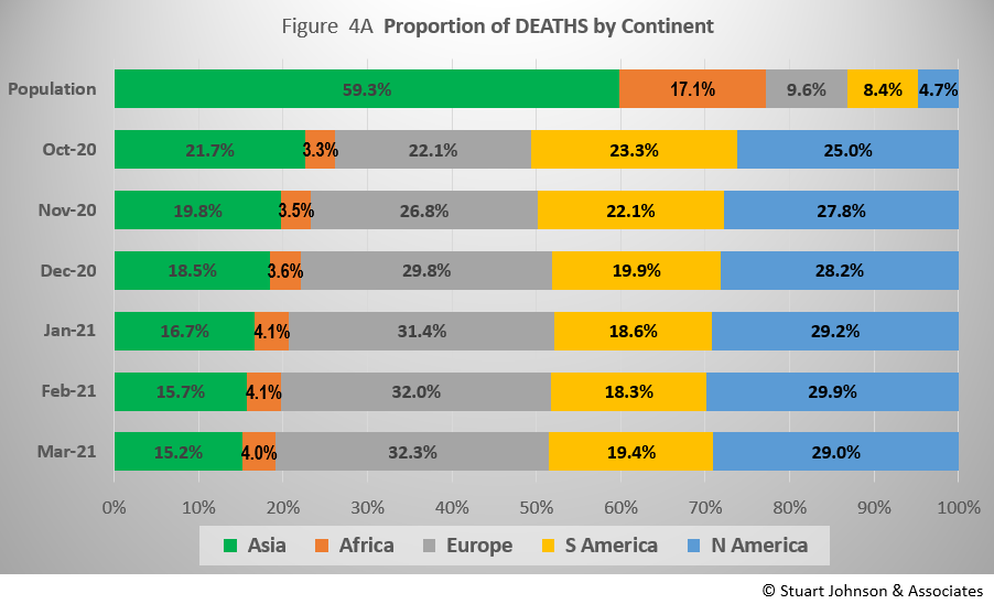
The proportion of deaths between continents is even more distorted than that of cases. Figure 4A shows the steady increase in the proportion of deaths in Europe and the Americas. March ended with Asia and Africa (76.4% of world population) accounting for less than 20% of COVID deaths. Europe has increased 45% from October to March, while North America increased nearly 20% by February, then dropped to a 15% overall increase in March. South America, with minor variations, has gone down nearly 17%.
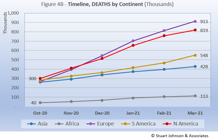
The overall distribution for deaths in March shows how the trajectory for deaths lags behind cases and has progressed at a steadier rate. Back in October, Asia, Europe and the Americas were close together. Europe and North America began a steady upward climb, with Europe surpassing North America by December, taking a very slight downturn in February, continuing at that pace to end March with 913-thousand deaths. North America tracked below Europe, taking a similar downturn in February and another in March, ending with 819-thousand deaths and a widening gap with Europe (by the numbers). On the other hand, South America started at a slower pace of growth in deaths, end March with an upturn and 548-thousand deaths. Meanwhile, Asia progressed steadily and below South America, ending March with 428-thousand deaths. Africa has remained the lowest and slowest in growth, ending March with 113-thousand deaths.
Comparison of U.S. to Top-5 Countries
Cases
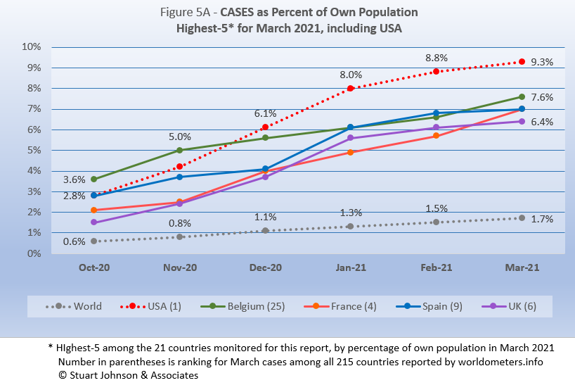
Early on, the small European country of Belgium was leading the world in COVID cases as a proportion of its population (Figure 5A). The U.S. and Spain were nearly a full percentage point lower in October. Belgium began to level off in December, while the U.S. continued climbing, with a slight acceleration in December that continued into January, then began to slow. Even so, the U.S. ended March with 9.3% of its population with reported COVID cases, far above the 1.7% global level and two to four percentage points higher than the next four countries.
After leveling off, Belgium began to climb again in February, ending March at 7.6% of its population with COVID cases. Spain moved up from 2.8% in October to 7.0% in March. France made an even steeper climb, starting at 2.1% in October and ending March in a tie with Spain at 7.6%. The U.K. tracked fairly close to Spain and France, starting at 1.5% and ending March at 6.4%.
Another way to look at population proportion is the measure "1 in." The global figure of 1.7% means that 1 in 61 people in the world have had COVID (and that only by official record keeping, not including any unreported and likely asymptomatic cases). For the U.S., at 9.3% that means 1 in
11. For the U.K., it is 1 in 16.
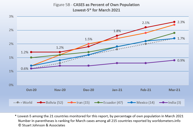
At the low end (Fig. 5B), the five lowest countries for cases by proportion of population (among the 21 that we track) are much closer to the global figure of 1.7% of population with confirmed cases of COVID-19 at the end of March. Those countries represent a considerable spread in size, from India, the second largest country, to Bolivia, ranked number 50 of the 215 countries tracked by worldometers. For Bolivia, its 2.3% level represents 1 in 43 people, for India it is 1 in 113.
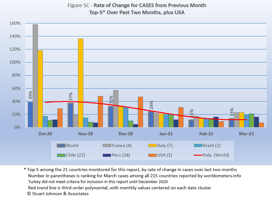
Because the size of countries makes the use of raw case numbers illusory, another measure I find helpful is the rate of change from month to month (Figure 5C). The overall trend in global change from month to month (red line) is going down, though it did move up from 11% in February to 13% in March. The variation between the top-5 each month has been significantly reduced, with increases in cases among the top-5 for February all much closer to the global level of change than any previous month, ranging from 14-17%. That rose somewhat in March as we began to hear reports of a "third wave," especially in Europe (and also in South America, though that was rarely reported), with the top-5 ranging from 16-23%.
Countries are selected based on the change over two-months. Except for the U.S. (which will appear every month), the countries representing the highest change are all new in this report. Last month, the top-5 were UK, Spain, Bolivia, Canada and Mexico.
France and Italy both had spikes well above global levels of change from October through December, before settling into patterns closer to the other top-5, both ending March 23% above February.
Brazil, Chile and Peru, typical of other South American countries, started below the global level of change, then began to increase at higher levels in the last two or three months. The U.S. started below the global level in October, rose sharply above it through January, then fell below it again in February and March, ending with March 7% higher than February.
NOTE: Last month's chart had several errors. Except for the U.S., the data shown was correct, but last month's chart indicated "over three-months" when it should have been "two-months."
The U.S. data was largely incorrect, using the global values instead of the actual values for October through January. The correct values are shown above.
Deaths
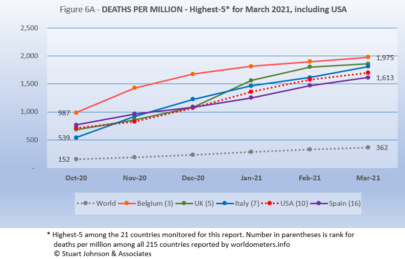
Because deaths as a percentage of population is such a small number, the "deaths per million" metric provides a comparable measure. As Figure 6A shows, Belgium continues to lead the world, though its rate has been slowing as other countries continue to rise. The remaining top-5 for January all tracked in a narrow band through December, then started to break apart somewhat, though still within a relatively narrow range—and all well above the global level of 362 deaths per million population (0.03%). UK has shown the most variance, rising then dipping in December, before surging in January, slowing in February, and slowing once again in March. The UK has been aggressive in testing and vaccinations, while the EU countries struggled to roll out vaccinations in the midst of rising cases.
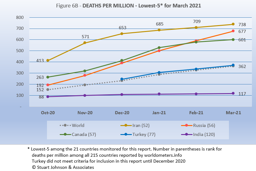
At the low end of deaths per million (Fig. 6B), Turkey has tracked at the global level since it reached the criteria needed to be included in this report (even though it is the top-10 by population). Except for Canada, the other four are all outside the hardest hit regions. While the others have remained steady or slowed in recent months, Russia continues to rise at a rate higher than the global increase.
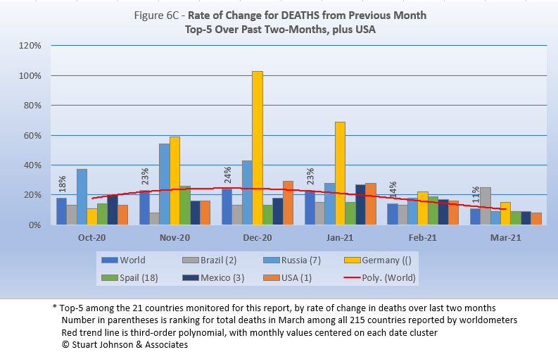
The trend in the rate of change in deaths (red line in Figure 6C) shows the delayed connection with cases. While monthly changes for cases were trending down since October, for deaths the trend peaked in December before starting to go down. ending March at 11%, the lowest level since October.
Brazil, Spain and Mexico replaced UK, Canada, and USA in the top-5 for March. USA dropped below the top-5, but remains in the chart for comparison.
The chart shows the serious situation faced by Germany, which saw deaths increasing at alarming rates in November and December, then falling off some in January, but still 25 points higher than the UK, which surged that month (and disappeared from the top-5 this month). Germany dropped noticeably in February, but still higher than the global level (21% compared to 14%), and dropped again in March, but still above the global level (15% compared to 11%).
Brazil, which had been below global rates of change through February, moved into the top spot because a 25% spike in March put its two-month increase at 42%. Russia, while lower than the global rate in March, was coming down from higher-than-global increases each month since October. While Spain and Mexico ended March below the global rate, higher increases in previous months put them in the top-5 for this report.
USA dropped out of the top-5, having peaked in December and January, before dropping to 16% in February when the global rate was 14%, then fell below the global rate of 11% by ending March with an 8% increase over February.
Mortality Rates (percentage of deaths against reported cases) have been slowly declining. This is not surprising as several factors came into play: the ratio of community spread versus outbreaks (nursing homes, similar confined settings) increased, lessons being applied to treatment, and increased testing (which would expand the spread between reported cases and deaths).
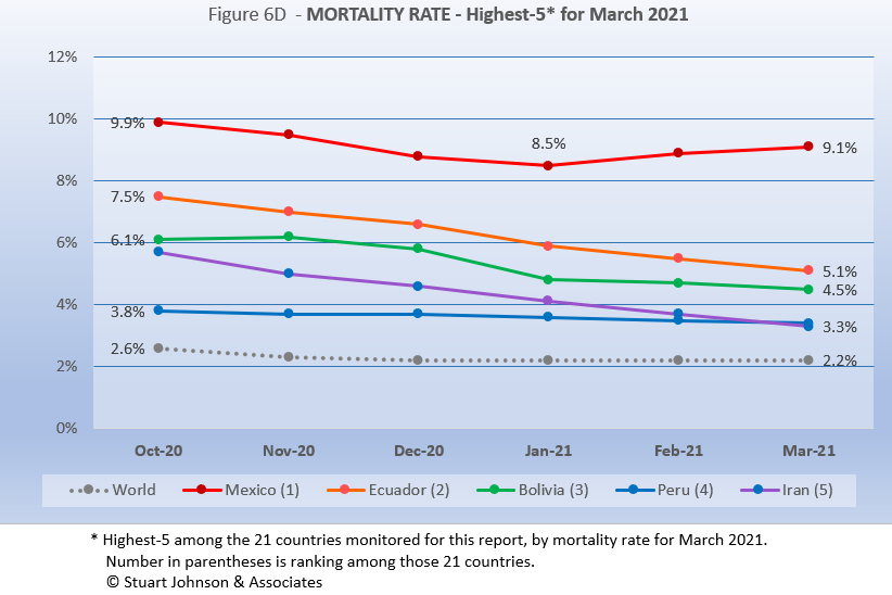
The top-5 in mortality rate (among the 21 countries observed) stand out because for the most part they had not been showing up in other charts until this month. Iran follows the change in the global Mortality Rate, but remains just over one percent higher. Ecuador, Bolivia and Peru have all seen Mortality Rates declining faster than the global rate. Mexico was declining for four months, then began to increase. Even though the increase leveled off some in March, Mexico still ended up with a Mortality Rate of 9.1%, far ahead of Ecuador in second place with 5.1%.
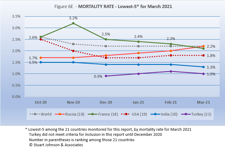
France replaces Spain this month in the lowest five by mortality rate among the 21 countries monitored for this report.
The U.S., while number 1 in cases and deaths, remains number 19 in mortality of the 21 countries, It has been below the global level, reaching a low of 1.7% in January, then rising one-tenth of a percent to 1.8% in February and March. France, which joined the list this month, was above the global level through February, before dipping to 2.1% in March. (Spain increased one-tenth to 2.3%, putting it above the global level and just out of the lowest five). Counter to the typical pattern where mortality rate decreases as cases increase faster than deaths, Russia's mortality rate continues to increase, drawing even with the global level this month.
How real is the threat of death from COVID? That's where successful mitigation comes in. Worldwide, by February, 1 in 2,772 people have died from COVID. In the U.S., while the mortality rate is low, because the number of cases is so high, 1 in 591 have died through March (down from 924 in December). With low mortality, the U.S. should have been able to keep deaths much lower, but the extraordinarily high number of cases means more deaths. Without a better-than-global mortality rate, the U.S. death rate would be far higher. The response of the health care system is part of keeping mortality down, but it's far too early to detail the cause for that positive piece of the COVID picture in the U.S. Even at the global level of 2.2%, the U.S. would have had 684-thousand deaths by the end of March, instead of 564-thousand.
Tests
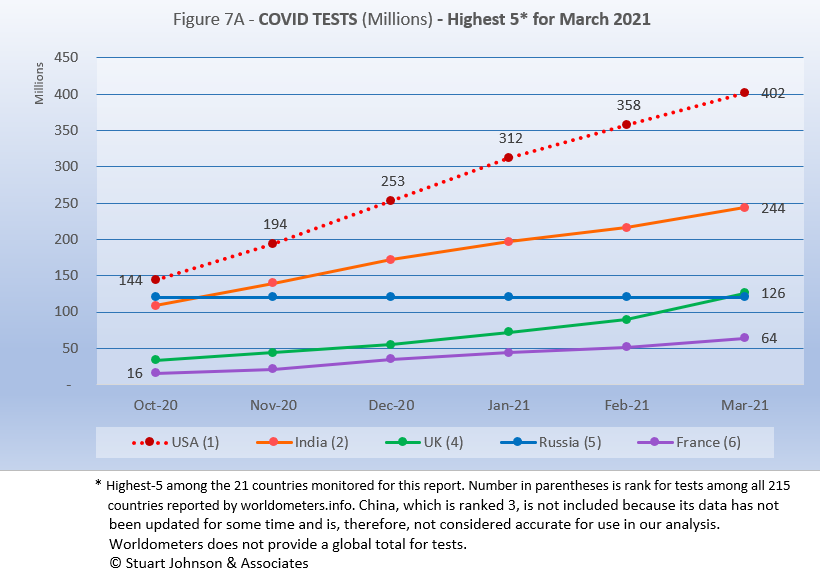
The same five countries remain on top in COVID testings, but UK has now surpassed Russia, which has remained level. .
The U.S. is far ahead of other countries in reported COVID tests administered, at 402 million, 65% ahead of India (the same spread as last month). These are raw numbers, though, so it is important to recognize the size of the country. It is also the case that COVID tests can be administered multiple times to the same person, so it cannot be assumed that the U.S. has tested almost all of its population of some 330-million. The University of Illinois at Champaign-Urbana, for example, is using a twice-weekly saliva test for its campus population to monitor the situation very closely. That's a lot of testing in one place.
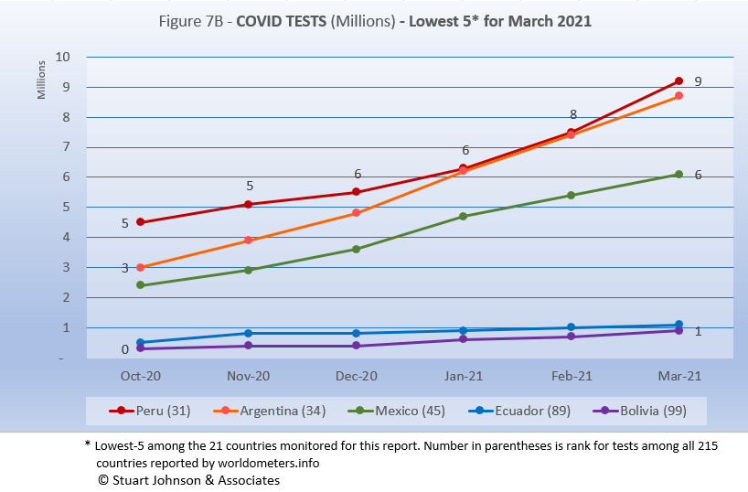
The same five countries, in the same order, remain the lowest in COVID testing.
There is tremendous disparity between countries in terms of testing. The five countries (among the 21 monitored) with the lowest reported number of tests are all in South America. Peru and Argentina are good examples, both having achieved close to 9-million tests by March. Argentina (8.7-million tests for its 45-million population) is well below Spain (42.7-million tests and a population of 47-million). Similarly, Peru (9.2-million tests and 33-million people) is also well below Canada (27.6-million tests and 38-million people).
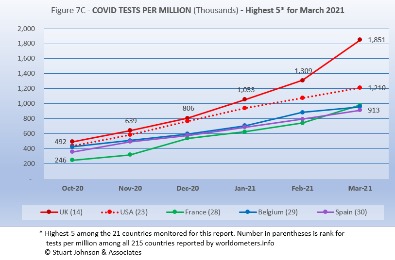
Tests per million adds another perspective. Fig. 7C shows the five countries with the highest tests per million. France replaces Russia in this month's top-5, while Belgium drops one place in the rankings.
The UK, already the most aggressive in testing, increased its numeric lead even more in March, with a reported 1.85-million tests per million. The U.S. continues on a straight line trajectory, reaching 1.21-million tests per million in March. France, Belgium and Spain track close to each other, all ending close to 900-thousand tests per million in March. Anything over 1,000 represents more tests than people (1,000 on the chart actually means 1,000,000), but as mentioned above, that does not mean that everyone had been tested. Some people have been tested more than once, and some are being test regularly or with increased frequency.
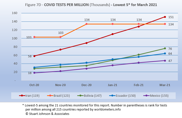
The same five countries appear as the lowest five in tests per million in March, with Iran and Brazil trading rankings though Brazil has not reported any additional testing since December. The five countries among the 21 monitored with the lowest tests-per-million (Fig. 7D) is a different mix than the five countries with the lowest number of tests, which were all in South America. Here, three are South America, one North America, and one Asia. All represent very low levels of testing, no more than 15% at the most. .
Causes of Death in U.S.
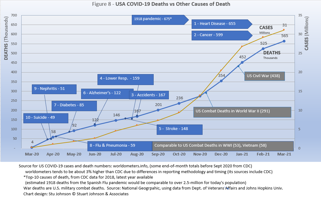
Early in the reporting on COVID, as the death rate climbed in the U.S., a great deal of attention was given to benchmarks, most notably as it approached 58,000, matching the number of American military deaths in the Vietnam War. At that time, I wrote the first article in this series, "About Those Numbers," in which I looked at ways of viewing the data, which at the time of that writing in May 2020 was still focused on worst-case models and familiar benchmarks, like Vietnam. Part of my approach in that article was to put the U.S. COVID deaths on a timeline against not only mileposts like war deaths or significant numbers (i.e., every 50,000 or 100,000), but against the reality of the top-10 causes of death each year, numbers available from the CDC.
Most media sources reported that the U.S. would pass 500,000 deaths on February 22, 2021. The CDC reported 497,415 deaths on February 21, while worldometer.info was already reporting 512,068. As mentioned elsewhere in this report, worldometer tends to be about 3% ahead of CDC and Johns Hopkins, a matter of a few days difference in data collection. At any rate, it is clear that February saw the U.S. death toll from COVID passed the 500,000 mark, headed toward 600,000. The pace in March slowed somewhat, with the total of 565-thousand still short of the next significant milepost of 599-thousand, the number who died from Cancer in 2018, the latest full year reported by the CDC.
Figure 8 shows the number of U.S. COVID cases and deaths against the top-10 causes of death reported by CDC for 2018, along with several other mileposts from wars and the 1918 pandemic. Notice that for nearly nine months, the curve for deaths was increasing at a faster rate than cases. Then, starting in November the curve for cases took a decided turn upward, while deaths increased at a more moderate pace.
The February slowdown in cases was met by a barely perceptible slowdown in deaths, because as pointed out earlier, deaths trail changes in cases. That trend continued in March. In fact, if the trajectory from January to February had continued, we would have seen close to 600-thousands in March. Instead, the curve slowed enough to avoid that milepost for now.
The latest "Ensemble Forecast" from CDC suggests this for the immediate future:
...the number of newly reported COVID-19 deaths will remain stable or have an uncertain trend over the next 4 weeks, with 3,100 to 10,200 new deaths likely reported in the week ending April 24, 2021. The national ensemble predicts that a total of 565,000 to 585,000 COVID-19 deaths will be reported by this date.
Note: As I've referenced in the notes for several charts, the data from worldometers.info tends to be ahead of CDC and Johns Hopkins by about 3%, because of reporting methodology and timing. I use it as a primary source because its main table is very easy to sort and provides the relevant data for these reports.
Perspective
The 1918-19 Spanish Flu pandemic is estimated to have struck 500 million people, 26.3% of the world population of 1.9-billion at that time. By contrast, we're now at 1.5% of the global population. Deaths a century ago have been widely estimated at between 50- and 100-million worldwide, putting the global mortality rate somewhere between 10 and 20-percent. It has been estimated that 675,000 died in the U.S.
IF COVID-19 hit at the same rate as 1918, we would see about 2-billion cases worldwide by the time COVID-19 is over, with the global population now at 7.8-billion—four times what it was in 1918. There would be 200- to 400-million deaths. The U.S. is estimated to have had 27-million cases (one-quarter of the population of 108-million) and 675,000 deaths. Today, with a population of 330-millions (a three-fold increase from 1918) this would mean more than 80-million cases, and 2- to 4-million deaths.
However, at the present rate of confirmed cases and mortality while the total number of global cases could approach 500 million or more—comparable to 1918 in number, that would be one-quarter of 1918 when taking population growth into account . .. and assuming the pandemic persists as long as the Spanish Flu, which went on in three waves over a two year period. With vaccination in progress and expected to be completed in the U.S. by the end of summer, , the end of COVID-19 could come sooner. Like 1918, however, there could be complicating factors such as the growing number of mutations that are more highly transmissible (but not necessarily more deadly).
Using the global mortality rate of 2.2% in March, total deaths with the above projection of cases, would be over 12-million worldwide, tragic but far below the number reported for 1918 (50-million) with an even wider gap (200 million) when taking population growth into account.
The contrast demonstrates the vast difference in scale between the Spanish Flu pandemic a century ago and COVID-19 now. Key differences are the mitigation efforts, available treatment today (though still leaving the health care system overwhelmed in some areas), and the beginning of vaccine distribution. In addition, in 1918 much of the world was focused on a brutal war among nations (World War I) rather than waging a war against the pandemic, which ran its course and was undoubtedly made much worse by the war, with trans-national troop movements, the close quarters of trench warfare, and large public gatherings supporting or protesting the war.
Vaccinations in the U.S.
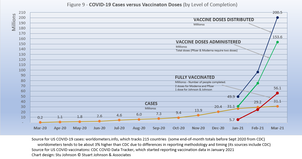
With remarkable speed (it usually takes years to develop vaccines), two COVID vaccines were granted emergency approval for use in the U.S. starting in January—the one by Pfizer requires super-cold storage, which limits its deployment. The other, by Moderna, requires cold storage similar to other vaccines. Both of these require two doses, which means that vaccine dosages available must be divided in two to determine the number of people covered. Since our last report, Johnson & Johnson was granted approval for a single-dose vaccine. The numbers in Figure 9 represent the status of all three vaccines as of March 31.
There has been a great deal of anxiety and frustration about vaccine availability. Much of it, I believe, is unwarranted. It is the result of a combination of politics, news reporting focused on highlighting trouble spots (admittedly, even the best journalists tread a razor edge between informing and inciting), and unrealistic expectations among many people fueled in part by social media. That situation seems to be easing as the delivery of vaccines continues to rise dramatically. One worrisome component remains the number of people who are adamant about not being vaccinated or at least remain skeptical, though those numbers seem to be shrinking.
When writing the January report, I personally knew of only a few people who had appointments for their first dose. There has been a lot of confusion, complaints, delays, but at this writing my wife and I both had our second dose of the Moderna vaccine this past week and will be considered fully vaccinated by mid-April. We qualified in stage 1B in Illinois, which includes people 65 and older as well as younger, essential workers. In line with President Biden's desire to see all people over 18 qualify for vaccination by May 1, Illinois and surrounding states had already made plans to move in that direction. To avoid more frustration in getting appointments, opening up vaccinations to everyone that quickly will require a continued rapid delivery of vaccine and expansion of vaccination sites.
Vaccinating over 300 million people in the United States (much less a majority of the billions around the world) is a daunting task. It is a huge logistical challenge, from manufacture to distribution to administration. Yet, it remains amazing that any of this is possible this soon after the identification of the virus just over a year ago.
There is a delicate balance between maintaining hope with the reality that this is a huge and complicated logistical operation that will take time—and it is a global situation that is beginning to raise issues of equity and fairness within and between countries.
Several people were waiting to be vaccinated when I got my first dose. One was very positive about getting her first dose, then asked if she would still have to wear her mask after the second dose. YES, came the emphatic response from the four other people waiting their turn. YES, even if vaccinated, we will have to continue mitigation efforts until the curve of new cases finally flattens and we can be assured that COVID no longer has a hold on us. That is why the announcements of reopening in Texas, with no restrictions is so worrisome to many. Thank goodness that many stores and other establishments will still require masks and social distancing. The debate over "opening" is in part a response to those who feel that government overreach goes far beyond reasonable mitigation efforts based on social distancing and when masks should be worn.
We can grasp the hope that the end is in sight, but let's not throw it away by being foolhardy!
Yet, in the tendency to turn everything into a binary right-wrong or agree-disagree with the science perspective, we ignore the need to recognize the nature of science and the fact that we are dealing with very complicated issues. So, in addition to recommending excellent sources like the Centers for Disease Control and Prevention (CDC), it is also wise to consider multiple qualified sources.
Maintaining Perspective
While there has been much focus placed in trusting "the science," it is important to recognize that science itself changes over time based on research and available data. In the highly volatile political atmosphere we find ourselves in (not just in the U.S., but around the world), there is a danger of trying to silence voices of experts whose views are out of sync with "the science" as reported by the majority of media outlets. In an earlier report, I mentioned the
Greater Barrington Declaration, currently signed by more than 55-thousand medical & public health scientists and medical practitioners, which states "As infectious disease epidemiologists and public health scientists we have grave concerns about the damaging physical and mental health impacts of the prevailing COVID-19 policies, and recommend an approach we call Focused Protection."
For a personal perspective from a scholar and practitioner who espouses an approach similar to the Focused Protection of the Greater Harrington Declaration, see comments by Scott W. Atlas, Robert Wesson Senior Fellow at the Hoover Institution at Stanford University, in an article "Science, Politics, and COVID: Will Truth Prevail?"
My purpose in mentioning these sources is not to take a political posiiton, but to recognize that there are dissenting voices that should be part of the conversation. The purpoe of these monthly reports remains first and foremost to present the numbers about COVID-19 in a manner that helps you understand how the pandemic is progressing and how the U.S. compares to the world—and how to gain more perspective than might be gathered from the news alone.
Profile of Monitored Continents & Countries
(Data from worldometers.info).
| Rank | Country | Population | Share of World Population |
Density People per square km |
Urban Population |
Median Age |
| WORLD | 7.82B | 100% | -- | -- | -- | |
| Top 10 Countries by Population, plus Five Major Continents See lists of countries by continent |
||||||
| - | ASIA | 4.64B | 59.3% | 150 | 51 countries | 32 |
| 1 | China | 1.44B | 18.4% | 153 | 61% | 38 |
| 2 | India | 1.38B | 17.7% | 454 | 35% | 28 |
| - | AFRICA | 1.34BM | 17.1% | 45 | 59 countries | 20 |
| - | EUROPE | 747.7M | 9.6% | 34 | 44 countries | 43 |
| - | S AMERICA | 653.8M | 8.4% | 32 | 50 countries | 31 |
| - | N AMERICA | 368.9M | 4.7% | 29 | 5 countries | 39 |
| 3 | USA | 331.5M | 4.3% | 36 | 83% | 38 |
| 4 | Indonesia* | 274.5M | 3.5% | 151 | 56% | 30 |
| 5 | Pakistan* | 220.9M | 2.8% | 287 | 35% | 23 |
| 6 | Brazil | 212.9M | 2.7% | 25 | 88% | 33 |
| 7 | Nigeria* | 206.1M | 2.6% | 226 | 52% | 18 |
| 8 | Bangladesh* | 165.2M | 2.1% | 1,265 | 39% | 28 |
| 9 | Russia | 145.9M | 1.9% | 9 | 74% | 40 |
| 10 | Mexico | 129.3M | 1.7% | 66 | 84% | 29 |
| *these countries do not appear in the details because they have not yet reached a high enough threshold to be included Other Countries included in Analysis most have been in top 10 of one or more categories covered in this report at least one month since October 2020 |
||||||
| Rank | Country | Population | Share of World Population |
Density People per square km |
Urban Population |
Median Age |
| 17 | Turkey | 84.3M | 1.1% | 110 | 76% | 32 |
| 18 | Iran | 83.9M | 1.1% | 52 | 76% | 32 |
| 19 | Germany | 83.8M | 1.1% | 240 | 76% | 46 |
| 21 | United Kingdom | 67.9M | 0.9% | 281 | 83% | 40 |
| 22 | France | 65.3M | 0.8% | 119 | 82% | 42 |
| 23 | Italy | 60.4M | 0.8% | 206 | 69% | 47 |
| 29 | Colombia | 50.9M | 0.7% | 46 | 80% | 31 |
| 30 | Spain | 46.8M | 0.6% | 94 | 80% | 45 |
| 32 | Argentina | 45.2M | 0.6% | 17 | 93% | 32 |
| 39 | Canada | 37.7M | 0.5% | 4 | 81% | 41 |
| 43 | Peru | 32.9M | 0.4% | 26 | 79% | 31 |
| 63 | Chile | 19.1M | 0.2% | 26 | 85% | 35 |
| 67 | Ecuador | 17.6M | 0.2% | 71 | 63% | 28 |
| 80 | Bolivia | 11.7M | 0.1% | 11 | 69% | 26 |
| 81 | Belgium | 11.6M | 0.1% | 383 | 98% | 42 |
Scope of This Report
What we track
From the worldometers.info website we track the following Categories:
- Total Cases • Cases per Million
- Total Deaths • Deaths per Million
- Total Tests • Tests per Million (not reported at a Continental level)
- From Cases and Deaths, we calculate the Mortality Rate
Instead of reporting Cases per Million directly, I try to put raw numbers in the perspective of several key measures. These are a different way of expressing "per Million" statistics, but it seems easier to grasp.
- Country population as a proportion of global population
- Country cases and deaths as a proportion of global cases and deaths
- Country cases as a proportion of its own population
- Cases and deaths expressed as "1 in X" number of people
Who we monitor
Our analysis covers countries that have appeared in the top-10 of the worldometers categories since September 2020. This includes most of the world's largest countries as well as some that are much smaller (see the chart in the previous section).
Search all articles by Stu Johnson
Stu Johnson is principal of Stuart Johnson & Associates, a communications consultancy in Wheaton, Illinois. He is publisher and editor of SeniorLifestyle, writes the InfoMatters blog on his own website and contributes articles for SeniorLifestyle. • Author bio (website*) • E-mail the author (moc.setaicossajs@uts*) • Author's website (personal or primary**)* For web-based email, you may need to copy and paste the address yourself.
** opens in a new tab or window. Close it to return here.
Posted: April 3, 2021 Accessed 667 times
![]() Go to the list of most recent Health & Wellness Articles
Go to the list of most recent Health & Wellness Articles
![]() Search Health & Wellness (You can expand the search to the entire site)
Search Health & Wellness (You can expand the search to the entire site)
![]() Go to the list of Most Recent and Most Popular Articles across the site (Home Page)
Go to the list of Most Recent and Most Popular Articles across the site (Home Page)