


See listing of Recent and Most Popular articles on the Home Page
 Loading requested view...
Health & Wellness
Category: News & Current Events / Topics: COVID-19 • Crisis • Dying and Death • Disease • History • News • Statistics • Trends
COVID-19 Perspectives for March 2022
by Stu Johnson
Posted: April 6, 2022
Omicron surge spreads around the world, making return to normal less clear. At the the same time, USA levels off after big spike in January, making a return to normal seem more likely, but are we moving too quickly?…

Putting the COVID-19 pandemic numbers in perspective (Number 21)
See a list of all of my articles related to COVID-19
This monthly report was spawned by my interest in making sense of numbers that are often misinterpreted in the media or overwhelming in detail (some would say that these reports are too detailed, but I am trying to give you a picture of how the COVID pandemic in the United States compares with the rest of the world, to give you a sense of perspective).
These reports will continue as long as the pandemic persists around the world.
Report Sections:
• March-at-a-glance
• The Continental View • USA Compared with Other Countries
• COVID Deaths Compared to the Leading Causes of Death in the U.S.
• U.S. COVID Cases versus Vaccinations
• Profile of Monitored Continents & Countries • Scope of This Report
January-at-a-glance
Reminder: you can click on any of the charts to enlarge it. It will open in another tab or window. Close it to return here.
GLOBAL SNAPSHOT
While there is a rush to return to normal, parts of the world continue to see surging cases of the omicron variant, with word at the end of March of other variants lurking on the horizon. Thus, COVID remains a global pandemic, but as has been true throughout, not uniform in its geographic spread at any point in time. Over the 21 months I have produced these reports, we've seen cases ebb and flow, impacting different regions, with Europe hit hard by the omicron variant since late November. Into the new year, however, omicron began to spread more broadly, with Asia turning into a new hot spot.. In fact, this month I have added South Korean and Vietnam to the list of monitored countries because they are now appearing in the top-10 or 20 in number of cases and/or deaths. It still appears that COVID is morphing into an endemic, which could be with us like the annual flu, but for now it has not let go of its reign as a global pandemic..
EXECUTIVE SUMMARY
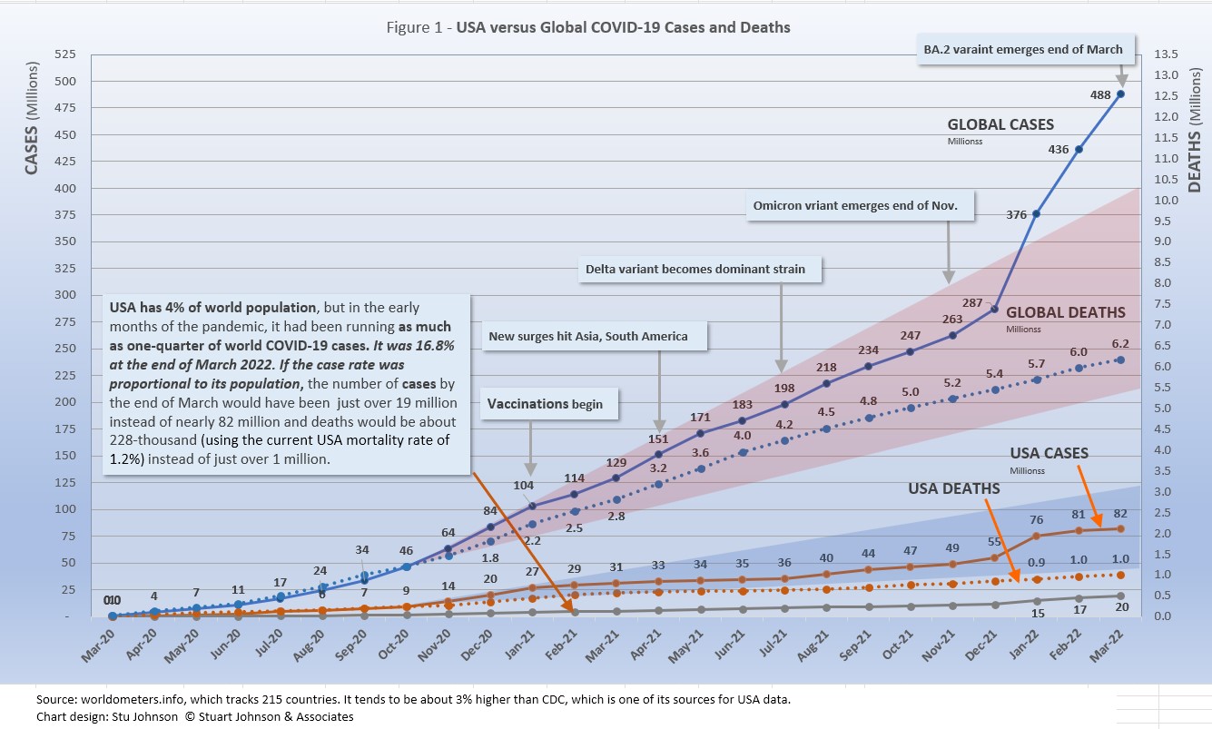
- Globally CASES reached 488 million by the end of March, a 12% increase over February, but a decline from 31% in January when omicron was hitting the hardest and 16% in February. The percentage of global population with reported cases of COVID-19 rose from 3.6.% in December to 6.2% in March. (The 1918 pandemic is generally thought to have infected 25% of the global population).
The red "cone" in Figure 1 above shows a high and low projection of Global cases based on the pace of spread in the first year of COVID-19. The bottom (roughly 210 million) represents the trajectory of the lower pact in late summer 2020, the upper (approximately 385 million) represents a continuation of the major surge from November 2020 through January 2021. Even when the delta variant in 2021 was announced with alarm, the Global increase in cases stayed within the projection cone Then came omicron, which hit Europe hard in December 2021, then shot through the projection cone in January then raced ahead at a very steep increase into March as it spread around the world, shooting upward by 200 million cases in three months/ It took 21 months to reach 287 million in December 2021. That puts global cases roughly 100 million higher than the upper projection based on that first major surge back in early 2021.
- DEATHS from COVID around the world, fortunately, continued to rise at a much slower pace than cases. March deaths were 3% higher than February, which had risen 5% over January. Each of the providing three months saw an increase of 4%. As I suggested last month, put a straight edge along the death line from February to Mary 2021 and you can see that the pace of deaths has slowed significantly, despite the dramatic rise in cases—roughly a million less than had it remained at the earlier pace. That still leaves a death toll from COVID of more than 6 million worldwide two years into this pandemic..
- BY CONTINENT. At the global level, omicron produced a noticeable bend in the curve for cases as a proportion of population (Fig. 3C),, but the huge increases for North America and Europe were dampened at the global level by much lower increases in Asia and Africa, which dominate global population. While the level of global proportion of cases rose from 3.6% in December to 6.2% in March, Europe increased in nearly straight-line trajectory from 11.6% to 23.5%, North America shot up in December, from 17.6% to 23.8%, then slowed noticeably, ending March much closer to Europe, at 26.0%. Both Europe and North America are now at or above the estimated 25% of the global population infected in the 1918 pandemic (but death rates are significantly lower).
- USA continues to lead the world in the number of reported cases and deaths, and while it leads the world in the number of COVID tests its vaccination rate remains lackluster in comparison to other countries. .
USA cases soared 37% in January, to 75.6-million or nearly 23% of the population, then slowed in February and March, adding another 8% (only 1% in March).. While the 81.7 million cases represents 24.7% of the population, the US proportion of world cases dropped from 20.1% to 16.8% as the omicron surge in Europe pushed cases in Netherlands to 46% of the population of that tiny country. Even Germany, which was lagging behind USA in proportion of population with COVID caught up to and passed USA in March by a very slim margin.
The blue projection cone surrounding USA cases in Figure 1, based on the same timeline as the global cone described above, stretched from 38 to 120 million cases, with the curve for cases staying well within those bounds. Cases in USA flattened significantly from January through July 2021 after vaccinations became available, Then, it rose slightly through November with a combination of delta and vaccine resistance. Omicron produced a serious upward bend in January, then slowed in February, ending March at about the mid-point in the cone.
The upward bend for USA cases since December 2021 is clearly visible in Figure 1, but even more pronounced in Figure 10 below, which "zooms in" on USA. Figure 11 provides a detailed view of USA vaccination.
Figure 1 also shows how much lower cases in USA would be—approaching 19-million by now, instead of 82-million—if they were proportional to the global population. It would also mean about 228-thousand deaths instead of just over 1 million (CDC still reports a little under 1 million, but worldometers.info, which I use for global data has been running about 5% ahead of CDC and Johns Hopkins). ..
USA deaths continue to represent a proportion of world COVID deaths far in excess of its 4% share of world population. (China and India represent roughly one-third of world population between them). USA deaths declined from 20.9% of the world total in September 2020 to 14.5% at the end of August 2021, before inching up again, ending February and March with deaths at 16.3% of the world total.
Hospitalizations for COVID in USA were reported at 41,408 in March, down 46% from 29,940 in February. The high was 133,002 in December 2020, the low was 12,979 in Mary 2021.
- THE OMICRON VARIANT emerged at the end of November 2021 and hit Europe hard, bringing back lockdowns and severe restrictions in several countries. In January the surge became turbo-charged and spread to North America and to a lesser but noticeable extent to South America and Asia. In March, the increase in Asia became more significant, while North America had slowed considerably. While deaths can follow well behind increases in cases, it appears that both delta and omicron have had minimal impact on the pace of COVID deaths as mortality rates (deaths as a proportion of cases) continue to fall.
- TESTING. USA leads in the number of tests, with 983-million, followed by India, UK, Russia and France. Of the 32 countries monitored for this report, Netherlands, Ukraine, Mexico, Bolivia and Ecuador report the lowest number of tests. By proportion of population (tests-per-million), UK remains far ahead of others, with the equivalent of 7 tests per person. USA is about 3 tests per person, similar to the other top countries. At the low end, the number of tests covers 29% or less of population. (See figures 8A, 8B, 8C, and 8D). With home tests available more widely in 2022 it will be hard to see their impact on the overall amount of testing, since their use is not reported to health agencies.
- VACCINATIONS. 64% of the world's population have been reported as receiving at least one dose of vaccine by the end of March. (See figures 5A, 5B, 5C, 9A, 9B and 11).
South America leads the world in vaccination, with Chile reporting 90% fully vaccinated. Ironically, Chile suffered a major surge of cases and deaths in March, which may be explained in part by differences in efficacy of available vaccines. USA continues to move ahead, but slowly, with 66% fully vaccinated at the end of March and another 11% partially vaccinated--increasing only 1 or 2% a month since November.
- COUNTRIES TO WATCH. South Korea and Vietnam were added to the list of countries monitored for this report as they appeared at #10 and #12 in the number of cumulative cases. That brings the number of countries on the list to 32 (see the table at the end of this report for a profile of the monitored countries). Of the top ten countries by population, Pakistan, Nigeria and Bangladesh have not reached the threshold (the top-20 in cumulative number cases or deaths) I have used for inclusion in my list of monitored countries.
The weekly comparison report on worldometers.info gives a sense of hot spots to watch. Based on weekly activity, this includes Australia, Thailand, Austria, Greece, New Zealand, and Israel—all in the top 20 of new cases and/or deaths in the last week of March. While some of these have populations too small to make much of an impact on this report, they generally confirm the spread of COVID in Europe and Asia.
Where you get information on COVID is important. In an atmosphere wary of misinformation, "news-by-anecdote" from otherwise trusted sources can itself be a form of misinformation. As I go through the statistics each month, I am reminded often that the numbers do not always line up with the impressions from the news. With that caveat, let's dig into the numbers for January 2022.
THE CONTINENTAL VIEW
The most obvious trend in March is the continued surge in COVID cases in Europe and its rise in Asia, while North and South America have slowed in the appearance of new cases. Oceana is not included because of its small size, about one-half a percent of world population.
While COVID-19 has been classified as a global pandemic, it is not distributed evenly around the world.
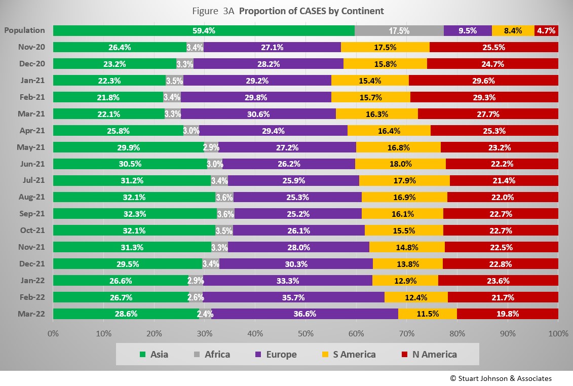
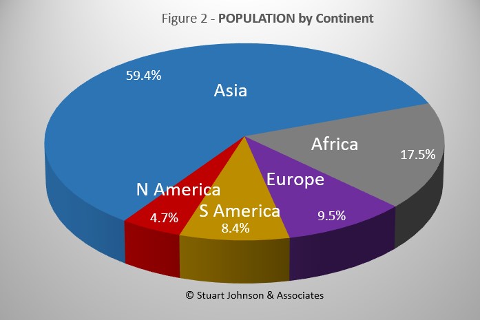
COVID cases now represent 6.2% of world population. (By the end of the 1918 pandemic, it is generally reported to be about one-quarter of the population.) Where Asia and Africa combined represent about three-quarters (76.9%) of the world's 7.9-billion people, Europe, South America and North America still account for 7 in ten COVID cases (68.7% - Figure 3A) and nearly three-quarters of COVID deaths (73.1% - Figure 4A).
The major trend in March was the continued massive surge in Europe due to the omicron variant. After four months at 25 to 26% of world cases, Europe's share kept pushing higher, ending March at 36.6%. Even though omicron produced surges on other continents, the impact was blunted because of Europe: South America continued a decline in proportion of world cases that started in June and North America was backing off a noticeable upward bump in January, with March down to 19.8%, the lowest level since this chart begins in November 2020. Asia peaked at around 32% from August through October 2021 before dropping (as Europe rose), but is back up to 28.6% at the end of March. Africa, never significance n proportion of population with COVID, dropped to its lowest level of 2.4% in March.
Overall, Europe is up 9% in COVID cases since the chart begins in November 2020, the highest it has seen,, while Asia is up 2% and the others down: Africa 1%, North and South America both down 6% to their lowest proportion.
While Africa shows only the slightest deviation from its low and slow growth in cases, the presence of omicron is very visible for the other continents.
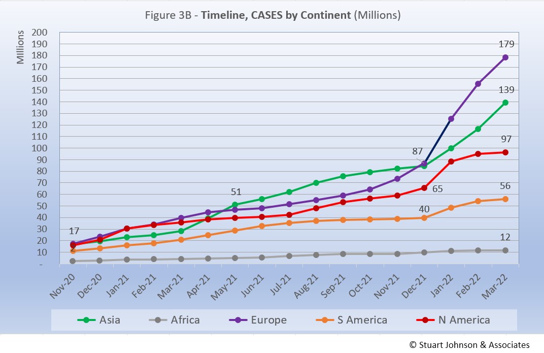
Europe shows the greatest impact in number of cases since omicron appeared in late November. After being virtually tied with Asia in December, Europe has seen its COVID cases rise 105% since then, while Asia increased steadily by 60%/ . North America increased significantly in January, then slowed, rising 50% in three months.(Had the January rise continued, it would have caught up with Asia in number of cases by March). South America saw the lowest three-month increase from omicron, at 17%.
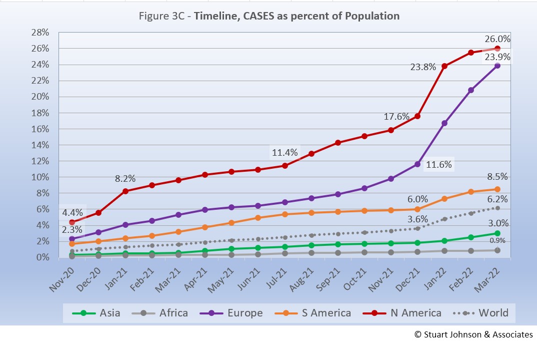
The raw numbers of Fig. 3B can be deceptive. Fig. 3C gives a more realistic picture of the impact by translating raw case numbers to percentage of population. (By contrast, Figure 3A is distribution of global cases). The shape of the curves is similar to those for raw numbers, but the order and spacing paints a different picture.
The impact of omicron is clearly evident, with the Global share of COVID cases increasing from 3.6% to 6,2% since December, Europe has seen the biggest increase, rising steadily for three months, while North America outpaced Europe in January before slowing. If they continue on their recent trajectory, Europe could pass North America in proportion of population by the next report. As you will see in the Comparison of Countries section below, USA is now behind the top-5 countries by proportion of cases, all of them in Europe,
South America stays above the Global level, but follows it fairly closely in rate of increase from omicron. Asia and Africa remain below the Global level, Asia increasing noticeably since omicron became evident, but at a slower rate than the Global level. Africa remains far below the Global level and shows only the slightest increase due to omicron.
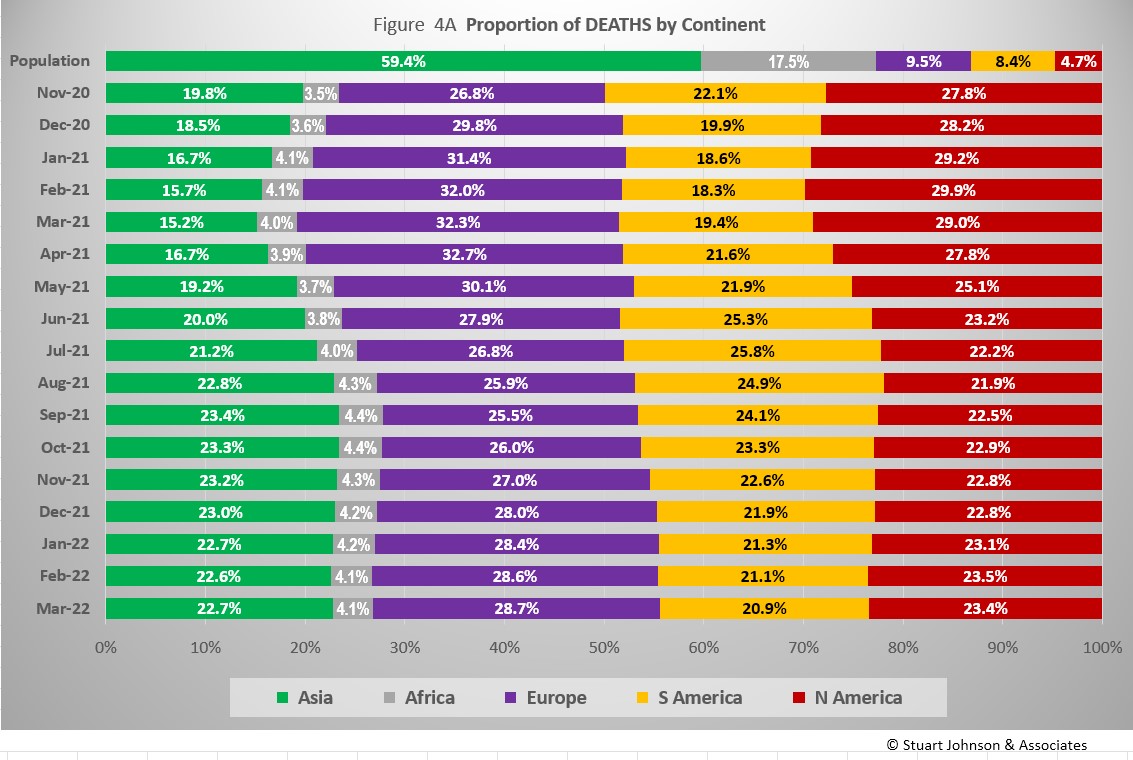
The proportion of deaths between continents shows less extreme change than that for cases. In fact, given the radical change in cases for Europe in the past four months (Fig. 3A), the continental share of COVID deaths has remained remarkably stable. The changes in Fig. 4A can be divided into three sextons by time (the pattern is similar for cases in Fig. 3A, but not as obvious as it is here):
- November 2020 to March 2021 - Europe and North America expand as Asia and South America contract.
- April to July 2021 - Asia and South America expand as Europe and North America contract
- August 2021 - March 2022 - Europe and North America expand as Asia remains about the same and South America contracts
Overall, Asia is up 3% in proportion of COVID deaths from where the chart starts in November 2020, Europe is up 2%, Africa is up less than 1%, while South America is down 1% and North America is down 4%.
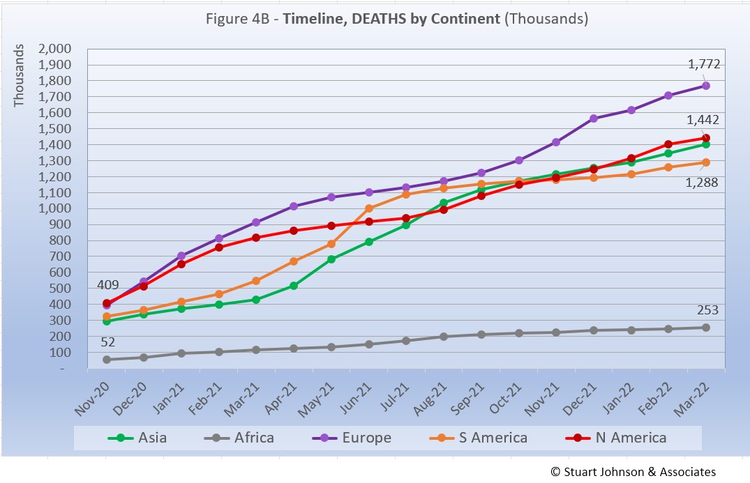
Deaths through March 2022 show that while the trajectory lags behind cases and has progressed at a steadier rate, it does reflect the overall changes in Cases by continent. Except for Africa, which is well below the other continents in the number of COVID deaths, for the other four the 1-million milestone has been in the rear view mirror for months.
While the omicron surge in Europe went "through the roof," what is interesting here is that the death rate actually took a turn downward in January, with a very slight upturn in February and March.. Part of that is explained by the lag between cases and deaths, but the relative steadiness in the path of each curve shows that the death rate has remained much more constant over time than cases surging with each new variant. And, as we'll see later, mortality rates (deaths as a proportion of cases) continue to fall.
Vaccinations
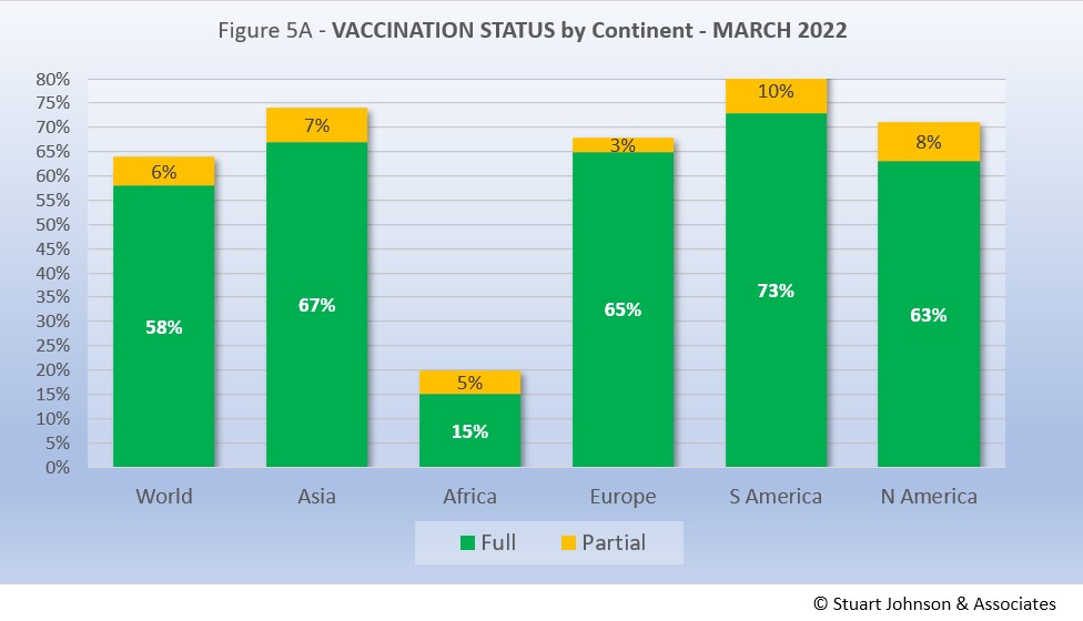
As Fig. 5A shows, nearly two thirds of the global population (64%) has been reported with at least one dose of vaccine, and more than half (58%) are fully vaccinated. That is still well below what is commonly thought of for "herd immunity," which is closer to 94% of the population being immune (most through vaccination), but is remarkable nonetheless given the enormity of the effort represented in little over a year since vaccines became available.
South America, which was slow to get into testing and vaccination, soared ahead of the other continents toward the end of 2020, then took the lead in total vaccine doses in August 2021. Asia pulled past North America in March with 74% vaccinations against 71%. North America has slipped to fourth place for those fully vaccinated, at 63%.
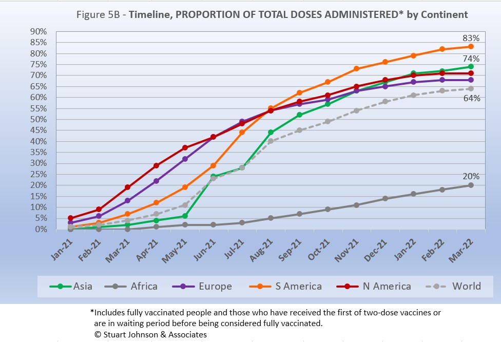
While South America got into vaccinations later and slower than North America and Europe, Figure 5B shows how it steadily pushed its way to the top of total vaccination doses administered by August 2021, expanding its lead since then—and this by proportion of population, not raw numbers, so it's a fair comparison. Where North America started aggressively, it slowed in June as Europe and Asia caught up, with Asia barely ahead of North America at the end of February, then moving ahead in March as North America and Europe leveled off in total doses administered. Africa remains far below the other countries, but is progressing more steadily since mid-2021.
COMPARISON OF USA WITH OTHER COUNTRIES
Cases
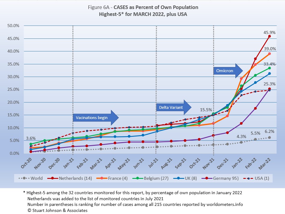
Raw numbers are virtually meaningless without relating them to the size of a given country, so looking at cases as a proportion of population helps get a sense of the relative impact. The countries with the greatest proportion of COVID cases illustrates how they amplify the world trend for cases (bottom line in Figure 6A),
Germany replaces USA in the top-5 this month, but USA is included for comparison. Northern Europe has dominated the top-5 of cases by proportion of population since November. Before that, Argentina and Colombia appeared briefly along with Spain. USA was in the top-5 until this month though it is practically tied with Germany. .
As we saw in the continental view, omicron left its unmistakable imprint on the rise in proportion of COVID cases. While USA leads in number of cases, it slowed in February and March, ending just under 25% as Germany ended just over that mark, moving it into the top-5. Netherlands, the smallest of the countries in both geography and population, has increased the fastest, approaching fully half of its population reported with COVID infections.
Another way to look at population proportion is the measure "1 in." The global figure of 6.2% means that 1 in 16 people in the world have been reported with COVID-19 since it began (and that only by official record keeping, not including any unreported and likely asymptomatic cases). For Netherlands, it is 1 in 2; for France, Belgium and UK it is 1 in 3; Germany and USA it is 1 in 4.
All five countries (of the 32 monitored) in the bottom-5 by proportion of population have been there since September 2021.
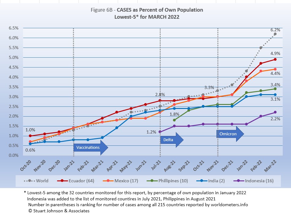
At the scale of this chart, the rise in Global case proportion is magnified compared to the previous chart, so it clearly shows the acceleration of cases produced by omicron around the world since November. Philippines and India were hit hardest in January, then slowed noticeably in February and March. Ecuador and Mexico also were hit by omicron in January, but did not slow down until March. Indonesia, on the other hand, did not show the impact of omicron until February and continued to increase into March.
These countries represent a considerable spread in size, from India, the second largest country, to Ecuador, ranked number 67 of the 215 countries tracked by worldometers. For Ecuador, its 4.7% of population means that 1 in 21 have been reported as having had the COVID virus; for India it is 1 in 32, and for Indonesia 1 in 45.
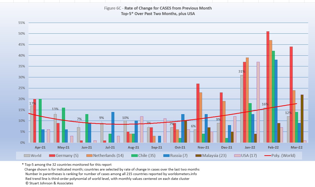
Because the size of countries makes the use of raw case numbers illusory, another measure I find helpful is the rate of change from month to month (Figure 6C). The focus of the selection is on recent changes, but the chart goes back to April 2021, which shows the first major surge fading as vaccinations take hold.
For this chart, countries are selected based on the change over two-months (end of January to the end of March for this report). For the chart this month Chile, Russia and Malaysia replace France, Italy, and Spain, showing the more scattered spread of COVID in March.
The overall trend (red line, reflecting global level) had been falling as the global level reached 6% (of change over the previous month) in November, but omicron pushed it back up to 31% by the end of January before settling back to 12% at the end of March.. (The trend line smooths out more rapid month-to-month changes).
Germany and Netherlands both show high rates of monthly change since November, close to the Global rate in January, then remaining high as the Global rate descended in January and February. Chile, which has the highest vaccination rate, still got caught well above the Global rate of increase in February, then dropped closer to it in March. Russia was also well above the Global rate in February, then fell below it in March. Malaysia was below the Global rate in February, but made the top-5 for rate of change because March was well above the Global rate. USA, which had been at or below the Global level in most earlier months, shot up in January, above the Global rate and about even with Germany, then dropped rapidly with a 7% increase in February and only 1% in March.
The chart below shows how the top-5 has shifted since May 2021, from dominance by Asia and South America in mid-2021, to resounding impact of omicron on Europe in the past four months, before broadening out in March.
| Month | Top-5 for Increase in Cases Over 2 Months | Note | ||||
|---|---|---|---|---|---|---|
| May 2021 | India | Argentina | Turkey | Iran | Columbia | Asia surging |
| June 2021 | India | Argentina | Colombia | Bolivia | Chile | South America surging |
| July 2021 | Colombia | Iran | Argentina | UK | Bolivia | Delta appears |
| August 2021 | Iran | UK | Mexico | Turkey | Russia | Delta rising |
| September 2021 | Iran | UK | Mexico | Turkey | USA | Delta fading |
| October 2021 | Philippines | UK | Ukraine | Turkey | Russia | Mixed |
| November 2021 | Belgium | Ukraine | Germany | UK | Netherlands | Omicron appears |
| December 2021 | Germany | Belgium | Netherlands | UK | France | Omicron intensifies |
| January 2022 | France | Italy | Spain | Belgium | Canada | Omicron intensifies |
| February 2022 | France | Italy | Germany | Netherlands | Spain | Omicron intensifies |
| March 2022 | Germany | Netherlands | Chile | Russia | Malaysia | Omicron spreads |
| Color Legend: Continent assignment as defined by United Nations and used by worldometers.info | ||||||
| Asia | Africa | Europe | S America | N America | ||
Deaths
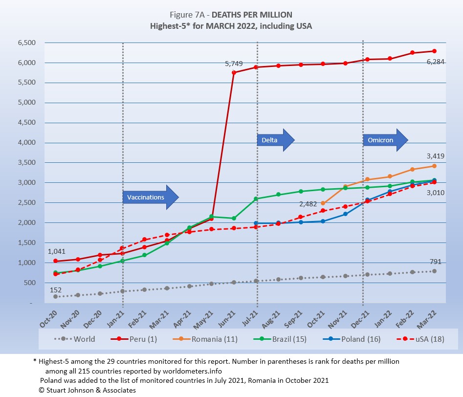
Because deaths as a percentage of population is such a small number, the "Deaths-per-Million" metric shown in Figure 7A provides a comparable measure.
The same five countries return to this month's top-5.
The Global curve for deaths-per-million shows a very steady growth, despite surges, vaccinations and variants that had a much more obvious influence on cases.
As Figure 7A shows, Peru still soars over the others following a correction to its death data in June 2021. It shows a slight increase in the death rate with omicron starting in January, remaining about double the remaining four, which all rose faster than the Global rate.
While USA tracks with its three neighbors in the top-5 for January and February, when omicron was mot evident, its overall curve is much smoother, with a steeper rise through the surge of November 2020 through February 2021, leveling off during the first months of vaccination, followed by a steady upturn starting with the delta variant in August 2021.
All of the countries on the chart are well above the Global level, and (except for Peru) remain fairly close to each other. With the present trajectories, it appears that Brazil will move into 5th place next month.
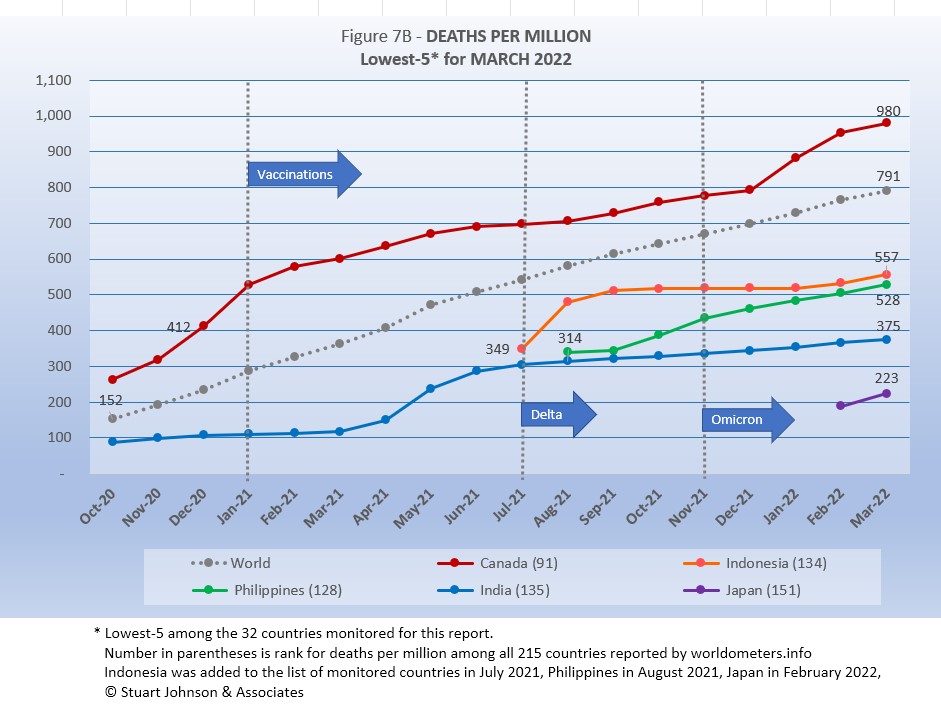
Japan replaces Malaysia this month, after being added to the list of monitored countries last month. The other four return and retain the same order.
.Showing the most obvious impact from omicron is Canada, which had been flattening out, headed toward falling below the Global rate, but January and February saw it accelerate significantly with a slight downturn in March. The others remained steady or showed only a slight increase during the omicron surge. Japan, new to the chart, was rising at a after rate than others, but enters well below India.
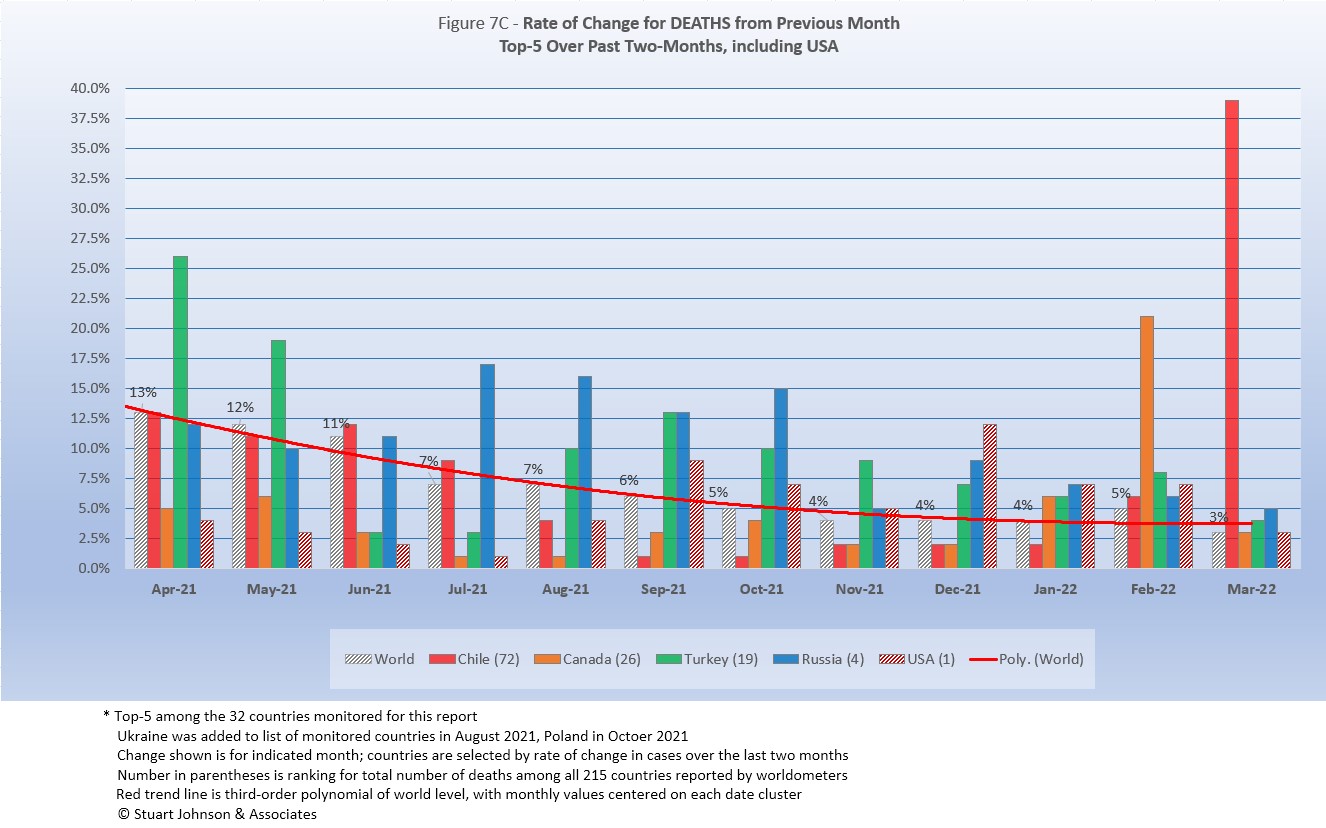
As with the comparable chart for Rate of Change for Cases (Figure 6C), countries for Rate of Change for Deaths (Figure 7C) are selected based on the change over two-months (end of January to end of March) in reported COVID deaths. The focus of the selection is on recent changes, but the chart goes back to March 2021 for perspective.
Chile replaces Poland this month.
Unlike Figure 6C for Rate of Change for Cases, which dipped then rose again at the end because of omicron, the global trend (red line) for Rate of Change for Deaths continued on a downward path, leveling off in February and March. .
Chile, which has been notable for leading South America in vaccinations, was hit with an exceptionally high increase in deaths, which we would not expect given the experience of other high-vaccination countries, where cases may soar, but deaths tend to continue at a steady pace. While the vaccination rate is high, several news stories I read suggested likely factors, including a sense of "triumphalism" in opening up too quickly after the vaccine roll out, use of vaccines with lower efficacy rates than those used elsewhere, and the vacation season coming right when omicron was at it is mot virulent.
Canada was well above the Global level of rate of change in deaths in February, then dropped even with it in March. The other three counties, including USA, were closer to the Global rate of change in February and March, but the change over two months was enough to put them in the top-5.
Contrast this chart with the one for cases above. The chart below shows how the top-5 has shifted since May 2021, from dominance by South America to a mix of Asia and Europe, then a dominance of Europe, followed by a broadening mix as omicron spread.
| Month | Top-5 for Increase in Deaths Over 2 Months | Note | ||||
|---|---|---|---|---|---|---|
| May 2021 | India | Turkey | Brazil | Colombia | Argentina | Tilt toward S America |
| June 2021 | Peru | India | Argentina | Colombia | Bolivia | South America surging |
| July 2021 | Peru | Ecuador | Colombia | Argentina | Russia | South America surging |
| August 2021 | Ecuador | Russia | Iran | Argentina | Colombia | South America fading |
| September 2021 | Indonesia | Iran | Russia | Turkey | Malaysia | Asia surging |
| October 2021 | Philippines | Russia | Ukraine | Turkey | Iran | Asia surging |
| November 2021 | Ukraine | Russia | Philippines | Turkey | Malaysia | Omicron beginning |
| December 2021 | Ukraine | Russia | Poland | Romania | Philippines | Omicron growing |
| January 2022 | Poland | Russia | Ukraine | Germany | Turkey | Omicron surging |
| February 2022 | Canada | USA | Poland | Turkey | Russia | Omicron surging |
| March 2022 | Chile | Canada | Turkey | Russia | USA | Omicron spreads |
| Color Legend: Continent assignment as defined by United Nations and used by worldometers.info | ||||||
| Asia | Africa | Europe | S America | N America | ||
Mortality Rate
Mortality Rates (percentage of deaths against reported cases) have generally been slowly declining. This is not surprising as several factors came into play:
- In the early days of the pandemic, there was a high proportion of "outbreak" cases (nursing homes, retirement communities, other settings with a concentration of more vulnerable people). As the pandemic continued the ratio of "community spread" (with lower death rates) to "outbreaks" increased and the overall Mortality Rate went down.
- As knowledge about treatment increased, mortality went down.
- Since the death count is more certain (though not without inaccuracies), the side of the equation that can change the most is cases. As testing revealed more cases, the Mortality Rate would naturally go down because it would only affect cases and not deaths. In addition, the official numbers do not take into account a potentially higher number of people with the virus who are unreported and asymptomatic, so the real mortality rate could be even lower. (This will be a factor with availability now of home testing, where positives may escape official reporting).
- Vaccinations started in January 2021 and available in January 2022 was the first anti-viral drug (though these should impact both cases and deaths).
- So far, the omicron variant has produced a huge spike in cases, but not in deaths (any increase could take another month or more), which is the reason the global mortality rate dropped so significantly in January 2022.
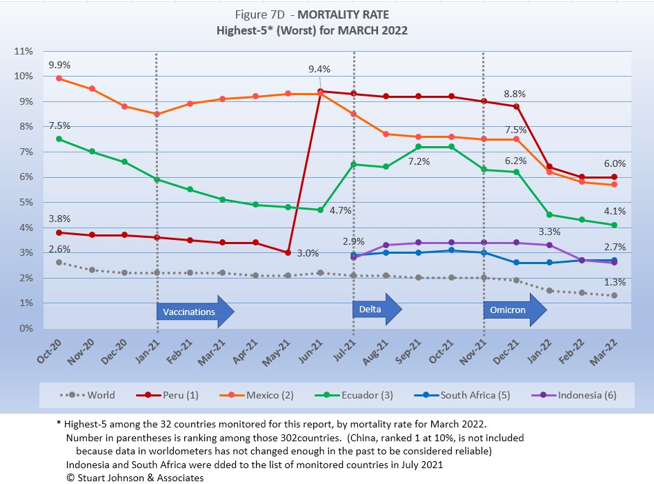
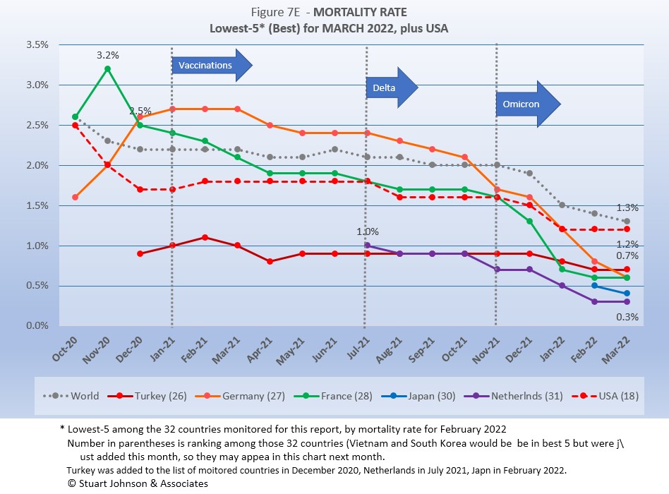
The Global mortality rate had dropped from 2.6% in October 2020 to 2.0% by September 2021, where it stayed for three months. Interestingly—and proving the point about death rates remaining steady and actually slowing down even as cases surge—the Global mortality rate dropped to 1.3% by the end of March, a mirror image of the upward slope of the curve for cases.
The same five countries return this month. Because of a correction in its data in June 2021, Peru saw a major spike in its mortality rate, which slowly went down through December, followed by the largest decline in mortality among the five at the same time omicron was pushing up case numbers. Of the five countries, only South Africa showed a very slight increase from January through March; the others all continue to decline.
Since these represent the best mortality rates, where low is good, the "rank" order is actually in reverse.
Japan replaced UK this month. The introduction of Japan emphasizes the spread of the omicron variant beyond Europe to other parts of the world, led by Asia. All five are well below the Global mortality rate of 1.3%. USA is closer, at 1.2%, where it has been stuck for three months. Germany, hit with a serious surge in cases, did not see a corresponding increase in deaths, so its mortality rate has been falling dramatically, above the Global rate for nearly a year before dropping below it and continuing to fall since omicron emerged. Japan, just added to the list of monitored countries, went down, but we'll have to watch the trend over time. The other three all leveled off in March.
How real is the threat of death from COVID? That's where successful mitigation comes in. Worldwide, by the end of February, 1 in 18 people have been reported as having contracted COVID and 1 in 1,324 people have died. In USA, while the mortality rate is low, because the number of cases is so high, 1 in 340 have died through February 2022—between Poland (also 1 in 340) and Argentina (1 in 363). India has the lowest impact from death, with 1 death for every 2,606 people. Peru is the worst, at 1 in 157.
With low mortality, USA should have been able to keep deaths much lower, but the extraordinarily high number of cases means more deaths. Even so, without a better-than-global mortality rate, the USA death rate would be far higher. Compared to the mortality rate during the 1918 pandemic, it could be ten times worse than it is. Even at the Global mortality rate of 1.3%, USA would have had just over 1.1-million deaths (out of 81.7 million cases) by the end of March, instead of just over 1 million with its mortality rate of 1.2%. As pointed out in Figure 1, however, if USA had cases closer to its proportion of world population, we would be looking at 258-thousand deaths out of 19-million cases. The response of the health care system and availability of vaccines are part of keeping mortality down.
Tests
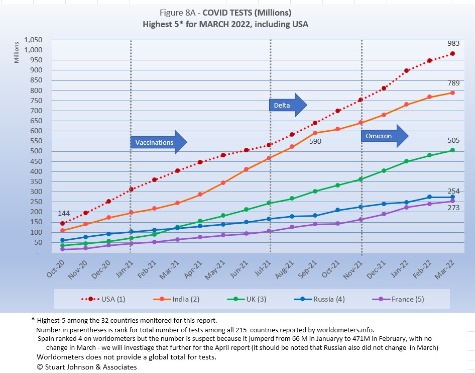
The same five countries remain on top in COVID testings, having been in the same order since March 2021.
USA remains ahead of other countries in reported COVID tests administered, at 983 million, 25% ahead of India, widening the gap since September, but well below the 56% gap in April. UK continues at the pace it set in February 2021, causing it to move into third place back in March 2021. . Russia and France remain on paths of slower growth in raw numbers. While it appeared France could surpass Russia at the rates both were increasing back in January, Russia has managed to accelerate just enough to stay ahead of France.
Since these are raw numbers, it is important to recognize the size of the country. It is also the case that COVID tests can be administered multiple times to the same person, so it cannot be assumed that USA has tested almost all of its population of some 331-million. Some schools and organizations with in-person gatherings are testing as frequently as once a week or more for those who are not yet fully vaccinated. That's a lot of testing!
Another wrinkle in the statistics for tests is the increasing availability of home tests, where we may able to track sales but not tests administered since they are not like PCR and rapid tests offered by agencies that report testing to health authorities. When a person tests positive with a home test, it is recommended they have a more reliable lab test to confirm their status. While the statistics for tests have a degree of ambiguity, they are useful in showing the problem of equity, which is evident in the next chart.
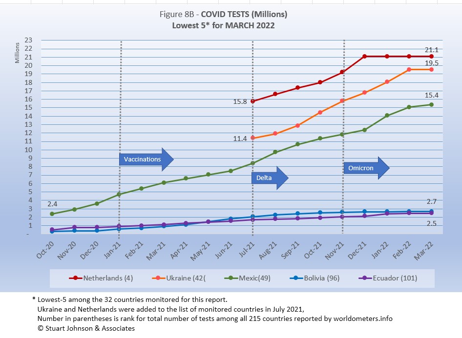
Netherlands returns to the bottom-5, replacing Romania. The other four have been in the bottom 5 since at least August.
After increasing every month, Netherlands has plateaued, which could be a reporting problem.. The number for Ukraine remained the same as March, but that could be attributed to the chaos caused by the Russian invasion in late February. Mexico continues to advance, while Bolivia and Ecuador languish at the bottom, with very little progress over the time span of the chart.
As questions arise about equity of testing between countries, check the number of tests for countries of similar size (within the 29 monitored countries):
- Mexico: 15.6M tests for 128.9M population, compared to Japan: 43.3M tests for 126.5M population (2.7X the tests)
- Ukraine: 19.5M tests for 43.7M population, compared to Argentina: 35.4M tests for 45.7M population (1.8X)
- Peru: 28.7M tests for 33.0M population, compared to Malaysia: 44.6M tests for 56.1M population (1.9X)
- Ecuador: 2.5M tests for 17.6M population, compared to Netherlands: 21.1M tests for 17.1M population (8.4X)
- Bolivia: 2.7M tests for 11.7M population, compared to Belgium: 32.7M tests for 11.6M population (12.1X)
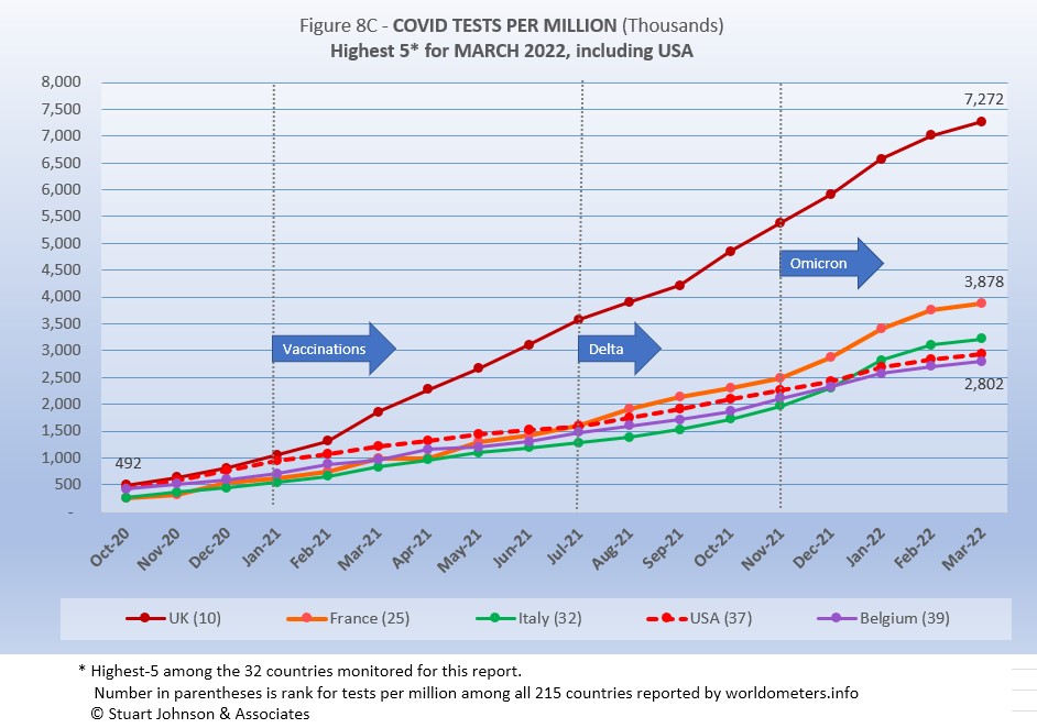
Tests per million adds another perspective. Fig. 8C shows the five countries with the highest tests per million. All five were in the same order from July through December 2021, then Italy moved to #3 in January 2022, passing USA and Belgium.
UK, already the most aggressive in testing, increased its numerical lead each month since February 2021, with just over 7.2 million tests-per-million population in February, representing roughly 7 tests per person. France maintained its #2 position, ending at 3.9 million tests-per-million, nearly four tests per person. USA, at 2.9 million tests-per-million is just ahead of Belgium at 2.8-million.
Anything over 1,000 (or "x-million tests-per-million") represents more tests than people (1,000 on the chart actually means 1,000,000), but as mentioned above, that does not mean that everyone had been tested. Some people have been tested more than once, and some are being tested regularly or with increased frequency.
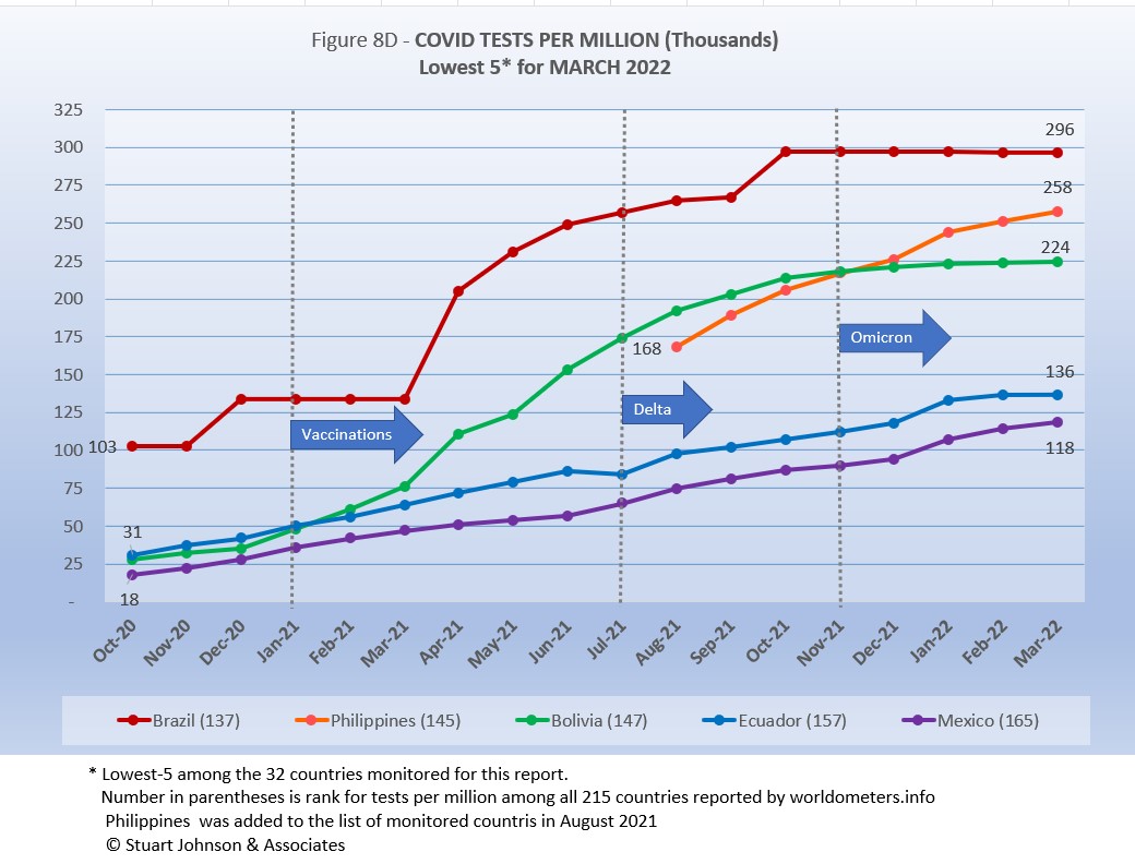
All five countries return from last month, in the same order.
Brazil has been stuck at 63.8-million since October.. While not "stuck," Bolivia has been leveling off since omicron struck. In the meantime Philippines is advancing faster than the others.
Ecuador and Mexico have coasted along at roughly the same slow pace, below the other three, but as Brazil and Bolivia slow down, the gap is slowly narrowing.
While some improvement is seen, the equivalent proportion of tests to population remains very low, from roughly 12% for Mexico to 30% for Brazil (and that would be reduced if some individuals receive more than one test). This illustrates the arguments over inequity in resources among countries.
Vaccinations
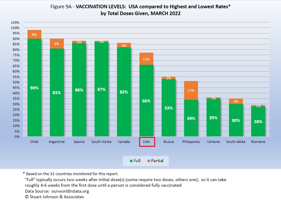
Figure 9A compares USA with the top-5 and bottom-5 of monitored countries by total doses administered. As you can see USA leans toward the upper countries, but its total vaccination rate of 77% increased only 1% over February, so its total vaccination rate remains below the full vaccination rate for all of the top-5. On the other hand, USA is well ahead of the bottom five of the 32 monitored countries for either total doses or fully vaccinated.
As pointed out in other parts of this analysis, Figure 9A does not tell the whole story. It's a bit of an apples and oranges comparison, with one major factor being the population of each country.
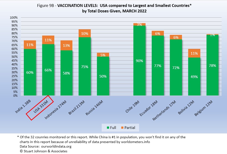
Taking population into account paints a different picture for USA compared to other monitored countries. In Figure 9B you see the five most populous countries on the left and the five smallest (of those monitored for this report) on the right. (China is not included because of unreliability of its data).
Brazil is ahead of USA in both full and total vaccinations. USA is ahead of India, Indonesia, and Russia for both total doses and full vaccination. .
On the side of smallest countries, all except Bolivia are ahead of all five of the biggest countries in fully vaccinated. Chile is far ahead of all ten in total and fully vaccinated. As reported above, Chile has experienced a surge in cases during omicron, which also impacted other places with high vaccination rates. However, where the others did not experience a corresponding rise in deaths, Chile's death rate went up. As pointed out above, this could be due to a combination of opening too soon and possibly using vaccines with lower efficacy rates than used elsewhere.
Thus, individual regions, provinces or states of the largest countries may be doing as well as some smaller countries, while the entire country lags behind the smaller ones.
CAUSES OF DEATH IN USA
Early in the reporting on COVID, as the death rate climbed in USA, a great deal of attention was given to benchmarks, most notably as it approached 58,000, matching the number of American military deaths in the Vietnam War. At that time, I wrote the first article in this series, "About Those Numbers," looking at ways of viewing the data, which at the time of that writing in May 2020 was still focused on worst-case models and familiar benchmarks, like Vietnam.
Three Critical Curves
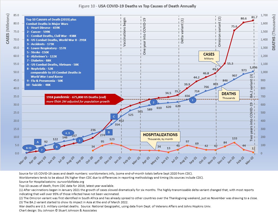
Figure 10 shows the number of USA COVID cases and deaths against the top-10 causes of death as reported by CDC. That data reflects 2019 figures, the latest year available. More recently, I added a curve for hospitalizations, with data going back to October 2020.
Notice that for nearly nine months, the curve for deaths was increasing at a faster rate than cases. Then, starting in October 2020 the curve for cases took a decided turn upward, while deaths increased at a more moderate pace (the two curves use different scales, but reflect the relative rate of growth between them).
Unlike the case and death curves, which are cumulative, hospitalizations reflects the number of cases requiring hospitalization each month. You can see three peaks: the first with the initial surge (before vaccines became available) in December 2020, followed by August 2021 (delta) and January 2022 (omicron), which now represents the peak of hospitalizations. Notice, however, that the relative spread of cases-to-hospitalization is enormously different for omicron. In December of 2020, there were roughly 6.5-million new cases where January 2022 saw 20.3-million (a 212% increase), yet hospitalizations were only 11-thousand higher (8%).
Benchmarking the Numbers
Media reporting tended to focus on easily grasped benchmarks—deaths in Vietnam or World War II, or major
milestones like 500,000 (crossed in February 2021).
In August 2021 we passed the 2018 level for #1 heart disease (655-thousand), then passed it again in September when the 2019 data "moved the goal post" to 659-thousand. Another significant benchmark, pointed out in some news reports, was the 675-thousand estimate for deaths in USA during the 1918 pandemic. Adjusted for population growth, however, that number would now be around 2-mllion.
Having passed the annual death benchmarks and 1918 deaths, now we can only watch as the numbers continue to climb . . . .
The latest "Ensemble Forecast" from CDC suggests that by our next report we should see:
..the number of newly reported COVID-19 deaths will likely decrease over the next 4 weeks, with 1,200 to 4,000 new deaths likely reported in the week ending April 30, 2022. The national ensemble predicts that a total of 990,000 to 999,000 COVID-19 deaths will be reported by this date...
Note: As I've referenced in the notes for several charts that data from worldometers.info tends to be ahead of CDC and Johns Hopkins by about 3%, because of reporting methodology and timing. I use it as a primary source because its main table is very easy to sort and provides the relevant data for these reports. Such differences are also found in the vaccine data from ourworldindata. Over time, however, trends track with reasonable consistency between sources.
Perspective
The 1918-19 Spanish Flu pandemic is estimated to have struck 500 million people, 26.3% of the world population of 1.9-billion at that time. By contrast, we're now at 3.1% of the global population. Deaths a century ago have been widely estimated at between 50- and 100-million worldwide, putting the global mortality rate somewhere between 10 and 20-percent. It has been estimated that 675,000 died in the U.S.
IF COVID-19 hit at the same rate as 1918, we would see about 2-billion cases worldwide by the time COVID-19 is over, with the global population now at 7.9-billion—four times what it was in 1918. There would be 200- to 400-million deaths. The U.S. is estimated to have had 27-million cases (one-quarter of the population of 108-million) and 675,000 deaths. Today, with a population of 331-million (a three-fold increase from 1918) this would mean more than 80-million cases, and 2- to 4-million deaths.
However, at the present rate of confirmed cases and mortality while the total number of global cases could approach 500 million or more—comparable to 1918 in number—that would be one-quarter of 1918 when taking population growth into account . .. and assuming the pandemic persists as long as the Spanish Flu, which went on in three waves over a two year period. (We are facing entering a third year in March 2022). At the present rate of increase (close to 20 million cases per month) we could break the 500 million milestone in April. That rate has accelerated as delta and omicron surges raised the case total significantly.
If the total number of cases globally does 500-million, using the global mortality rate of 1.3% in March, there would be roughly 6.5-million deaths worldwide. Tragic but far below the number reported for 1918 (50-million) with an even wider gap (200 million) when taking population growth into account.
Earlier in the summer of 2021, I indicated that with vaccinations in progress and expected to be completed in the U.S. by the end of summer, the end of COVID-19 could come sooner. Like 1918, however, there have been major complicating factors, such as the combination of the delta and omicron variants with a high number of unvaccinated (ironically hitting hardest in Europe and USA where vaccines are readily available). While we may have thought the end of the pandemic was in sight, it is still too early to make predictions on the duration and severity of the COVID-19 pandemic globally. Indeed, when I commented on the curve for cumulative cases in December, said it looks like the trajectory of an airplane climbing toward cruising altitude. From January through March,, however, it looks more like a rocket headed toward orbit!
Despite the darkening forecast since delta and omicron, the vast difference in scale between the Spanish Flu pandemic a century ago and COVID-19 cannot be denied. Cases may be soaring but are behind 1918 when adjusted for population growth, and either way deaths are far below 1918 mortality. The key differences are the mitigation efforts, treatments available today (though still leaving the health care system overwhelmed in some areas during surges), the availability of vaccines and the first anti-viral drug for those recently infected.
In addition, in 1918 much of the world was focused on a brutal war among nations (World War I) rather than waging a war against the pandemic, which ran its course and was undoubtedly made much worse by the war, with trans-national troop movements, the close quarters of trench warfare, and large public gatherings supporting or protesting the war. While you will see pictures of police and others wearing masks during the 1918-19 pandemic, the need to promote the war effort and maintain morale took precedence over the kind of mitigation associated with major virus outbreaks since then, including COVID-19. Another factor clearly shown in the charts in these reports has been that the rate of increase in deaths has for some time now been well below the increase in cases, especially since vaccines became available in January 2021.
VACCINATIONS IN USA
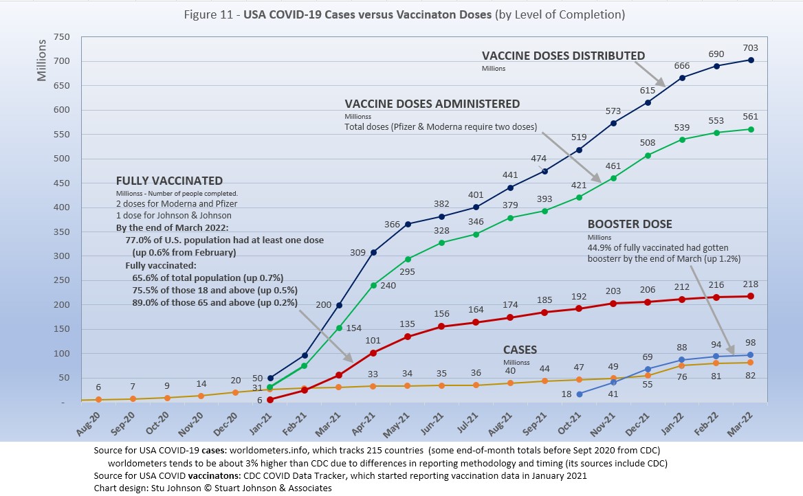
With remarkable speed (it usually takes years to develop vaccines), two COVID vaccines were granted emergency approval for use in USA starting in January 2021—the one by Pfizer requires super-cold storage, which limits its deployment. The other, by Moderna, requires cold storage similar to other vaccines. Both of these require two doses, which means that vaccine dosages available must be divided in two to determine the number of people covered. By March 2021 Johnson & Johnson had been granted approval for a single-dose vaccine. The numbers in Figure 11 represent the status of all three vaccines as of March 31 (as reported by CDC, which will be slightly different than ourworldindata data used in earlier vaccination charts). .
A person is considered "fully vaccinated" two weeks after the final (or only) vaccine dose; roughly five to six weeks total for Pfizer and Moderna and two weeks for Johnson & Johnson.
After a rapid start, vaccination slowed in late spring of 2021. Figure 11shows an upturn in Doses Distributed and Administered in August, a sign that perhaps the delta variant provided the impetus for increased vaccinations. Doses Distributed continued to climb until starting to slow the last two months. A similar but deeper slow down occurred in Does Administered. Fully vaccinated has been increasing at a very slow rate, though nearly 90% of the vulnerable 65+ population is fully vaccinated.
Those getting boosters is up to nearly 98 million in six months, four in ten (44%) of those who are already fully vaccinated, but the curve bent down in February and again in March. During March, the FDA announced approval of a second booster for those over 65 and those with certain medical conditions, but the response has been cautious because of a lower sense of urgency than with the initial vaccination and booster.
In addition, in early November 2021 the CDC expanded vaccination approval for children ages 5-12 and in December 2021the FDA approved the first anti-viral drug, Pfizer's Paxlovid. Despite that, USA fully vaccinated stands at 66%, not bad compared to other large countries, but well behind the best among the 32 countries monitored for this report (see Figures 9A and 9B above).
A year ago we were debating lock-downs. Today with many states fully opened, the debate is whether things are moving too quickly, motivated more by politics than public health. It is clear USA is still far below other countries in total vaccination, still regarded as the best defense. And, the number of surge-inducing variants continues.
As the richer countries with access to more resources make progress, the global situation has raised issues of equity and fairness within and between countries. Even as the U.S. and other countries launched large scale vaccine distribution to a needy world community, the immensity of the need is so great that a common refrain heard now is whether this aid is too little, too late. As COVID fades into a bad memory in countries able to provide help, will the sense of urgency remain high enough to produce the results needed to end this global pandemic?
Maintaining Perspective
In the tendency to turn everything into a binary right-wrong or agree-disagree with science or government, we ignore the need to recognize the nature of science and the fact that we are dealing with very complicated issues. So, in addition to recommending excellent sources like the Centers for Disease Control and Prevention (CDC), it is also wise to consider multiple qualified sources.
While there has been much focus placed in trusting "the science," it is important to recognize that science itself changes over time based on research and available data. In the highly volatile political atmosphere we find ourselves in (not just in the U.S., but around the world), there is a danger of not allowing the experts to change their views as their own understanding expands, or of trying to silence voices of experts whose views are out of sync with "the science" as reported by the majority of media outlets.
In an earlier report, I mentioned the Greater Barrington Declaration, currently signed by more than 62-thousand medical & public health scientists and medical practitioners (and 865-thousand "concerned citizens"), which states "As infectious disease epidemiologists and public health scientists we have grave concerns about the damaging physical and mental health impacts of the prevailing COVID-19 policies, and recommend an approach we call Focused Protection."
For a personal perspective from a scholar and practitioner who espouses an approach similar to the Focused Protection of the Greater Harrington Declaration, see comments by Scott W. Atlas, Robert Wesson Senior Fellow at the Hoover Institution at Stanford University, in an article "Science, Politics, and COVID: Will Truth Prevail?"
Several months ago on SeniorLifestyle I posted an article by Mallory Pickett of The New Yorker, "Sweden's Pandemic Experiment," which provides a fair evaluation of the very loose protocols adopted by Sweden, essentially a variation of the "Focused Protection" approach. The "jury is still out" on this one, so judge for yourself whether Sweden hit the mark any better than the area in which you live.
UPDATE ON SWEDEN: As of early April, Sweden reported 2.5 millions cases of COVID, or 24.5% of its 10.2 million population. There have been 18,331 deaths, for a mortality rate of 0.7%. Cases went up 4% over February and the mortality rate remained at 0.7%. Ranked 89 in population, Sweden was #38 in cases and #45 in deaths (up one in cases, the same as deaths from last month). Hospitalizations fell 27%, from 1,567 to 1,148, compared to a 21% drop last month. The high was 33,035 in January 2021, the low 907 in May 2021.
That puts Sweden even with Spain in cases as a proportion of population (24.6%), with a mortality rate equal to Turkey (0.7%), near the bottom (best) among the 32 countries monitored for this report and well below the global rate of 1.3%.
FROM PANDEMIC TO ENDEMIC: In November 2021 I posted on SeniorLifestyle an article by Sarah Zhang from The Atlantic, "America Has Lost the Plot on COVID." In it, she suggests that America (and the world) is headed not toward the eradication of COVID-19, but its transformation from pandemic to endemic, joining the seasonal flu as something we will deal with for some time. Getting there, she contends, is more a matter of mixed policy strategies than "following the science," but coming to grips with its inevitability could help lead to more effective strategies.
Zhang mentions Denmark as a counterpoint to what is happening in America, saying
One country that has excelled at vaccinating its elderly population is Denmark. Ninety-five percent of those over 50 have taken a COVID-19 vaccine, on top of a 90 percent overall vaccination rate in those eligible. (Children under 12 are still not eligible.) On September 10, Denmark lifted all restrictions. No face masks. No restrictions on bars or nightclubs. Life feels completely back to normal, says Lone Simonsen, an epidemiologist at Roskilde University, who was among the scientists advising the Danish government. In deciding when the country would be ready to reopen, she told me, “I was looking at, simply, vaccination coverage in people over 50.” COVID-19 cases in Denmark have since risen—under CDC mask guidelines, the country would even qualify as an area of “high” transmission where vaccinated people should still mask indoors. But hospitalizations are at a fraction of their January peak, relatively few people are in intensive care, and deaths in particular have remained low.
Crucially, Simonsen said, decisions about COVID measures are made on a short-term basis. If the situation changes, these restrictions can come back—and indeed, the health minister is now talking about that possibility. Simonsen continues to scrutinize new hospitalizations everyday. Depending on how the country’s transition to endemicity goes, it could be a model for the rest of the world.
UPDATE ON DENMARK: In early April, Denmark reported 2.9 million cases of COVID or 46% of its population of 5.8 million. This is an increase of 2 million cases in a month, or 14% (last month it increased 58% due a omicron-related surge). Cases are up from 497 thousand in November, or 8% of the population. Deaths increase by 947 from February to 5,777 (20%), for a mortality rate of 0.2%, the same as last month. Denmark was #37 in cases and #81 in deaths (the same for cases as last month, but up five ranks for deaths). Hospitalizations dropped 34%, from 1,782 to 1,162. The high was 9,982 in December 2020, the low was 55 in June 2021.
Denmark's case-to-population proportion is more than eight times the global rate of 6.2% and even with Netherlands, the worst among the 32 countries monitored for this report. Despite that, it's mortality rate remains striking. At 0.2% it is below Netherlands, whose 0.3% is the lowest among the motored countries. Both countries, then, illustrate a seeming irony pairing super high case rates with extremely low mortality rates. Does this prove the point of Zhang's observation about focusing on the prevention of hospitalization? Of course, as argued for USA, more cases leads to more deaths, even when the mortality rate is extremely low.
How we evaluate the many approaches used to deal with COVID will determine how we prepare for and approach the next global event—including what now appears to be a transition from pandemic to endemic for COVID-19.
My purpose in mentioning these sources is to recognize that there are multiple, sometimes conflicting, sometimes dissenting, voices that should be part of the conversation. The purpose of these monthly reports remains first and foremost to present the numbers about COVID-19 in a manner that helps you understand how the pandemic is progressing and how the U.S. compares to the world—and how to gain more perspective than might be gathered from the news alone.
Profile of Monitored Continents & Countries
(Data from worldometers.info).
| Rank | Country | Population | Share of World Population |
Density People per square km |
Urban Population |
Median Age |
| WORLD | 7.82B | 100% | -- | -- | -- | |
| Top 10 Countries by Population, plus Five Major Continents See lists of countries by continent |
||||||
| - | ASIA | 4.64B | 59.3% | 150 | 51 countries | 32 |
| 1 | China | 1.44B | 18.4% | 153 | 61% | 38 |
| 2 | India | 1.38B | 17.7% | 454 | 35% | 28 |
| - | AFRICA | 1.34BM | 17.1% | 45 | 59 countries | 20 |
| - | EUROPE | 747.7M | 9.6% | 34 | 44 countries | 43 |
| - | S AMERICA | 653.8M | 8.4% | 32 | 50 countries | 31 |
| - | N AMERICA | 368.9M | 4.7% | 29 | 5 countries | 39 |
| 3 | USA | 331.5M | 4.3% | 36 | 83% | 38 |
| 4 | Indonesia** | 274.5M | 3.5% | 151 | 56% | 30 |
| 5 | Pakistan* | 220.9M | 2.8% | 287 | 35% | 23 |
| 6 | Brazil | 212.9M | 2.7% | 25 | 88% | 33 |
| 7 | Nigeria* | 206.1M | 2.6% | 226 | 52% | 18 |
| 8 | Bangladesh* | 165.2M | 2.1% | 1,265 | 39% | 28 |
| 9 | Russia | 145.9M | 1.9% | 9 | 74% | 40 |
| 10 | Mexico | 129.3M | 1.7% | 66 | 84% | 29 |
| *these countries do not appear in the details because they have not yet reached a high enough threshold to be included **Indonesia was added to the monitored list in July 2021 Other Countries included in Analysis most have been in top 20 of cases or deaths |
||||||
| Rank | Country | Population | Share of World Population |
Density People per square km |
Urban Population |
Median Age |
| 11 | Japan (5) | 126.5M | 1.6% | 75 | 92% | 48 |
| 13 | Philippines (2) | 109.6M | 1.4% | 368 | 47% | 26 |
| 15 | Vietnam (6) | 97.3M | 1.3% | 314 | 38% | 32 |
| 17 | Turkey | 84.3M | 1.1% | 110 | 76% | 32 |
| 18 | Iran | 83.9M | 1.1% | 52 | 76% | 32 |
| 19 | Germany | 83.8M | 1.1% | 240 | 76% | 46 |
| 21 | United Kingdom | 67.9M | 0.9% | 281 | 83% | 40 |
| 22 | France | 65.3M | 0.8% | 119 | 82% | 42 |
| 23 | Italy | 60.4M | 0.8% | 206 | 69% | 47 |
| 25 | South Africa (1) | 59.3M | 0.8% | 94 | 67% | 28 |
| 28 | South Korea (6) | 51.3M | 0.7% | 527 | 82% | 44 |
| 29 | Colombia | 50.9M | 0.7% | 46 | 80% | 31 |
| 30 | Spain | 46.8M | 0.6% | 94 | 80% | 45 |
| 32 | Argentina | 45.2M | 0.6% | 17 | 93% | 32 |
| 35 | Ukraine (1) | 43.7M | 0.6% | 75 | 69% | 41 |
| 39 | Poland (1) | 37.8M | 0.5% | 124 | 60% | 42 |
| 39 | Canada | 37.7M | 0.5% | 4 | 81% | 41 |
| 43 | Peru | 32.9M | 0.4% | 26 | 79% | 31 |
| 45 | Malaysia (3) | 32.4M | 0.4% | 99 | 78% | 30 |
| 61 | Romania (4) | 19.1M | 0.2% | 84 | 55% | 43 |
| 63 | Chile | 19.1M | 0.2% | 26 | 85% | 35 |
| 67 | Ecuador | 17.6M | 0.2% | 71 | 63% | 28 |
| 69 | Netherlands (1) | 17.1M | 0.2% | 508 | 92% | 43 |
| 80 | Bolivia | 11.7M | 0.1% | 11 | 69% | 26 |
| 81 | Belgium | 11.6M | 0.1% | 383 | 98% | 42 |
(1) Added to the monitored list in July 2021 |
||||||
Scope of This Report
What I track
From the worldometers.info website I track the following Categories:
- Total Cases • Cases per Million
- Total Deaths • Deaths per Million
- Total Tests • Tests per Million (not reported at a Continental level)
- From Cases and Deaths, I calculate the Mortality Rate
Instead of reporting Cases per Million directly, I try to put raw numbers in the perspective of several key measures. These are a different way of expressing "per Million" statistics, but it seems easier to grasp.
- Country population as a proportion of global population
- Country cases and deaths as a proportion of global cases and deaths
- Country cases as a proportion of its own population
- Cases and deaths expressed as "1 in X" number of people
Who I monitor
My analysis covers countries that have appeared in the top-20 of the worldometers case and deaths categories since September 2020. This includes most of the world's largest countries as well as some that are much smaller (see the chart in the previous section). Vaccination data is taken from ourworldindata.org and CDC. Hospitalization date is found at ourworldindata.org.
This article was originally posted on my InfoMatters blog.
Search all articles by Stu Johnson
Stu Johnson is principal of Stuart Johnson & Associates, a communications consultancy in Wheaton, Illinois. He is publisher and editor of SeniorLifestyle, writes the InfoMatters blog on his own website and contributes articles for SeniorLifestyle. • Author bio (website*) • E-mail the author (moc.setaicossajs@uts*) • Author's website (personal or primary**)* For web-based email, you may need to copy and paste the address yourself.
** opens in a new tab or window. Close it to return here.
Posted: April 6, 2022 Accessed 790 times
![]() Go to the list of most recent Health & Wellness Articles
Go to the list of most recent Health & Wellness Articles
![]() Search Health & Wellness (You can expand the search to the entire site)
Search Health & Wellness (You can expand the search to the entire site)
![]() Go to the list of Most Recent and Most Popular Articles across the site (Home Page)
Go to the list of Most Recent and Most Popular Articles across the site (Home Page)