


See listing of Recent and Most Popular articles on the Home Page
 Loading requested view...
Health & Wellness
Category: News & Current Events / Topics: COVID-19 • Crisis • Dying and Death • Disease • History • News • Statistics • Trends
COVID-19 Perspectives for September 2021
by Stu Johnson
Posted: October 9, 2021
The curve continues to go the wrong way for USA, while globally it is a mixed picture, but COVID is just not going away soon…
Putting the COVID-19 pandemic numbers in perspective (Number 15)
See a list of all of my articles related to COVID-19
This monthly report was spawned by my interest in making sense of numbers that are often misinterpreted in the media or overwhelming in detail (some would say that these reports are too detailed, but I am trying to give you a picture of how the COVID pandemic in the United States compares with the rest of the world, to give you a sense of perspective).
New this month:
- I have added more detail about vaccination levels world-wide. In addition to the section "US COVID Cases versus Vaccinations," which was added several months ago, you will find four new charts on vaccination levels in "The Continental View" and "USA Compared with Other Countries."
- The rising number of cases and deaths in Malaysia reached the threshold to add it to the list of monitored countries, bringing that number to 28 (when these reports began I was monitoring 21 countries).
- The list of top-10 causes of death in the U.S. (Figure 10) has been updated with data now available from CDC for 2019.
These reports will continue as long as the pandemic persists around the world.
Report Sections:
• September at-a-glance
• The Continental View • USA Compared with Other Countries
• COVID Deaths Compared to the Leading Causes of Death in the U.S.
• U.S. COVID Cases versus Vaccinations
• Profile of Monitored Continents & Countries • Scope of This Report
September-at-a-glance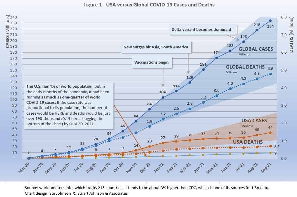
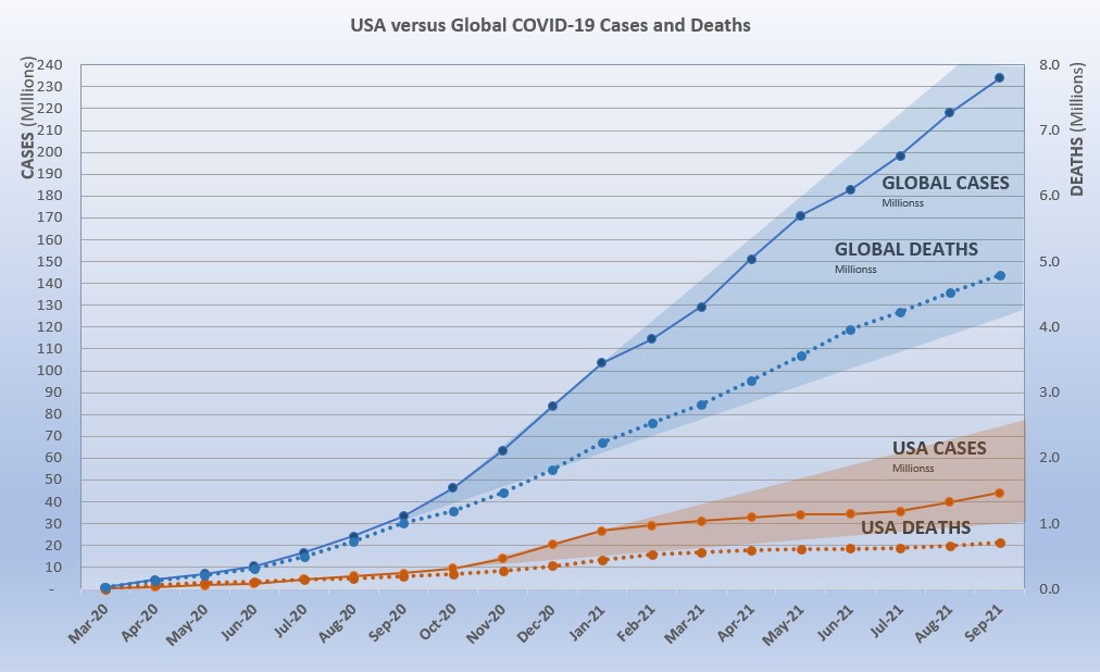
- COVID-19 continued to spread around the world, reaching 234-million cases by the end of September, up 7% from August.
The level of reported cases represents 3.0% of the global population of 7.8-billion, up from 2.8% at the end of September. The increase over August was 7%, back to the level of May after an apparent delta-related surge, which saw a monthly increase of 9% in July and 10% in August. That means that the delta-related surge seen last month has subsided some on a global scale, but continues to be problematic. In some areas it is driven by dense populations and/or lack of vaccine, in others (USA being a prime example) by vaccine resistance.
The blue "cone" in Figure 1 shows the possible high and low projection of global cases, with the bottom (roughly 125-million) representing the trajectory of the lower pace in late summer 2020 and the upper (approximately 255-million) representing a continuation of the surge from November 2020 through January 2021. You can see that the curve for global cases has bent down and back up several times since February 2021, but is very slowly moving away from—but still close to—the upper edge of the prediction cone. USA had fared better until August, which I'll get to below. - The pattern for deaths tends to lag behind cases by weeks or months, and the global rate of increase continues to fall below that of cases—dropping from a 23% increase in January to 6% at the end of September, after two months at 7%. While the curve for deaths is not increasing as much as that for cases, it is still climbing at a noticeable rate (unlike USA where cases and deaths flattened between January and July 2021, before rising again).
- Last month I noted a significant difference, by continent and country, between the curves over time for cases compared to deaths, using South America as an example. This month, however, it is clear that cases and deaths are flattening out for South America as a whole, though some countries still have high deaths-per-million and mortality rates (notably Peru, Brazil, Argentina and Colombia).
- USA. continues to lead the world in the number of reported cases and deaths, with deaths passing two significant benchmarks, the number of deaths estimated for the 1918 pandemic (675,000, though that would be over 2-million if adjusted for population growth) and the number of deaths from heart disease. We've actually crossed the heart disease benchmark twice: last month using the 2018 data (655,000) and again this month using the updated data for 2019 (659,000).
While the 18.9 USA share of global cases at the end of September is down from a high of 25.9% in January, the trend is erratic. The rate was 18.9% in June before dropping to 18.0% in July, then headed back up to 18.3% in August and up again to 18.9% in September.
Similarly, deaths have declined from 20.9% of the world total in September 2020 to 14.9% at the end of September 2021. That, however, is up slightly from the low of 14.5% in August. As you will see in details to follow, while USA outpaced everyone through the early months of the pandemic, the vast disparity was slowly shrinking until the delta variant brought a resurgence in cases. The projection cone surrounding USA Cases in Figure 1 shows a pronounced flattening of the curve from January to July, with a very noticeable upward bend in August and September—though still in the bottom half of the projection cone (which for USA extends from roughly 30 to 75-million). The upward bend for USA cases in August and September is clearly visible in Figure 1, but even more pronounced in Figure 10 below, which "zooms in" on USA.
Figure 1 also shows how much lower cases in the US would be—approaching 9.4-million by now, instead of 44.2-million—if they were proportional to the global population. It would also mean just over 150-thousand deaths instead of crossing the 700-thousand threshold. One must be careful, however, in stating the situation so simplistically, since reality is a complex set of factors. It cannot be denied, however, that the US share to date has been extraordinarily high compared to other large countries.
- Countries to watch. For this report, I moved Malaysia into the list of monitored countries, increasing that list from 27 to 28 countries (a profile of this list can be found at the bottom of this page). In addition, the weekly comparison report on worldometers gives a sense of hot spots to watch. Based on activity in the last week or two, this includes Thailand, Romania, Vietnam, Serbia, Cuba and Israel. While some of these have population too small to make much of an impact on this report, they generally confirm (along with countries recently added to my monitored list) the shift of growth in COVID to eastern Europe and southeast Asia.
- With vaccinations, USA continues to move ahead. After a noticeable slowdown in June and July, the August numbers moved up. In September, total doses distributed were up but the pace of doses administered ("shots in the arm") slowed some while the increase in those fully vaccinated continued at about the same pace as we've seen since June, when things slowed down after five months of rapid increase. (See Figure 11).
This month, I added several new charts showing vaccination status by continent and country. This will help put USA in context. For example, while South America had 41% fully vaccinated at the end of September, it leads the other continents with a total of 62% with at least one dose, putting it at the top (see Figure 5A). Similarly, while USA is in the middle of the 28 monitored countries, it is ahead of the largest countries in those fully vaccinated and second to Brazil in proportion of total doses given (see Figure 9B).
This is where I have to suggest how important it is to get information from reliable and knowledgeable sources that know how to interpret the numbers. In an atmosphere wary of misinformation, "news-by-anecdote" from otherwise trusted sources can itself be a form of misinformation. As I go through the statistics each month, I am reminded often that the numbers do not always line up with the impressions from the news. With that caveat, let's dig into the numbers for September 2021.
The Continental View
While COVID-19 has been classified as a global pandemic, it is not distributed evenly around the world, though we began to see some shifts in patterns starting in April 2021.
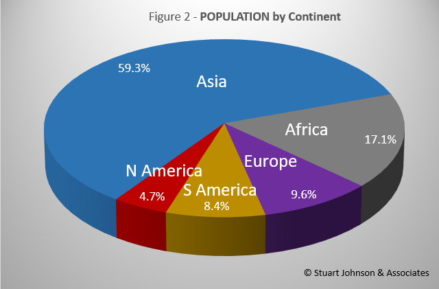
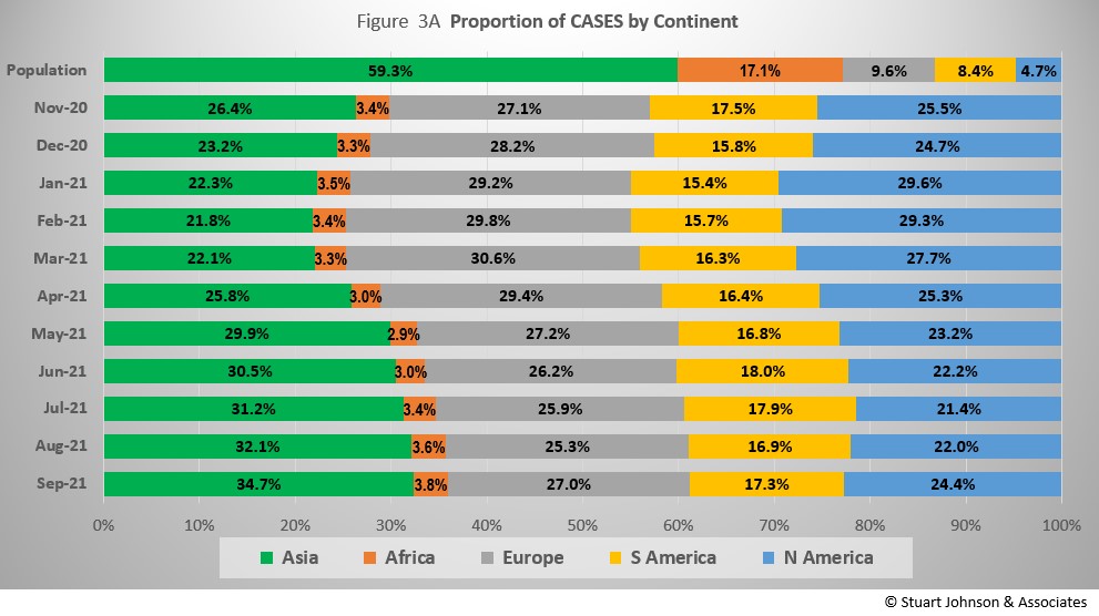
Asia accounts for 59.3% of the world's population (Figure 2), but had only 34.7% of COVID cases at the end of September (Figure 3A)—affecting a mere 1.6% of its population (COVID cases have been reported for 3.0% of world population). This is up from 1.5% for Asia and 2.8% for the global population in August.
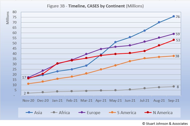
After shrinking in proportion of cases from October 2020 to March 2021, Asia now continues to increase, with each month surpassing the previous one. The trade-off is general decline in Europe and the Americas. Europe was down each month since March, then went up again in September. North America also went down starting in March, but bumped up in August and September. Meanwhile South America (with 8.4% of world population) bottomed out at close to 15% of COVID cases back in January and crept up to a share of 18% in June before shrinking, then expanding again in September.
Where Asia and Africa combined represent about three-quarters (76.4%) of the world's 7.8-billion people, Europe, South America and North America still account for nearly two-thirds of cases (64.0% - Figure 3A) and about 7 in 10 of COVID deaths (72.1% - Figure 4A). The shares for Europe and the Americas combined are slowly coming down from their highs (74.7% for cases and 80.8% for deaths in February).
Oceana's population is too small to be statistically significant, so it is not included in my analysis.
While news reports have given the impression of widespread delta-variant surges, growth in the number of cases in September was not uniform across continents. Asia and North America continue to climb, while South America slowed for the second month. Europe continued on the same rate of increase for the third month. Africa showed a very slight decrease in its rate of growth.
Asia has the highest number of reported COVID cases, having surpassed both Europe and North America when it had a dramatic upturn in April and May. While that pace has slowed, it continues to climb faster than the other continents. North America started to flatten out in January, but then the combination of delta variant and vaccine resistance, especially in USA, combined into a noticeable acceleration of cases since June.
Europe began to flatten out in May, but then turned upward and has held a fairly steady pace for the last three months. Of the four hardest hit continents, only South America has shown a slowing in its increase in cases.
Africa, second by population, remains a loner, with an almost flat curve compared to the other four large continents, with a barely noticeable increase in July and August before bending back down slightly in September.
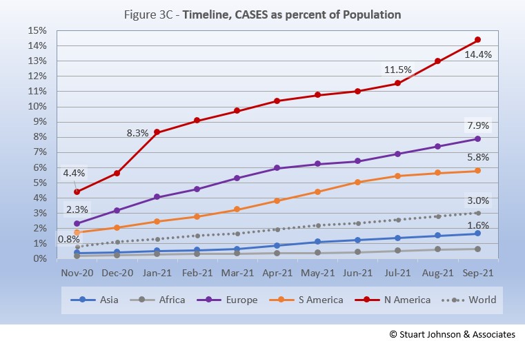
The raw numbers of Figure 3B can be deceptive. Figure 3C gives a more realistic picture of impact by translating raw case numbers to percentage of population.
After a sharp increase in January, North America slowed down for six months, before jumping 1.5 points to 13.0% in August, then up to 14.4% in September—far ahead of the other continents in proportion of population reported with COVID and the most dramatic change for any of them since the delta variant became a factor.
Europe remains well below North America, though it did show a steady upward movement over the last three months, after a short downturn in May and June. South America is the only continent to show a slowing in growth of cases as a proportion of population. August and September combined to show a definite flattening of its growth in cases. Asia and Africa have not changed dramatically in rate over the past five months and both continue to inch away from the global rate, which stood at 3.0% at the end of September. However, as pointed out last month, individual countries in Asia have dominated my watch list in the past few months.
The rate of increase for Asia and Africa is masked by their sheer size. For example, Asia increased by nearly 76-thousand cases in September, an 8% increase over August, while North America's increase of 53-thousand cases—23-thousand less—represented an 11% increase.
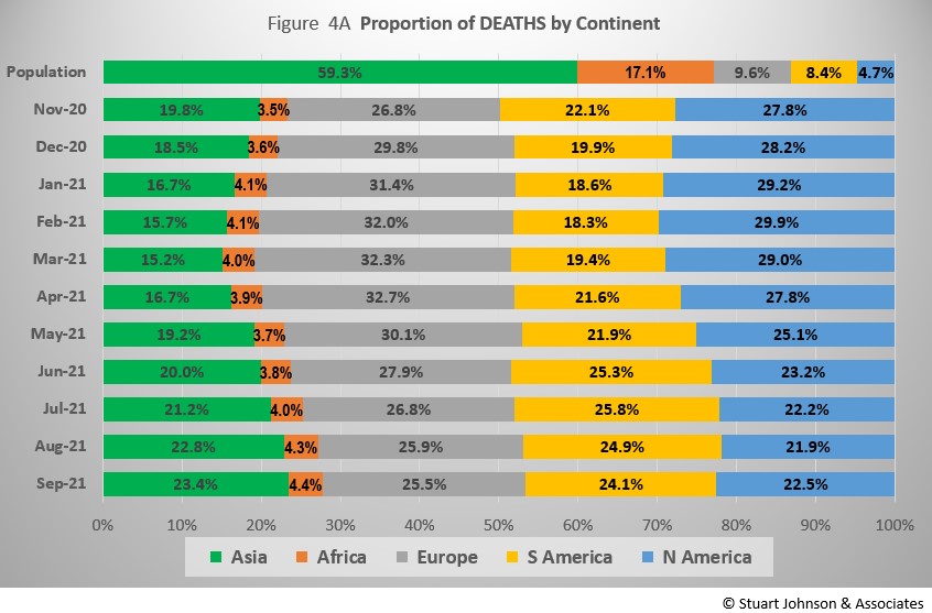
The proportion of deaths between continents is even more distorted than that of cases. In the early months of COVID, Europe and the Americas were growing in deaths, forcing Asia to bottom out in its proportion of global deaths at 15.2% in March. From there, Asia has increased in proportion of COVID deaths—23.4% in September—but still just over a third of its proportion of global population.
Europe, with 9.6% of world population, hit its high of 32.7% of COVID cases in April, after which it moved steadily down to 25.5% by the end of September—not yet reflecting an upturn in cases. North America topped out at 29.9% in February and has since declined to 21.9% in August. The upward bump in September reflects the lag in deaths following the increase in cases starting last month. South America countries to waver, growing to 25.8% in July, but now seems on a path of slowing growth, finishing September at 24.1%.
Africa has not changed all that much in proportion of COVID deaths, ranging from 3.5% in November to 4.4% in September, but it has been growing by a tenth of a percent or more each of the last four months. .
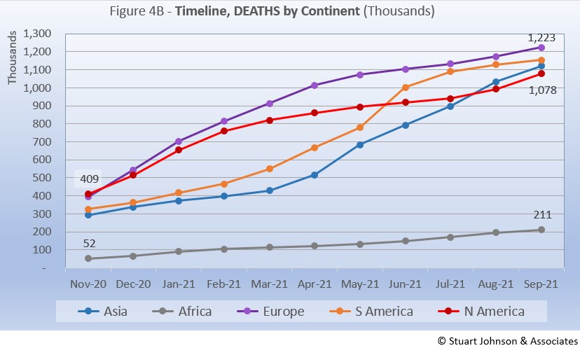
Deaths through September shows that while the trajectory lags behind cases and has progressed at a steadier rate, it does reflect the overall changes in Cases by continent. Four of the continents have now crossed the 1-million benchmark for deaths, with North America joining Europe, South America and Asia this month.
Europe remains at the top in number of deaths. The growth rate for South America, which climbed dramatically in June and seemed poised to pass Europe, slowed down significantly, staying in second place for number of deaths. Asia slowed slightly in September, but remains in third place, having passed North America in August. North America had been slowing until July, then moved up to stay close to Asia, but remaining in fourth place. Africa continues at a slow and steady pace, with a slight drift upward since May, but remains well below the other continents despite being second in size, with 1.3-billion people.
Vaccinations
Beginning this month, we'll compare vaccination at the continental level using data from ourworldindata.org. (New York Times also has an excellent survey of vaccination rates, but ourworldindata has more flexibility in looking at data over time).
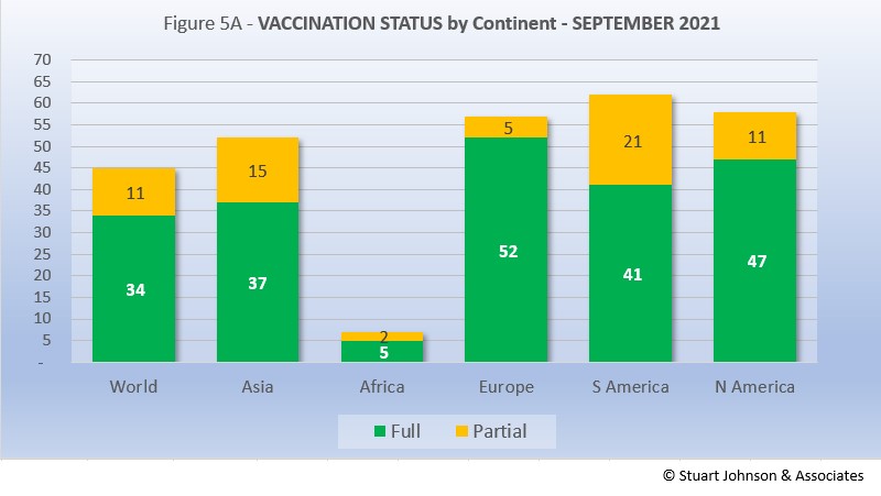
As Figure 5A shows, about one-third of the global population have been reported as fully vaccinated (roughly 2.6-billion people), with another 11% having received the first of two doses or in the waiting period to be considered fully vaccinated. Given continuing gloomy reports in the news, those numbers may be surprisingly high given the monumental task of vaccinating multiple billions of people.
Europe is ahead of the pack, with 52% of its population fully vaccinated, followed by North America at 47%. Interestingly, South America, which struggled with surges over recent months, has attacked the vaccination front, putting the continent in the lead for total doses administered at 62%. Clearly, Africa remains the loner—and the loser—on the vaccination front, which highlights arguments over vaccine availability and inequities in distribution.
By next month we could see a shift in position as South Americans get their second dose, though it takes another two weeks to be considered fully vaccinated. There may also be a strategic component that could lift the total but keep the "partial" block on the high side. As Britain did for a while, some countries may focus on getting first doses out before following-up on second doses. The idea behind that is that getting vaccination started broadly is worth the delay in getting to full vaccination. The downside to that strategy, however, is the potential loss of efficacy if the second does is not administered within an optimum timeframe.
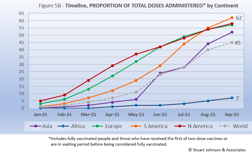
While South America got into vaccinations later and slower than North America and Europe, Figure 5B shows how it pushed its way to the top of the total vaccination doses administered by September—and this by proportion of population, not raw numbers, so it's a fair comparison. Where North America started aggressively, it slowed in June as Europe caught up, then both have tracked virtually the same the last three months, reaching 58% and 57% respectively in September. Meanwhile, South America steadily increased, barely taking the lead in August, then moving ahead in September.
The world trajectory was clearly influenced by Asia, which shows serious vaccination administration starting in June and moving upward to top 50% in September. Africa remains far behind the others, though there is an encouraging upward movement beginning in July.
Because a majority of vaccines being used now require two doses, we will likely see total doses expand more quickly in coming months, with full vaccination catching up at a rate dependent on supply, strategy and willingness of populations to cooperate.
Comparison of U.S. with other Countries
Cases
Raw numbers are virtually meaningless without relating them to the size of a given country, so looking at cases as a proportion of population helps get a sense of the relative impact.
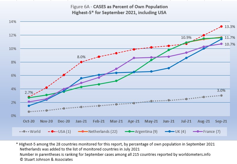
Spain drops from the top-5, replaced by UK. The other four return, but shuffle their order from August.
USA moved back into #1 last month after being edged out by a very slim margin by Argentina in July. In September USA pushed well past the others, but on a trajectory that matched UK, which has been climbing steadily for three months. Meanwhile, after hitting #1 by the slimmest of margins in July, Argentina has slowed. Netherlands, added in July, is actually hidden by Argentina as they track together. France flattened out following a peak in April, then accelerated slightly before slowing again in September to end at #5, as UK kept its upward pace to #3.
The top-5 by proportion of population with COVID cases, have progressed at a rate higher than the Global level, though Netherlands, Argentina and France all slowed to more closely match the Global rate of increase in September. Along with UK, their positions have narrowed since July, with USA running away—hardly a distinction to brag about. However, at the current pace, UK could follow USA to outdistance the others by the end of October.
Another way to look at population proportion is the measure "1 in." The global figure of 3.0%% means that 1 in 33 people in the world have been reported with COVID (and that only by official record keeping, not including any unreported and likely asymptomatic cases). For USA it is 1 in
8. For all of the other four it is 1 in 9.
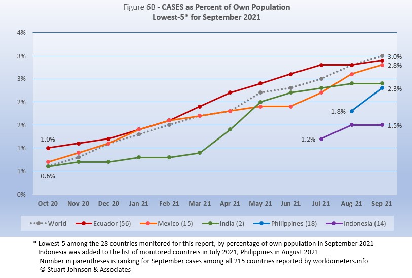
Canada is replaced by Philippines, which was added to the list of monitored countries in August. Ecuador, Mexico and India all move up one place, Indonesia stays at #5. Where Ecuador was well above the Global level, the new mix finds all five below that level in September.
Ecuador was on a path to continue above the Global level until it leveled off in August, with a modest increase in September. Mexico was slowing through June, then accelerated for two months before slowing slightly in September. India rose very sharply between March and May then slowed considerably. Philippines shows the sharpest rise, but since it was new to the report last month, we need to see where it goes in coming months. That can also be said of Indonesia, which rose faster than the Global pace in August before flattening in September.
These countries represent a considerable spread in size, from India, the second largest country, to Ecuador, ranked number 67 of the 215 countries tracked by worldometers. For Ecuador, its 2.9% of population means that 1 in 35 have been reported as having had the COVID virus, for India it is 1 in 41, and for Indonesia 1 in 65.
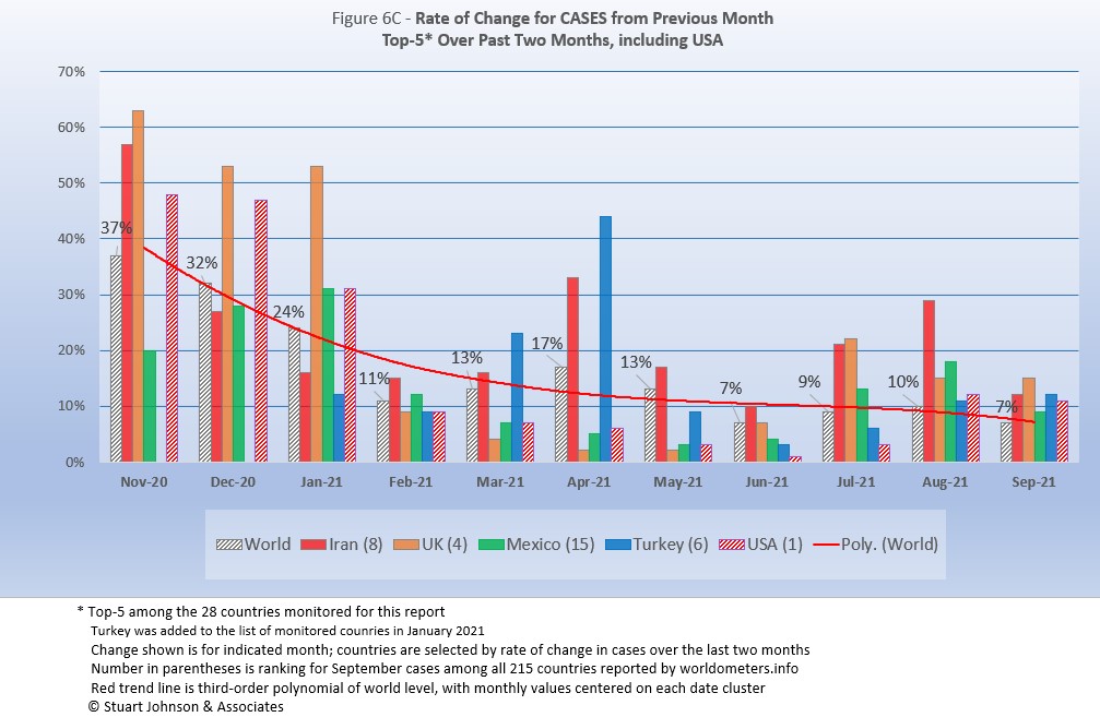
Because the size of countries makes the use of raw case numbers illusory, another measure I find helpful is the rate of change from month to month (Figure 6C). The focus of the selection is on recent changes, but the chart goes back to November to keep the surges of late 2020 in perspective.
For this chart, countries are selected based on the change over two-months (end of July to end of September for this report). USA, which will always appear in this chart, happens to be among the top-5 in September. Iran, UK and Mexico return in the same order from last month, while Turkey replaces Spain and USA replaces Russia.
The overall trend (red line, reflecting global level) flattens as it drops, but unlike last month when it kicked up a bit, this time it continues going down due to the drop in world cases. (A polynomial trend line flexes as adjacent data points go up and down, so the leading edge of newest dates can change the shape of the curve as new months are added).
Overall, global levels were much higher from November through January (the highest period of surging cases as pointed out in Figure 1), as was the absolute variation between countries.
May and June represented a low point with lower levels of change and less variation between countries. The impact of the delta variant is evident in July and August as levels of change from the previous month kicked up again, but then it moderated in September.
Iran has experienced month-to-month increases of 29% in August and 11% in September, but had a high of 57% in November. UK, after doing well with its plans to "reopen" got caught with delta-variant surges, turning very low monthly increases from March through June into a 22% increase in July, followed by 15% each in August and September. Mexico also dipped between March and June, then went up to 13% in July, 18% in August and back down to 9% in September. Turkey, which was added to the list of monitored countries in January, saw a spike of 44% in April, then fell below Global levels before rising again to 11% in August and 12% in September.
USA started well above the Global level from November (48%) through January (31%), then dropped to 9% in February after vaccinations had begun and the surge seemed to have ended (in USA anyway). From there it is fell further below the global level each month until reaching a low of 1% in June. This has reversed, with a small bump in July that was still well below the global level. Then August went above the global rate (10%) to hit a 12% increase, followed by 11% in September—not as bad as the early surge, but enough to show the impact of delta on the still-too-large number of unvaccinated individuals. (This is visible in Figure 1, which compares Global and USA curves, but even more evident in Figure 10, which focuses on USA),
Deaths
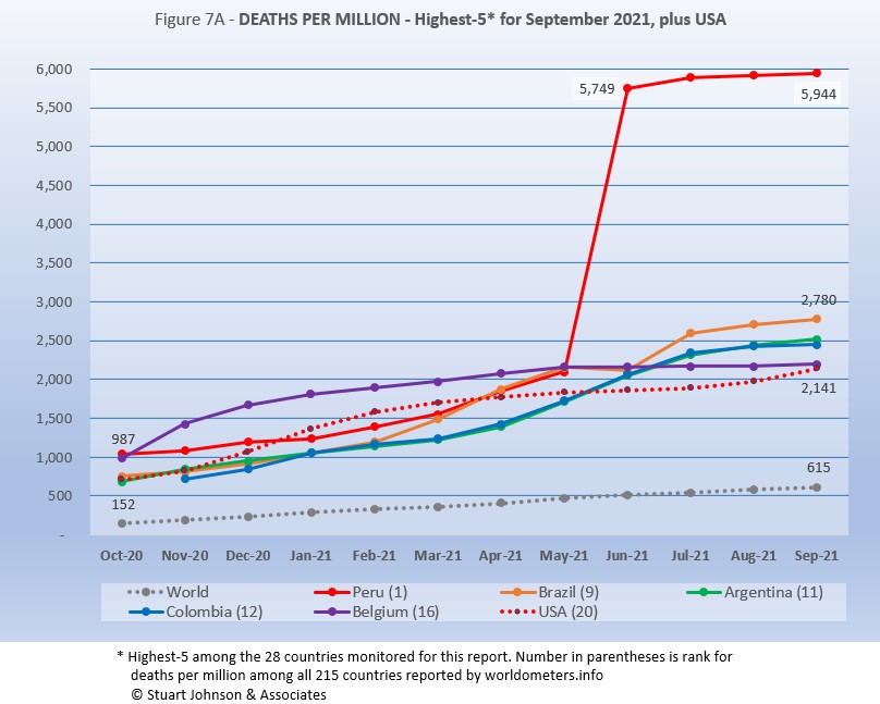
Because deaths as a percentage of population is such a small number, the "Deaths-per-Million" metric shown in Figure 7A provides a comparable measure.
The same five countries appear in the same order as last month.
As Figure 7A shows, Peru still soars over the others following a correction to its death data in June. September remains more than double #2 Brazil and nearly ten times the Global level of 580.
While the worst deaths-per-million is dominated by South American countries, as suggested in other parts of the report this month, there is a slowing and even some flattening evident in the last two months. Peru, Brazil, and Argentina have all slowed in growth of deaths-per-million (the number cannot go down, but it can flatten). Columbia pretty much flattened in September, so it no longer hides Argentina, whose curve is so close it is hard to distinguish the two. Belgium, at one time the leader in deaths-per-million (among monitored countries) is the only European representative, and it has flattened considerably since May.
USA rose steadily until evidence of the effectiveness of vaccination began to become evident with a slow down from March through July, before turning back upward in August and September, coinciding with the delta variant and vaccine resistance, so it now matches Belgium.
Since this analysis focuses on 28 countries that have been in the top-20 of cases and deaths, there are 7 other countries not monitored with Deaths-per-Million between Peru, with a population of 33.5M, and Brazil, with 214.5M. The largest are Hungary (9.6M, 3,139 Deaths-per-Million), Bulgaria (6.9M, 3,083), and Czechia (10.7M, 2,840).
All of the countries on the chart, including USA, are all well above the Global level, and (except for Peru) fairly close to each other for the past three months after nearly converging in June.
While the delta variant was causing cases to rise, particularly in July and August, death rates in general remained unaffected or low in comparison—even South America, which had been the exception is slowing down.
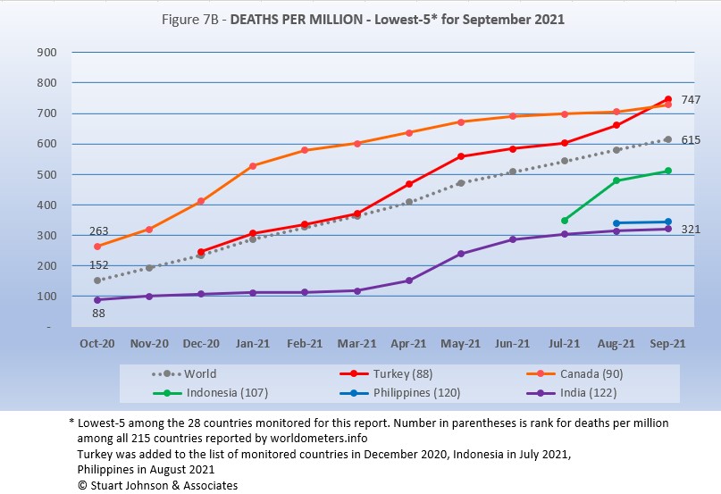
Among the lowest five for Deaths-per-Million, Netherlands is replaced by Philippines, which was added to the list of monitored countries in July.
Even though Canada bent upward a bit in September, Turkey has moved up more than the others since July, putting it just ahead of Canada at #1 (of the lowest five), both above the Global level. Indonesia, added to the list in July, climbed quickly in August before slowing some in September. Philippines increased almost imperceptibly in September, but so far that represents just two months of data. India saw a rapid increase from April through June before the pace slowed down,
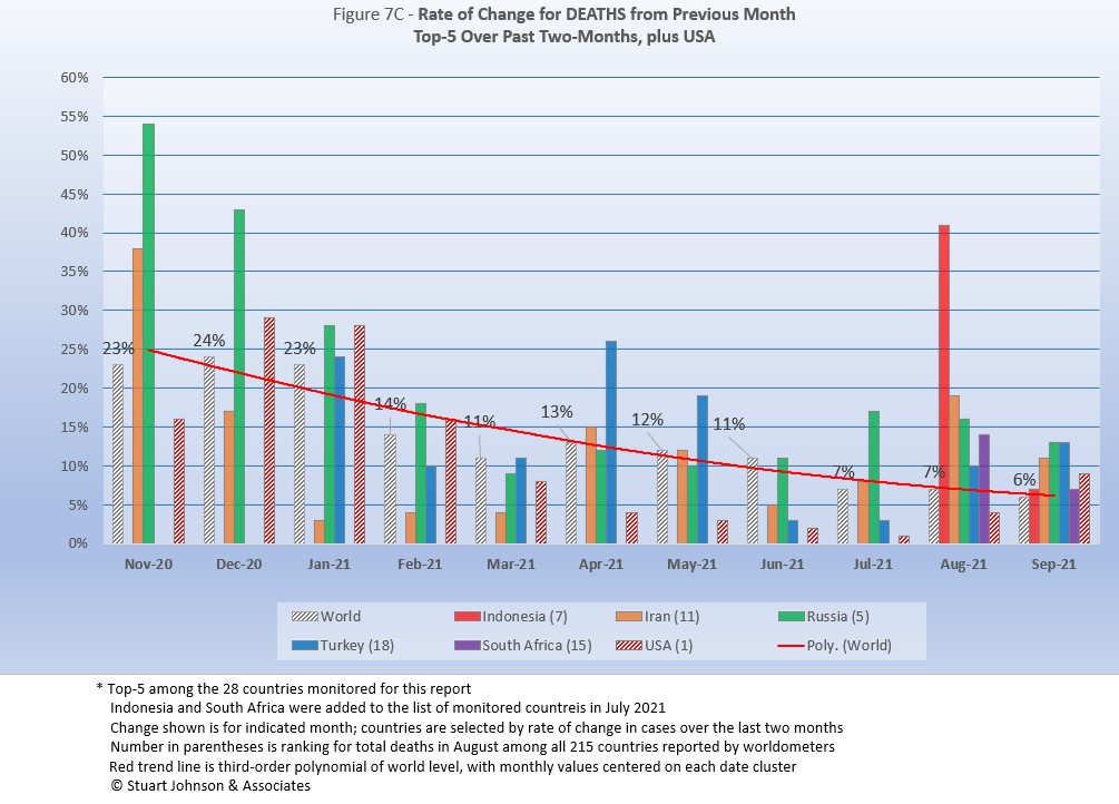
As with the comparable chart for Rate of Change for Cases (Figure 6C), countries for Rate of Change for Deaths (Figure 7C) are selected based on the change over two-months (end of July to end of September for this report) in reported COVID deaths. The focus of the selection is on recent changes, but the chart goes back to November to keep the surges of late 2020 in perspective.
The mix has changed noticeably this month. Dropping from the list since last month are Ecuador, Argentina and Colombia, replaced by Indonesia, Turkey and South Africa. This emphasizes the improving situation in much of South America. USA appears every month for comparison.
The trend
in the rate of change in deaths (red line in Figure 7C) shows the delayed connection with cases and appears smoother than the month-to-month changes in the Global level. Monthly Global changes for deaths trended down through March, bumped up in April and has generally moved down from there, ending September at 6%, the lowest point. (As mentioned with Rate of Change for Cases, the trend line is a polynomial that can change shape as new values are added at the most-recent end.)
An important comparison is individual countries each month against the global (World) level. As shown in Figure 7C, the Global level peaked at 24% in December, with Russia at or above the Global level from November through February. As the Global level drops, the variation between the top countries tends to even out. August proved to be a clear exception, with all five countries above the Global level, dramatically showing the impact of the delta variant. In September the variance was much less, but all of the top-5 were still at or above the Global level.
USA was higher than the Global level in December, January and February, then has been significantly lower since then, falling to a 1% change in July (over the number of deaths in June), but that bumped up in August to 4% over July, still well below the Global level of 7%. In September, however, USA showed a 9% increase in deaths over August, reversing the steady decline from December 2020 to August 2021. The decline follows the introduction of vaccination, the surge in the last two months follows the impact of the delta variant and the persistence of vaccination resistance.
Mortality Rate
Mortality Rates (percentage of deaths against reported cases) have generally been slowly declining. This is not surprising as several factors came into play:
- In the early days of the pandemic, there was a high proportion of "outbreak" cases (nursing homes, retirement communities, other settings with a concentration of more vulnerable people). As the pandemic continued the ratio of "community spread" (with lower death rates) to "outbreaks" increased and the overall Mortality Rate went down.
- As knowledge about treatment increased, mortality went down.
- Since the death count is more certain (though not without inaccuracies), the side of the equation that could change the most was cases. As testing revealed more cases, the Morality Rate would naturally go down because it would only affect cases and not deaths. In addition, the official numbers do not take into account a potentially higher number of people with the virus who are asymptomatic, so the real mortality rate could be even lower.
- Vaccinations started in January (though that should impact both cases and deaths).
In recent months, the delta variant produced surges in cases, particularly among those who are unvaccinated, though the death rate stayed lower than early on, which results in a lower mortality rate (remember, however, that deaths from the delta variant may become more evident in coming months).
The Global mortality rate has dropped from 2.6% in October to 2.1% by April, where it has stayed except for a bump back to 2.2% in June, before dropping again, to 2.0% in September. The median for the countries monitored for this report has dropped from 4.5% in October to 2.7% in March, where it stayed until moving up to 2.8% in September.
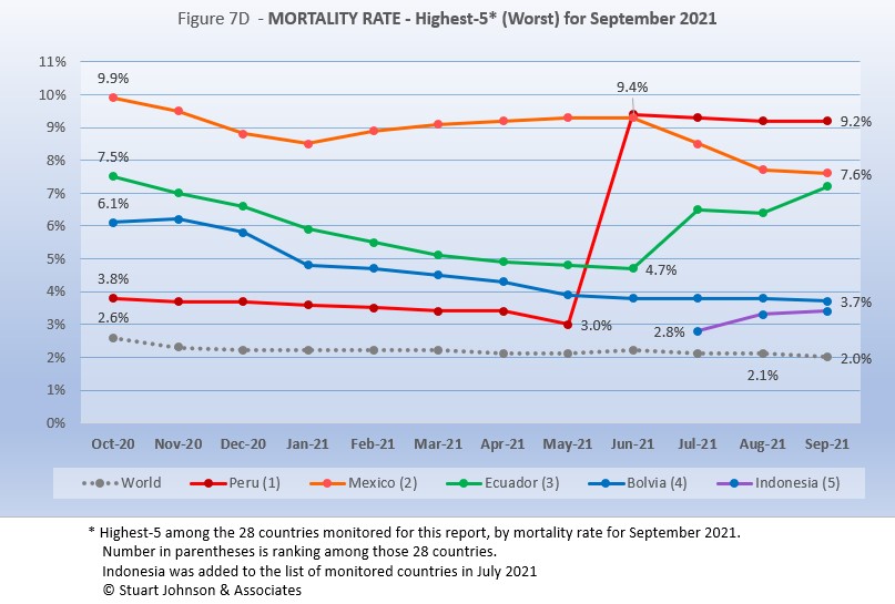
All five of the top-5 in mortality rate (among the 28 countries monitored) return in September, in the same order. Despite a generally improving picture for South America, three of the five with the worst mortality rates are located there and Mexico is not far away.
Peru was in fourth place and declining until June when its corrected death numbers drove Mortality to 9.4%, just ahead of Mexico at 9.3%. Since then Peru has shown a very slight decline, while Mexico has fallen significantly (though September noticeably slowed). Ecuador was on a steady path of dropping mortality rate through June, then has gone up more than Mexico went down, with the two looking like they will cross paths in the next report.
Bolivia is the one South American country among the five with the worst mortality to show a steady decline, though the pace of the decline has slowed since May. Indonesia was added to the list of monitored countries in July, coming in at #5. All five have been significantly above the Global rate since at least October 2020 when this chart begins.
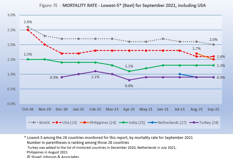
Since these represent the best mortality rates, where low is good, the "rank" order is actually in reverse. Philippines replaced France, while USA now shows the highest mortality rate of the five best, but they are all below the Global level, which was down to 2.0% at the end September.
In spite of the delta variant, mortality rates continue to drop, though it could take several months to begin to see the real impact of delta because of the lag between cases and deaths. Turkey and Netherlands were both at 0.9% mortality for September. India has been at 1.3% since June. Philippines, new to the list of monitored countries last month, dropped from above USA to slightly below it at 1.5%. USA held steady at 1.8% for six months before dropping to 1.6% in August and September.
How real is the threat of death from COVID? That's where successful mitigation comes in. Worldwide, by the end of September, 1 in 33 people have been reported as having contracted COVID and 1 in 1,633 people have died. In USA, while the mortality rate is low, because the number of cases is so high, 1 in 467 have died through September 2021—the same figure for Mexico, with a third of the population and a mortality rate of 7.6% in September. Of the 28 countries monitored, India has the lowest impact from death, with 1 death for every 3,080 people. Peru is the worst, at 1 in 165.
With low mortality, USA should have been able to keep deaths much lower, but the extraordinarily high number of cases means more deaths. Without a better-than-global mortality rate, the USA death rate would be far higher. Compared to the mortality rate during the 1918 pandemic, it could be ten times worse than it is. Even at the Global mortality rate of 2.0%, USA would have had 884-thousand deaths (for 44.2-million cases) by the end of September, instead of 714-thousand. The response of the health care system and availability of vaccines are part of keeping mortality down, but it's far too early to detail the cause for that positive piece of the COVID picture for USA.
Tests
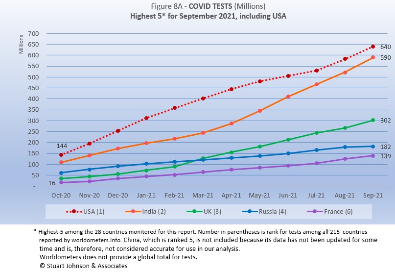
The same five countries remain on top in COVID testings, having been in the same order since March 2021.
USA remains ahead of other countries in reported COVID tests administered, at 640-million, 8% ahead of India, but that has narrowed from a 56% gap in April. UK continues at the pace it set in February (causing it to move into third place back in March). Russia and France remain on paths of slower growth in raw numbers.
Since these are raw numbers, it is important to recognize the size of the country. It is also the case that COVID tests can be administered multiple times to the same person, so it cannot be assumed that USA has tested almost all of its population of some 330-million. Some schools and organizations with in-person gatherings are testing as frequently as once a week or more for those who are not yet fully vaccinated. That's a lot of testing!
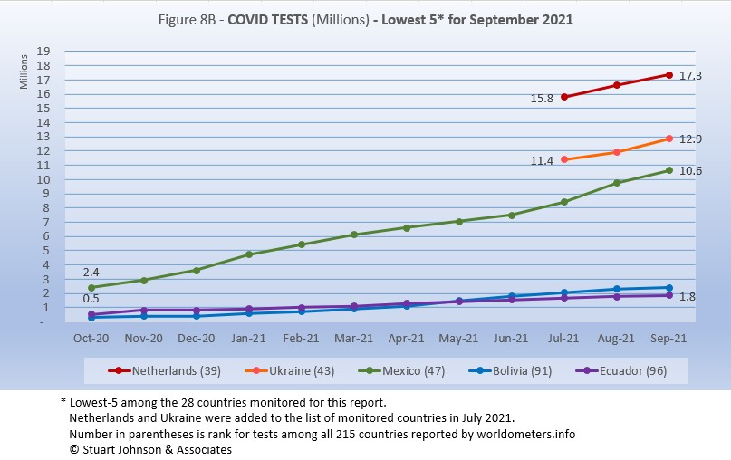
Netherlands replaces South Africa. The others return in the same order as August.
Netherlands, Ukraine and Mexico all show upward movement in tests while Bolivia and Ecuador remain at the bottom.
As questions arise about equity of testing between countries, check the number of tests for countries of similar size (within the 28 monitored countries):
- Mexico: 10.6M tests for 129.3M population, compared to Philippines: 21.1M tests for 109.6M population (2X the tests)
- Ukraine: 12.8M tests for 43.7M population, compared to Argentina: 24.3M tests for 45.2M population (1.9X)
- Peru: 17.9M tests for 32.9M population, compared to Malaysia: 30.1M tests for 32.4M population (1.6X)
- Ecuador: 1.8M tests for 17.6M population, compared to Netherlands: 17.3M tests for 17.1M population (9.6X)
- Bolivia: 2.4M tests for 11.7M population, compared to Belgium: 20.0M tests for 11.6M population (8.3X)
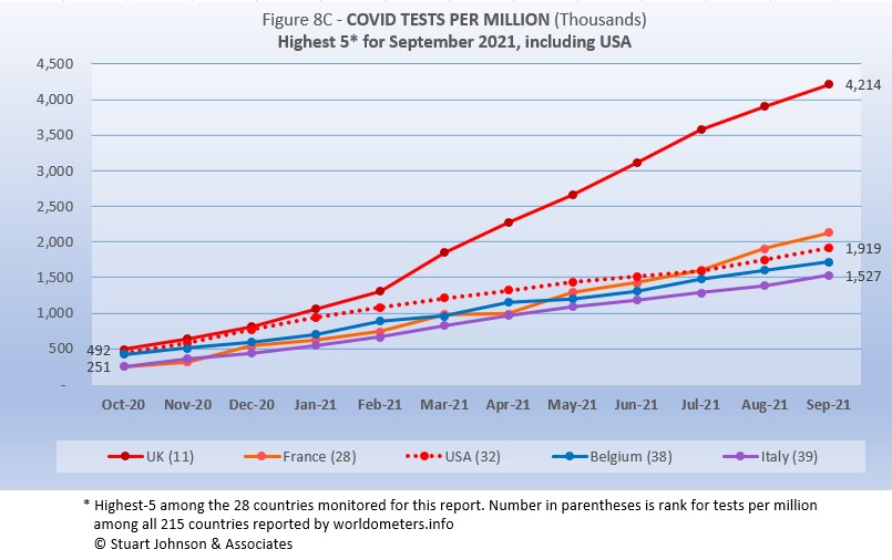
Tests per million adds another perspective. Fig. 8C shows the five countries with the highest tests per million. All five return from August, in the same order (though they appear tied, France was slightly ahead of USA in July).
UK, already the most aggressive in testing, increased its numerical lead each month since February, with a reported 4.2-million tests-per-million population in September, more than 4 tests per person. France increased its lead over USA, ending at 2.1-million tests-per-million, more than two tests per person. USA continues on a straight line trajectory, with a very slight dip in June and July, followed by a slight increase in August and September, reaching 1.9-million tests-per-million. Belgium and Italy are not far behind, tracking closely with France and USA. Italy is up to 1.5-million tests-per-million, 1.5 tests per person.
Anything over 1,000 (or "x-million tests-per-million") represents more tests than people (1,000 on the chart actually means 1,000,000), but as mentioned above, that does not mean that everyone had been tested. Some people have been tested more than once, and some are being tested regularly or with increased frequency.
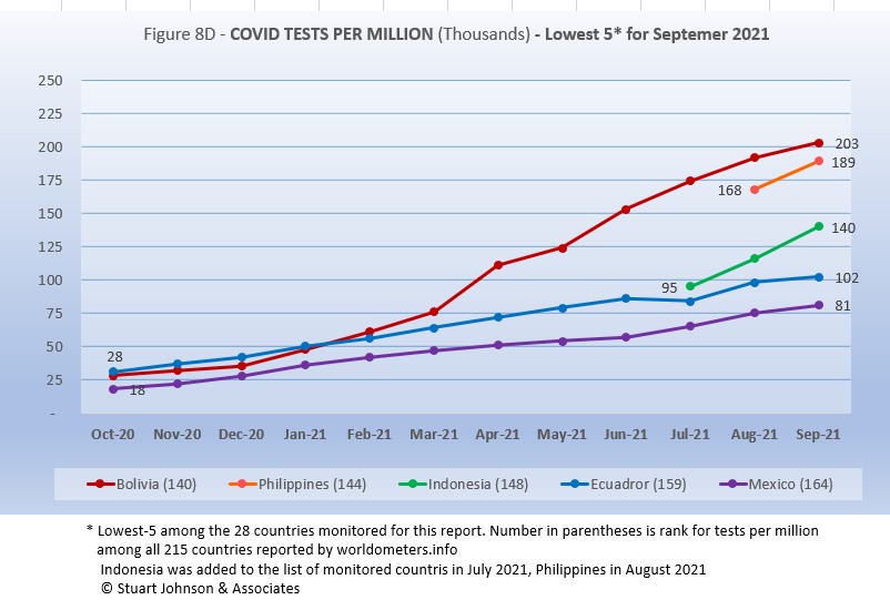
Philippines replaces Brazil. Indonesia was added in July when it joined the list of monitored countries. The other three return from August, in the same order they have been in since February.
While still in the bottom five of the 28 countries monitored for this report, Bolivia has made the most substantial progress (Brazil's progress was enough to move it off this chart this month). Bolivia has been steadily moving up, hitting 203-thousand tests-per-million. .Philippines is not far behind at 108-thouand tests-per-million. Indonesia is increasing at a faster rate than seen in Bolivia and Philippines for September. Ecuador leveled off some in September and Mexico still remains below the number of tests needed to cover even one tenth of its population.
While improvement is evident in all five, the equivalent proportion of tests to population remains very low, from roughly 8% to 20% (and that would be reduced in some individuals receive more than one test). This illustrates the arguments over inequity in resources among countries.
Vaccinations
This month I've added two charts comparing vaccination rates for USA against the other 27 monitored countries.
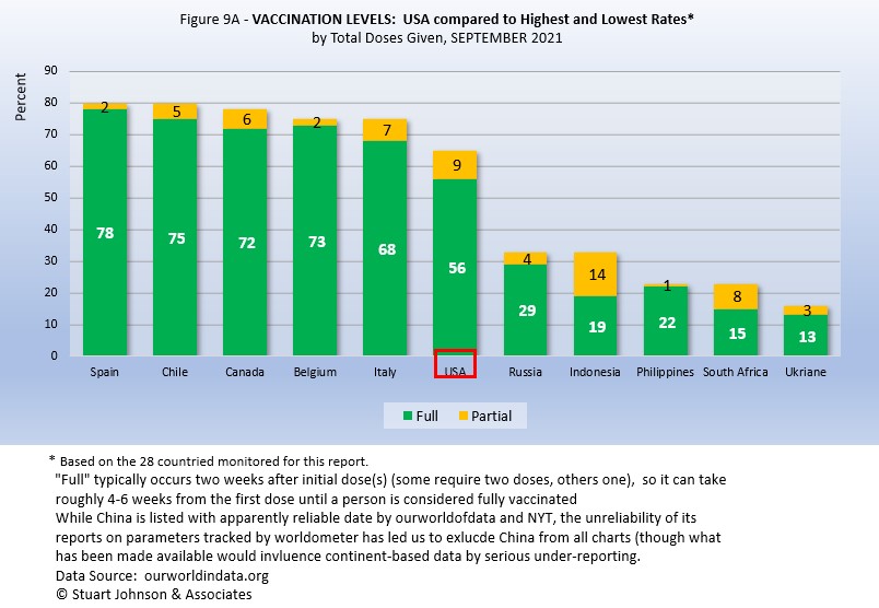
Figure 9A compares USA with the top-5 and bottom-5 by total doses administered. As you can see USA leans toward the upper countries, but is clearly behind Spain, with the highest proportion of fully vaccinated, at 78%. Including partial vaccination, USA comes up to 65%, but that does not even reach the proportion of fully vaccinated in Italy. On the other hand, USA is well ahead of the bottom five of the 28 monitored countries for either total doses or fully vaccinated.
As pointed out in other parts of this analysis, Figure 9A does not tell the whole story. It's a bit of an apples and oranges comparison, with one major factor being the population of each country.
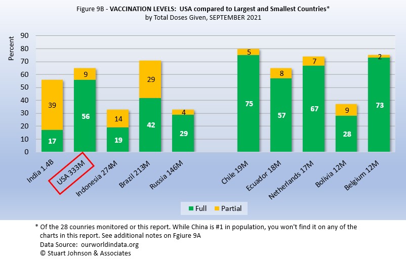
Taking population into account paints a different picture for USA compared to other monitored countries. In Figure 9B you see the five most populous countries on the left and the five smallest on the right. (China is not included because of unreliability of its data).
Here, USA is far ahead of the four other largest countries in fully vaccinated, but Brazil is ahead when including those partially vaccinated (first of two doses, or in the waiting period following the final shot). On the side of smallest countries, all except Bolivia are ahead of USA in fully vaccinated, Three of the five are ahead of Brazil in total doses.
As a point of interest, the smallest countries are roughly comparable in size to the state of Illinois, where I live, (about 14-million), state-wide vaccination would be similar to Netherlands. Thus, individual regions, provinces or states of the largest countries may be doing as well as some smaller countries, while the entire country lags behind the smaller ones.
Causes of Death in U.S.
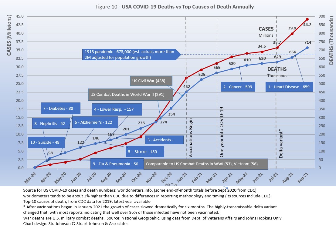
Early in the reporting on COVID, as the death rate climbed in the U.S., a great deal of attention was given to benchmarks, most notably as it approached 58,000, matching the number of American military deaths in the Vietnam War. At that time, I wrote the first article in this series, "About Those Numbers," in which I looked at ways of viewing the data, which at the time of that writing in May 2020 was still focused on worst-case models and familiar benchmarks, like Vietnam.
Figure 10 shows the number of USA COVID cases and deaths against the top-10 causes of death as reported by CDC. This month, that data has been updated to show 2019 figures, the latest year available. Except for Flu & Pneumonia and Nephritis, which swapped the #8 and 9 positions, the others stayed in the same order and changed by small increments, if at all, but did mean that some of the benchmarks in the chart moved slightly.
Notice that for nearly nine months, the curve for deaths was increasing at a faster rate than cases. Then, starting in October 2020 the curve for cases took a decided turn upward, while deaths increased at a more moderate pace (the two curves use different scales, but reflects the relative rate of growth between them).
Media reporting tended to focus on easily grasped benchmarks—deaths in Vietnam or World War II, or major
milestones like 500,000 (crossed in February 2021).
In August we passed the 2018 level for heart disease (655-thousand), the passed it again in September when the 2019 data "moved the goalpost" to 259-thousand. Another significant benchmark, pointed out in some news reports, was 675-thousand estimate for deaths in USA during the 1918 pandemic. Adjusted for inflation, however, that number would now be around 2-mllion.
The latest "Ensemble Forecast" from CDC suggests that by our next report we should see:
...the number of newly reported COVID-19 deaths will likely decrease over the next 4 weeks, with 5,100 to 15,100 new deaths likely reported in the week ending October 30, 2021. The national ensemble predicts that a total of 734,000 to 756,000 COVID-19 deaths will be reported by this date...
Note: As I've referenced in the notes for several charts, the data from worldometers.info tends to be ahead of CDC and Johns Hopkins by about 3%, because of reporting methodology and timing. I use it as a primary source because its main table is very easy to sort and provides the relevant data for these reports. Such differences are also found in the vaccine data from ourworldindata. Over time, however, trends track with reasonable consistency between sources.
Perspective
The 1918-19 Spanish Flu pandemic is estimated to have struck 500 million people, 26.3% of the world population of 1.9-billion at that time. By contrast, we're now at 3.0% of the global population. Deaths a century ago have been widely estimated at between 50- and 100-million worldwide, putting the global mortality rate somewhere between 10 and 20-percent. It has been estimated that 675,000 died in the U.S.
IF COVID-19 hit at the same rate as 1918, we would see about 2-billion cases worldwide by the time COVID-19 is over, with the global population now at 7.8-billion—four times what it was in 1918. There would be 200- to 400-million deaths. The U.S. is estimated to have had 27-million cases (one-quarter of the population of 108-million) and 675,000 deaths. Today, with a population of 330-million (a three-fold increase from 1918) this would mean more than 80-million cases, and 2- to 4-million deaths.
However, at the present rate of confirmed cases and mortality while the total number of global cases could approach 500 million or more—comparable to 1918 in number, that would be one-quarter of 1918 when taking population growth into account . .. and assuming the pandemic persists as long as the Spanish Flu, which went on in three waves over a two year period. At the present rate of increase (close to 13-million cases per month) it would take another 20 months to reach 500-million, roughly June of 2023.
If the total number of cases globally did approach 500-million, using the global mortality rate of 2.0% in September, there would be roughly 10-million deaths worldwide, tragic but far below the number reported for 1918 (50-million) with an even wider gap (200 million) when taking population growth into account.
Earlier in the summer, I indicated that with vaccination in progress and expected to be completed in the U.S. by the end of summer, the end of COVID-19 could come sooner. Like 1918, however, there are now complicating factors, such as the combination of the delta variant with a high number of unvaccianted (some by choice, as in USA and Europe, and many more in underdeveloped countries by inequitable access to vaccine). While we may have thought the end of the pandemic was in sight, it is still too early to make predictions on the duration and severity of the COVID-19 pandemic globally. Indeed, the slope of the global growth of cases and deaths still looks like the trajectory of an airplane climbing toward cruising altitude.
Despite the darkening forecast in the past three months, the vast difference in scale between the Spanish Flu pandemic a century ago and COVID-19 even more than a year-and-a-half in, cannot be denied.. Key differences are the mitigation efforts, treatments available today (though still leaving the health care system overwhelmed in some areas during surges), and the availability of vaccines. In addition, in 1918 much of the world was focused on a brutal war among nations (World War I) rather than waging a war against the pandemic, which ran its course and was undoubtedly made much worse by the war, with trans-national troop movements, the close quarters of trench warfare, and large public gatherings supporting or protesting the war.
Vaccinations in the U.S.
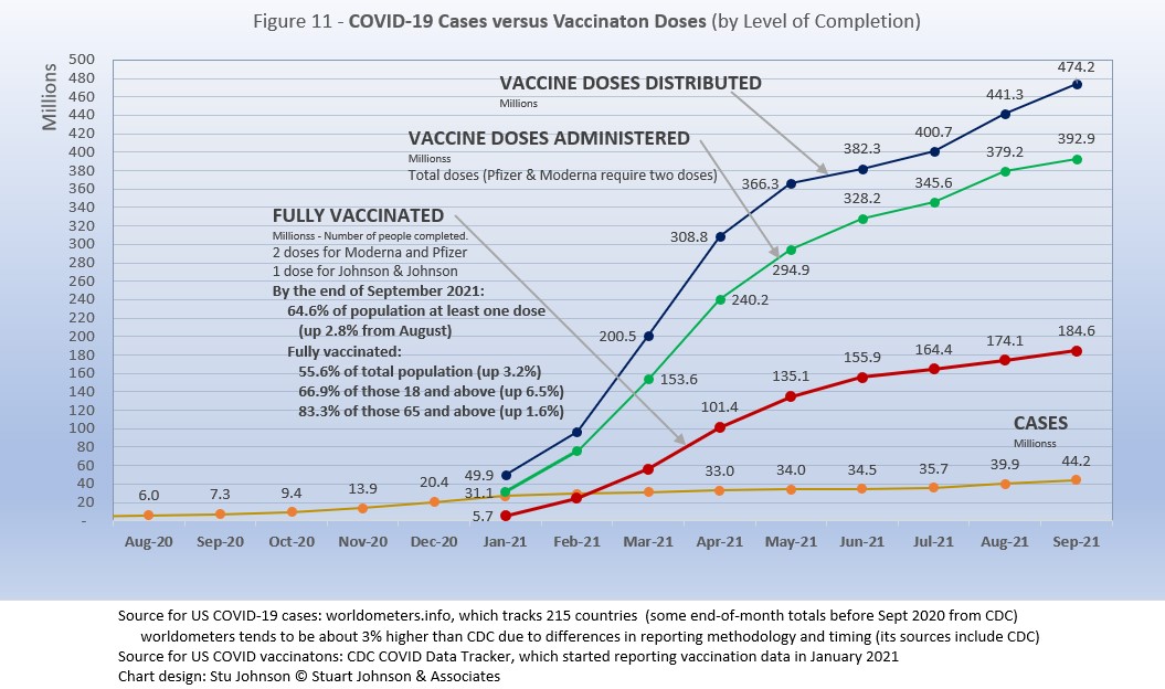
With remarkable speed (it usually takes years to develop vaccines), two COVID vaccines were granted emergency approval for use in the U.S. starting in January 2021—the one by Pfizer requires super-cold storage, which limits its deployment. The other, by Moderna, requires cold storage similar to other vaccines. Both of these require two doses, which means that vaccine dosages available must be divided in two to determine the number of people covered. By March 2021 Johnson & Johnson had been granted approval for a single-dose vaccine. The numbers in Figure 11 represent the status of all three vaccines as of September 30 (as reported by CDC, which will be slightly difference than ourworldofdata data used in earlier vaccination charts). .
A person is considered "fully vaccinated" two weeks after the final (or only) vaccine dose; roughly five to six weeks total for Pfizer and Moderna and two weeks for Johnson & Johnson.
Early on (still somewhat evident in March 2021) there was much anxiety about vaccine availability and scheduling appointments. That is behind us and vaccinations are readily available to most of the population (there will always be some disparities and trouble spots, but in general most people who want the vaccine can get it). Now, the biggest concern is convincing the dubious, the deniers, and the resisters to get vaccinated and help the country reach herd immunity (about 70% of the population fully vaccinated). Earlier in the summer, as vaccination rates started to stall, some areas began providing incentive, from free beer to lotteries for the fully vaccinated, and celebrity testimonials urging vaccination. The seriousness of the delta variant has scared others into taking action, yet the number of unvaccinated remains troubling, so we now face the use of or threats of using mandates in both the public and private sectors. Some (United Airlines) have been met with strong compliance, others (school systems, health care, cities and states) have been met with limited success and even more strident resistance, including law suits.
Figure 11 shows an upturn in Doses Distributed and Administered in August, a sign that perhaps the delta variant has provided the impetus for increased vaccinations. The rate of increased distribution continued into September. However, instead of rising, doses administered slowed slightly and fully vaccinated stayed on the steady, slow rise of the past three months.
The CDC (Centers for Disease Control and Prevention) revised its mask guidelines as the delta variant intensified. Some resistors claim this proves the science cannot be trusted—but that position misunderstands the nature and role of science, which is to observe and constantly assess assumptions and recommendations based on a growing (and developing) body of data.
Some school districts that were prepared to make masking optional announced that the school year would begin with masks in place, regardless of vaccination status. The district in which we live had strong arguments on both sides (option versus mandate) through the summer, but just before the start of school, Illinois Governor Priztker announced a mask mandate for all private and public schools pre-school through grade 12. Now, with school in session for two months or more, we have seen in Illinois dozens of outbreaks, most requiring some isolation or reduction in activity, while during the writing of this report at least one suburban Chicago school has returned to full remote learning for two weeks to steam further spread of COVID.
Debates over masking policy provides evidence that the real battle now is vaccination. A year ago we were debating lock-downs. Today the debate is how to be open but remain safe. Will the rise of infections and the call for more masking be enough to spur more vaccinations? For some, perhaps, but whether low levels of vaccinations have prolonged the pandemic (around the world) will be the subject of discussion and debate for years to come.
Vaccinating over 300 million people in the United States (much less a majority of the billions around the world) is a daunting task. It is a huge logistical challenge, from manufacture to distribution to administration. Yet, it remains amazing that any of this is possible this soon after the identification of the virus just over a year and a half ago.
There is a delicate balance between maintaining hope with the reality that this is a huge and complicated logistical operation that will take time, with the prospect that COVID will be with us for some time, partly because getting shots into the arms of the unvaccinated is proving to be a far bigger challenge that most officials assumed a few months ago.
As the richer countries with access to more resources make progress, the global situation is raising issues of equity and fairness within and between countries. Even as the U.S. and other countries launch large scale vaccine distribution to a needy world community, the immensity of the need is so great that a common refrain heard now is whether this aid is too little, too late. As COVID fades into a bad memory in countries able to provide help, will the sense of urgency remain high enough to produce the results needed to end this global pandemic?
Maintaining Perspective
The following section has appeared several months and I repeat it here because there is an even greater need now to evaluate what is happening: to understand the science and its dynamic nature, to put politics in perspective and to show empathy, to truly demonstrate that we are in this together and want to get out of it as soon as possible.
In the tendency to turn everything into a binary right-wrong or agree-disagree with science or government, we ignore the need to recognize the nature of science and the fact that we are dealing with very complicated issues. So, in addition to recommending excellent sources like the Centers for Disease Control and Prevention (CDC), it is also wise to consider multiple qualified sources.
While there has been much focus placed in trusting "the science," it is important to recognize that science itself changes over time based on research and available data. In the highly volatile political atmosphere we find ourselves in (not just in the U.S., but around the world), there is a danger of not allowing the experts to change their views as their own understanding expands, or of trying to silence voices of experts whose views are out of sync with "the science" as reported by the majority of media outlets.
In an earlier report, I mentioned the Greater Barrington Declaration, currently signed by nearly 58-thousand medical & public health scientists and medical practitioners, which states "As infectious disease epidemiologists and public health scientists we have grave concerns about the damaging physical and mental health impacts of the prevailing COVID-19 policies, and recommend an approach we call Focused Protection."
For a personal perspective from a scholar and practitioner who espouses an approach similar to the Focused Protection of the Greater Harrington Declaration, see comments by Scott W. Atlas, Robert Wesson Senior Fellow at the Hoover Institution at Stanford University, in an article "Science, Politics, and COVID: Will Truth Prevail?"
Several months ago on SeniorLifestyle I posted an article by Mallory Pickett of The New Yorker, "Sweden's Pandemic Experiment," which provides a fair evaluation of the very loose protocols adopted by Sweden, essentially a variation of the "Focused Protection" approach. The "jury is still out" on this one, so judge for yourself whether Sweden hit the mark any better than the area in which you live.
UPDATE ON SWEDEN: Very little change from July. At the end of September Sweden reported just over 1.1-million cases of COVID, or 11.1% of its population of 10.2-million (the same as August, which was up from July). There have been 14,864 deaths, for a mortality rate of 1.2%. Ranked 89 by population, Sweden was number 34 in cases and number 44 in deaths (down from 32 and 41 in August). That would put Sweden below USA and very close to Netherlands and Argentina at the top of my cases as a proportion of population, but the mortality rate would be below India, near the bottom (best) among the 28 counties monitored for this report and well below the global rate of 2.0%.
How we evaluate the many approaches used to deal with COVID will determine how we prepare for and approach the next global event.
What is clear in September 2021 compared to September 2020 is that while debates rage about masking and other policies, the response to surges in countries with vaccine readily available is much more like the "focused protection" approach discussed by the sources cited here than the full lockdowns of a year ago.
My purpose in mentioning these sources is to recognize that there are multiple, sometimes dissenting, voices that should be part of the conversation. The purpose of these monthly reports remains first and foremost to present the numbers about COVID-19 in a manner that helps you understand how the pandemic is progressing and how the U.S. compares to the world—and how to gain more perspective than might be gathered from the news alone.
Profile of Monitored Continents & Countries
(Data from worldometers.info).
| Rank | Country | Population | Share of World Population |
Density People per square km |
Urban Population |
Median Age |
| WORLD | 7.82B | 100% | -- | -- | -- | |
| Top 10 Countries by Population, plus Five Major Continents See lists of countries by continent |
||||||
| - | ASIA | 4.64B | 59.3% | 150 | 51 countries | 32 |
| 1 | China | 1.44B | 18.4% | 153 | 61% | 38 |
| 2 | India | 1.38B | 17.7% | 454 | 35% | 28 |
| - | AFRICA | 1.34BM | 17.1% | 45 | 59 countries | 20 |
| - | EUROPE | 747.7M | 9.6% | 34 | 44 countries | 43 |
| - | S AMERICA | 653.8M | 8.4% | 32 | 50 countries | 31 |
| - | N AMERICA | 368.9M | 4.7% | 29 | 5 countries | 39 |
| 3 | USA | 331.5M | 4.3% | 36 | 83% | 38 |
| 4 | Indonesia** | 274.5M | 3.5% | 151 | 56% | 30 |
| 5 | Pakistan* | 220.9M | 2.8% | 287 | 35% | 23 |
| 6 | Brazil | 212.9M | 2.7% | 25 | 88% | 33 |
| 7 | Nigeria* | 206.1M | 2.6% | 226 | 52% | 18 |
| 8 | Bangladesh* | 165.2M | 2.1% | 1,265 | 39% | 28 |
| 9 | Russia | 145.9M | 1.9% | 9 | 74% | 40 |
| 10 | Mexico | 129.3M | 1.7% | 66 | 84% | 29 |
| *these countries do not appear in the details because they have not yet reached a high enough threshold to be included **Indonesia was added to the monitored list in July 2021 Other Countries included in Analysis most have been in top 20 of cases or deaths |
||||||
| Rank | Country | Population | Share of World Population |
Density People per square km |
Urban Population |
Median Age |
| 13 | Philippines (2) | 109.6M | 1.4% | 368 | 47% | 26 |
| 17 | Turkey | 84.3M | 1.1% | 110 | 76% | 32 |
| 18 | Iran | 83.9M | 1.1% | 52 | 76% | 32 |
| 19 | Germany | 83.8M | 1.1% | 240 | 76% | 46 |
| 21 | United Kingdom | 67.9M | 0.9% | 281 | 83% | 40 |
| 22 | France | 65.3M | 0.8% | 119 | 82% | 42 |
| 23 | Italy | 60.4M | 0.8% | 206 | 69% | 47 |
| 25 | South Africa (1) | 59.3M | 0.8% | 94 | 67% | 28 |
| 29 | Colombia | 50.9M | 0.7% | 46 | 80% | 31 |
| 30 | Spain | 46.8M | 0.6% | 94 | 80% | 45 |
| 32 | Argentina | 45.2M | 0.6% | 17 | 93% | 32 |
| 35 | Ukraine (1) | 43.7M | 0.6% | 75 | 69% | 41 |
| 39 | Poland (1) | 37.8M | 0.5% | 124 | 60% | 42 |
| 39 | Canada | 37.7M | 0.5% | 4 | 81% | 41 |
| 43 | Peru | 32.9M | 0.4% | 26 | 79% | 31 |
| 45 | Malaysia (3) | 32.4M | 0.4% | 99 | 78% | 30 |
| 63 | Chile | 19.1M | 0.2% | 26 | 85% | 35 |
| 67 | Ecuador | 17.6M | 0.2% | 71 | 63% | 28 |
| 69 | Netherlands (1) | 17.1M | 0.2% | 508 | 92% | 43 |
| 80 | Bolivia | 11.7M | 0.1% | 11 | 69% | 26 |
| 81 | Belgium | 11.6M | 0.1% | 383 | 98% | 42 |
(1) Added to the monitored list in July 2021 |
||||||
Scope of This Report
What I track
From the worldometers.info website I track the following Categories:
- Total Cases • Cases per Million
- Total Deaths • Deaths per Million
- Total Tests • Tests per Million (not reported at a Continental level)
- From Cases and Deaths, I calculate the Mortality Rate
Instead of reporting Cases per Million directly, I try to put raw numbers in the perspective of several key measures. These are a different way of expressing "per Million" statistics, but it seems easier to grasp.
- Country population as a proportion of global population
- Country cases and deaths as a proportion of global cases and deaths
- Country cases as a proportion of its own population
- Cases and deaths expressed as "1 in X" number of people
Who I monitor
My analysis covers countries that have appeared in the top-10 of the worldometers categories since September 2020. This includes most of the world's largest countries as well as some that are much smaller (see the chart in the previous section).
This article was originally posted on my InfoMatters blog.
Search all articles by Stu Johnson
Stu Johnson is principal of Stuart Johnson & Associates, a communications consultancy in Wheaton, Illinois. He is publisher and editor of SeniorLifestyle, writes the InfoMatters blog on his own website and contributes articles for SeniorLifestyle. • Author bio (website*) • E-mail the author (moc.setaicossajs@uts*) • Author's website (personal or primary**)* For web-based email, you may need to copy and paste the address yourself.
** opens in a new tab or window. Close it to return here.
Posted: October 9, 2021 Accessed 624 times
![]() Go to the list of most recent Health & Wellness Articles
Go to the list of most recent Health & Wellness Articles
![]() Search Health & Wellness (You can expand the search to the entire site)
Search Health & Wellness (You can expand the search to the entire site)
![]() Go to the list of Most Recent and Most Popular Articles across the site (Home Page)
Go to the list of Most Recent and Most Popular Articles across the site (Home Page)