


See listing of Recent and Most Popular articles on the Home Page
 Loading requested view...
Health & Wellness
Category: News & Current Events / Topics: COVID-19 • Crisis • Dying and Death • Disease • History • News • Statistics • Trends
COVID-19 Retrospective
by Stu Johnson
Posted: May 12, 2023
Now that COVID's status as a global pandemic has ended, I will take a retrospective look at how USA compared to other countries in this three-year-plus ordeal…

Putting the COVID-19 pandemic numbers in perspective (Number 31 - Final report)
See a list of all of my articles related to COVID-19
There was no report in March.
The image used with this report illustrates the feeling of relief spreading around the world as the World Heath Organization announced the official end of the status of COVID-19 as a global pandemic. However, don't be too quick to throw away your masks. There are still regional hot spots. A friend from the Philippines reported that masks are back where he is.
This is the 31st and final report in a series driven by my concern that the numbers from the COVID-19 global pandemic needed to be put in perspective, including a comparison of USA with other countries around the world. For most of the past year it appeared that COVID was morphing from pandemic to endemic as major indicators slowed and plateaued, and I approached each report wondering if it should be my last. Even the sources of data I used began switching from "live" updates to daily or even weekly updates.
On May 5, the World Health Organization suspended the emergency status declared for COVID-19 on January 30, 2020. (It was declared a global pandemic in March 2020.) Despite the announcement ending the emergency status, COVID is not completely behind us. In most countries it has transformed from pandemic to endemic, with the likelihood of seasonal vaccinations and concerns for those suffering from "long COVID." Even so, it is time to end these reports and make this a retrospective look at where we are after three years of dealing with COVID while it bedeviled us as a pandemic.
Report Sections:
• April-at-a-glance
• The Continental View • USA Compared with Other Countries
• U.S. COVID Cases versus Vaccinations
• COVID Deaths Compared to the Leading Causes of Death in the U.S.
• Profile of Monitored Continents & Countries • Scope of This Report
April-at-a-glance
Reminder: you can click on any of the charts to enlarge it. It will open in another tab or window. Close it to return here.
GLOBAL SNAPSHOT
COVID swept most of the globe with devastating impact not only on individual health and the healthcare system, but beyond that to vast economic and social upheaval whose consequences will be analyzed for years to come.
This is my 31st and final report on the COVID-19 pandemic, which extended more than three years. It is not dead, but will remain with us as an endemic, like the seasonal flu. While hospitalizations and deaths have slowed dramatically, COVID will continue to be among the leading causes of death and the lingering effects of long COVID will remain troublesome for some time.
EXECUTIVE SUMMARY
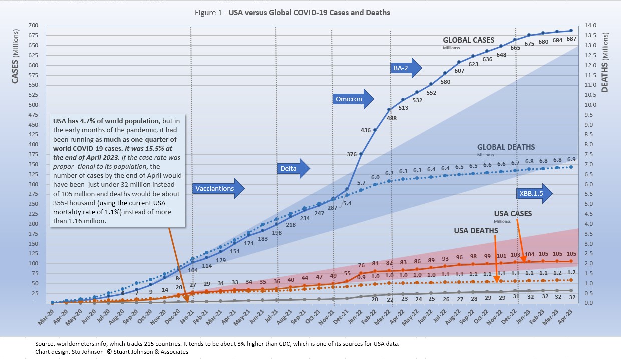
- Globally CASES reached nearly 687 million by the end of April 2023, an increase of less than 1% over March, after being at 2 to 3% per month from September 2022 to January 2023. The most recent high of 31% over the previous month was in January 2022 in response to the omicron variant. The percentage of global population with reported cases of COVID-19 rose from 4.8% in January 2022 to 8.6% in April 2023. (The 1918 pandemic is generally thought to have infected 25% of the global population). As we will see, however, some countries are far higher than that.
The blue "cone" in Figure 1 above shows a high and low projection of Global cases based on the pace of spread in the first year of COVID-19. The bottom (roughly 342 million in April 2023) represents the trajectory of the lower pace in late summer 2020, the upper (approximately 650 million) represents a continuation of the first major surge from November 2020 through January 2021, just before vaccinations became available.
While each major variant was announced with dire warnings, only omicron in November 2021 produced a truly significant impact, clearly seen as the curve for cases shot upward through the projection cone in January 2022 before beginning to slow after a three-month long surge. Initially, Europe was hit the hardest, but as you'll see in the charts below it had an impact around the world. Toward the end of 2022 cases began to surge in Asia and a number of Asian countries were added to my list of monitors countries (appearing in the top-20 of cases and/or deaths). Even as the rate of increase for deaths slowed noticeably in April 2022, cases continued to climb, not showing much of a slowdown until the past three months.
- DEATHS from COVID around the world slowed remarkably despite the rocket-like surge in cases caused by the omicron variant in the early months of 2022. Deaths increased 1% each for a year before falling to less than 1% in March and April of 2023, down from the most recent high of 5% in February 2022 and over 20% in monthly increases from late 2020 into 2021. (Remember, however, percentages will be higher when the base numbers are lower, but the stark difference over time remains clear). The leveling in the global curve for deaths is obvious, falling more than 5 million short of the pace through February 2022, after which the curve bent downward most noticeably. That still leaves a death toll from COVID-19 approaching 7 million worldwide in more than three years of the pandemic.
- BY CONTINENT. Worldwide, COVID cases were reported at 8.6% of global population by the end of April. Europe and North America have clearly outpaced the rest of the world, with sharp increases from the omicron variant from December 2021 through March 2022, both continuing to climb at a faster pace then the other continents, each now reporting one-third of their populations having been infected with COVID according to official reports.
- USA continued to lead the world in the number of reported cases and death. While it led the world in the number of COVID tests its vaccination rate was lackluster in comparison to other countries (which kept the death rate higher than it should have been).
- CASES. While the 106.6 million cases represents 31.8% of its own population the USA proportion of world cases dropped from 20.1% in January 2022 to 15.4% in December 2022 and January 2023 before creeping up to 15.5% in February, where it remained through the official end of the pandemic in April. At the same time, surges in Europe and Asia pushed cases in France to 61.0% and South Korea to 60.7% of their populations by April. Europe, with about 9% of world population, accounted for 36.2% of reported COVID cases in the world.
The red projection cone surrounding USA cases in Figure 1, based on the same timeline as the global cone described above, stretched from 70 to 180 million cases by April 2023, with the curve for cases staying well within those bounds, despite the significant but short-lived surge from omicron in January 2022.
Figure 1 also shows how much lower cases in USA would have been—approaching 32-million by April 2023, instead of 105 million—if they were proportional to the global population. It also would have meant about 355 thousand deaths instead of more than 1.1 million.
- USA DEATHS continued to represent a proportion of world COVID deaths far in excess of its 4.7% share of world population. (China and India represent roughly one-third of world population between them). USA deaths declined from 20.9% of the world total in September 2020 to 14.5% at the end of August 2021, before inching up again, reaching 16.9% in February 2023, where it remained through April.
- HOSPITALIZATIONS for COVID in USA were reported at 9,254 in April, down 37% from March, and down considerably from the high of 133 thousand in January 2022 when hospitalizations related to omicron peaked.
- THE OMICRON VARIANT emerged at the end of November 2021 and hit Europe hard, bringing back lockdowns and severe restrictions in several countries. In January 2022 the surge became turbo-charged and spread to North America and to a lesser but noticeable extent to South America and Asia. In April 2022, the increase in Asia continued, while North America had slowed considerably.
While deaths could follow well behind increases in cases, both delta and omicron, with its sub variants), had minimal impact on the pace of COVID deaths as mortality rates (deaths as a proportion of cases) continued to fall.
- TESTING. USA led in the number of tests, with nearly 1.2 billion tests reported by the end of April 2023, followed by India, UK, Russia and France. As home tests became available (and do not contribute to statistics) reported testing trends began to plateau, so I began using a shorter version of the Testing section in my reports.
- VACCINATIONS. 70% of the world's population was reported as receiving at least one dose of vaccine by the end of April 2023, the same as March, and essentially plateaued since mid-2022 s (See figures 5A, 5B, 5C, 9A, 9B and 11).
South America led the world in vaccinations, with 86% receiving at least one dose. Except for Africa, which continued to play catch-up (37%), the rest of the world reached its own saturation points over the last year of the pandemic.
- COUNTRIES TO WATCH. Of the top ten countries by population, Pakistan, Nigeria and Singapore had not reached the threshold (the top-20 in cumulative number cases or deaths) I have used for inclusion in my list of monitored countries by the official end of the pandemic.
The weekly comparison report on worldometers.info gives a sense of hot spots to watch—countries not among the 34 already monitored for this report. Based on weekly activity in the first week of May, this includes New Zealand, Greece, Hong Kong, Denmark, Croatia, and Ireland, all in the top 20 of new cases and/or deaths. Even with the global pandemic declared over, the statistics remind us that as it has morphed into an endemic, the threat of COVID has not suddenly disappeared, but fallen below global pandemic levels.
THE CONTINENTAL VIEW
The most obvious trend since mid-2022 was the rise in proportion of COVID cases in Asia and Europe while the pace of increase in deaths slowed significantly and the proportion of deaths among continents remained more stable.
While COVID-19 was classified as a global pandemic, it was never distributed evenly around the world.
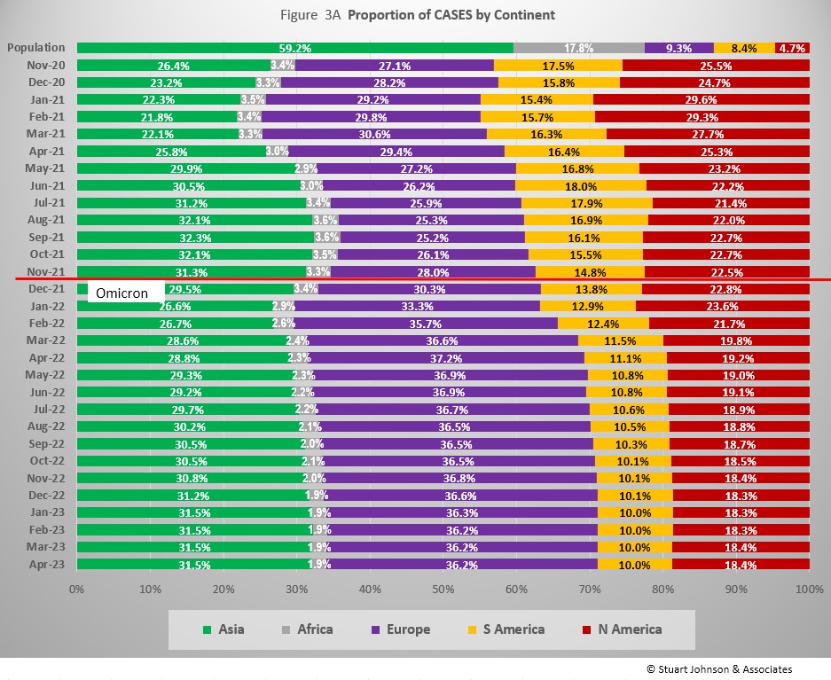
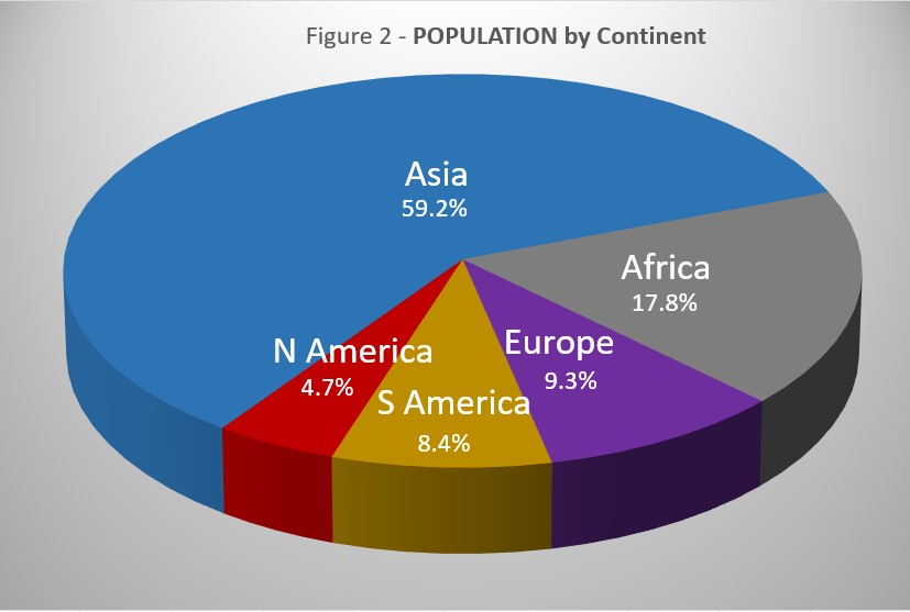
Reported COVID cases represented 8.6% of world population by the end of April 2023. (By the end of the 1918 pandemic, it is generally reported to be about 25%, fully one-quarter of the population). Where Asia and Africa combined represent about three-quarters (77.0%) of the world's 8.0 billion people, Europe, South America and North America accounted for 2 out of 3 COVID cases (65.9% - Figure 3A) and three-quarters of COVID deaths (73.6% - Figure 4A).
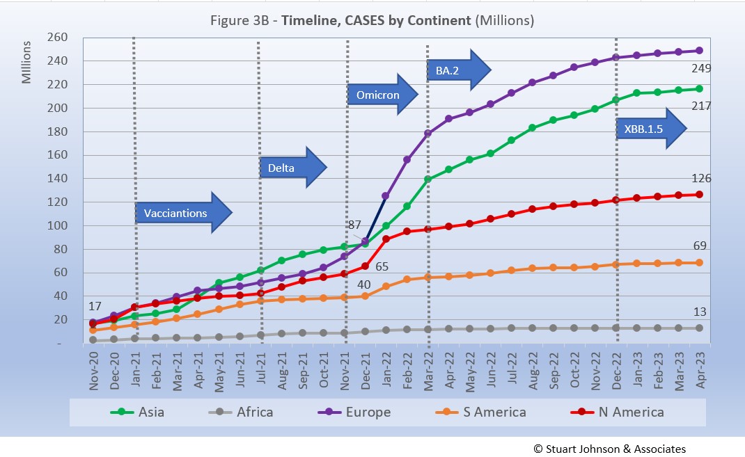
As in other charts, the omicron variant which emerged in November 2021 is a key reference point. Since then, Europe increased steadily to 37.2% of world cases by April 2022 before falling back to 36.2% by February 2023 as Asia continued a 15-month expansion. Meanwhile, South America continued to shrink by nearly 3% as Asia grew. North America, after a noticeable post-omicron surge in January 2022, shrank 5% by April 2023.
While Africa showed only the slightest deviation from its low and slow growth in Cases, the impact of omicron is very visible for the other continents, with the pace slowing for each following one to three months of rapid growth.
Europe showed the greatest impact in number of cases since omicron appeared in late November 2021. After being virtually tied with Asia in December 2021, Europe saw its COVID cases rise in number by 186%, while Asia increased by 149%. Both had slowed since March, but continued to climb at a pace faster than the other continents.
North America increased significantly in January 2022, then slowed below the pace of Europe and Asia. (Had the January rise continued, it would have caught up with Asia in number of cases by March or April 2022). South America saw the lowest post-omicron increase. The Americas were obviously hit by omicron, but to a lesser extent and shorter duration than Europe and Asia, making their curves bend down sooner and deeper.
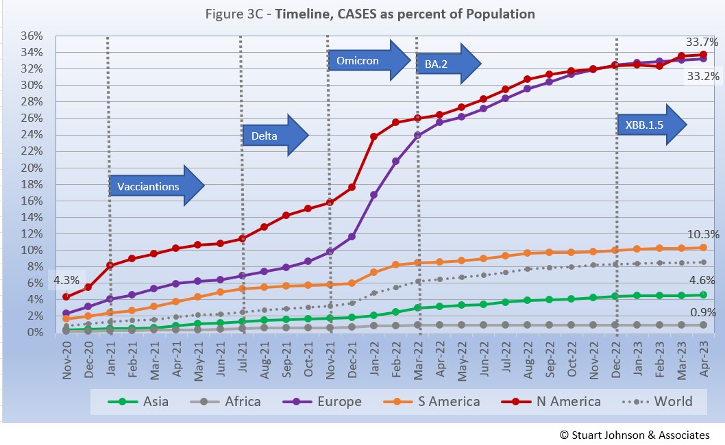
The raw numbers of Fig. 3B can be deceptive. Fig. 3C gives a more realistic picture of the impact by translating raw case numbers to percentage of population.
The impact of omicron is clearly evident, with the Global share of COVID cases increasing from 3.6% in December 2021 to 6.2% in March 2022, then growing at a slower pace to 8.6% by the end of April 2023. North America had led the continents in cases as a proportion of population, but Europe saw a far more significant increase from omicron, nearly matching North America by October 2022 and tracking each other very closely to the end of April 2023.
South America stayed above the Global level, but at a slightly slower rate of increase. Asia and Africa remained below the Global level in cases as a proportion of population throughout the pandemic. Figure 3C begs the question, why were Europe and North America hit so much harder by COVID-19—closer to 1918 levels—a question that will keep researches busy for years to come.
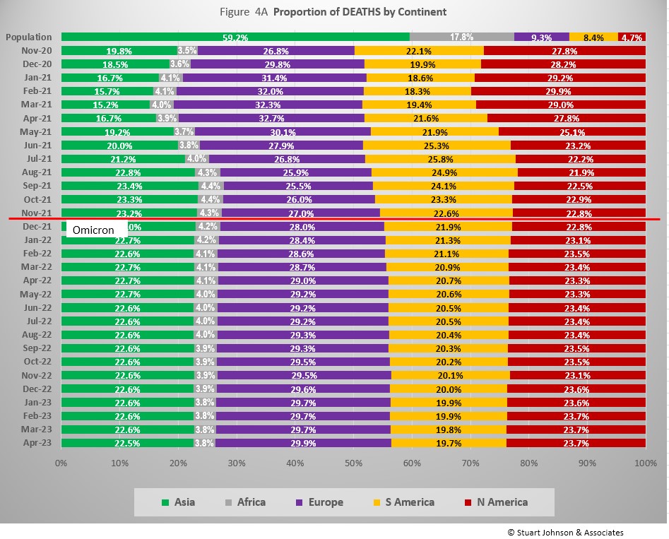
The proportion of deaths between continents shows less extreme change than that for cases. Again, as in the previous chart, it now makes sense to look at the emergence of omicron as the key reference point.
Since omicron, Europe increased in proportion of deaths by 2.9%, North America was up 0.9%, while Africa was down 0.5%, Asia down 1.3% and South America down 2.8%. With most of the change in the first few months following omicron, proportion of deaths by continent was far more stable than the changes in cases seen in Figure 3A above.
The most notable characteristic of deaths is the growing detachment from cases. Unlike the first year of the pandemic, when deaths went up dramatically with surges in cases, the death rate (compare it with cases in Figure 1) slowed significantly even as cases continued to climb. It is important to remember, also, that reports of deaths will be much closer to reality than cases, since it is likely that the number of cases detected by home testing. self-quarantining, and asymptomatic cases was far higher than officially reported case numbers.
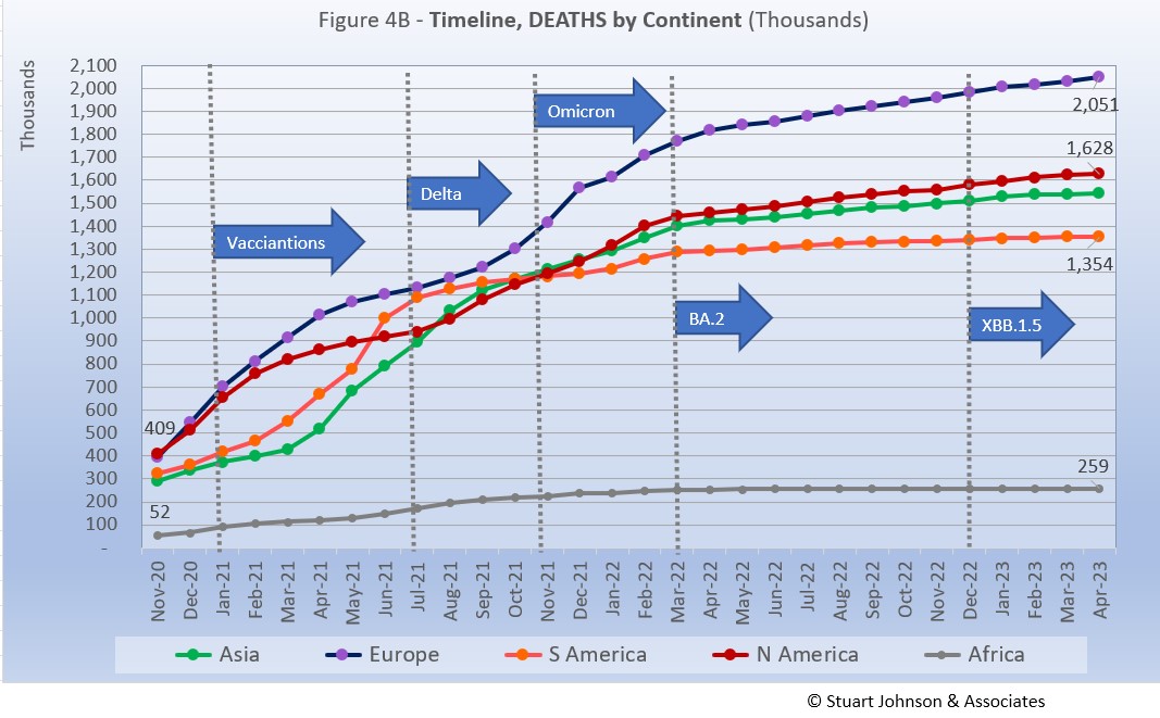
Deaths through April 2023 shows that while the trajectory lagged behind cases and progressed at a steadier rate, it did reflect the overall changes in Cases by continent. Having crossed the 1 million mark in mid-2021, Europe crossed the 2 million mark in deaths in January 2023. Except for Africa, each of the other continents crossed 1 million deaths during the pandemic.
While the omicron surge in Europe went "through the roof," what is interesting here is that while the death rate immediately went up as omicron hit, it then turned back down and steadily slowed into 2022. The relative steadiness in the path of each curve shows that the death rate remained much more constant over time than cases, which tended to surge in varying degrees with each new variant. And, as we'll see later, mortality rates (deaths as a proportion of cases) continued to fall.
Vaccinations
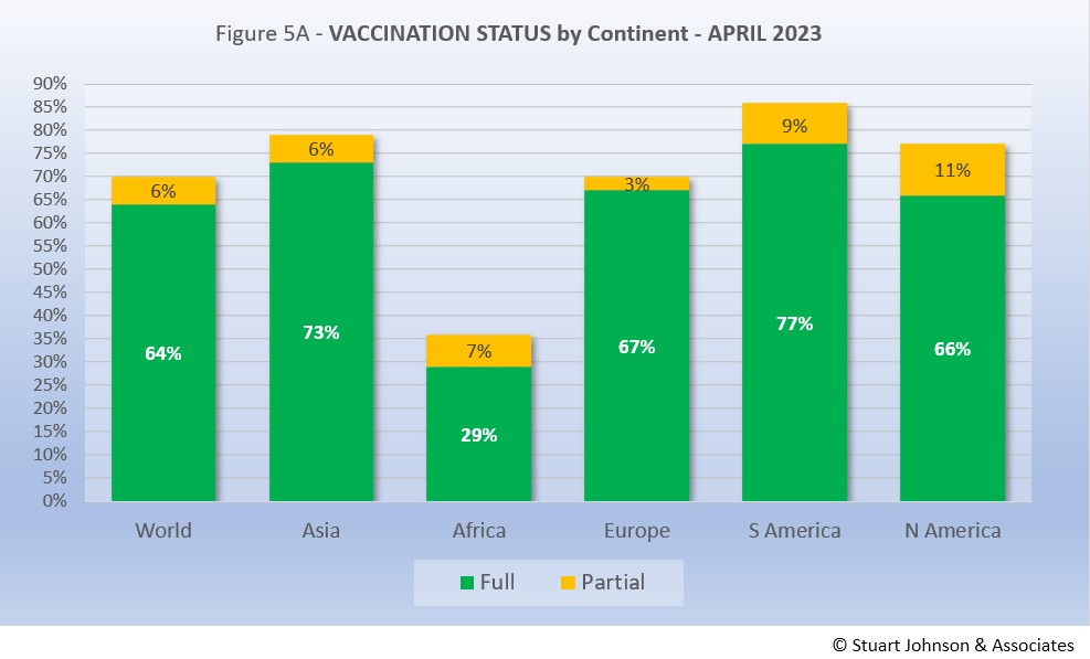
Growth in vaccinations reached a virtual standstill in the months before the pandemic officially ended. As Fig. 5A shows, more than two thirds of the global population (70%) had been reported with at least one dose of vaccine, and six in ten (64%) were fully vaccinated, an increase of only 2% in fully vaccinated since August 2022. That is still well below what is commonly thought of for "herd immunity," which is closer to 94% of the population being immune (most through vaccination), but is remarkable nonetheless given the enormity of the task, most of it carried out in the year after vaccinations began in January 2021, before each continent seemed to reach its own saturation point.
South America, which was slow to get into testing and vaccination, soared ahead of the other continents toward the end of 2021, then took the lead in total vaccine doses in August 2022,remaining well ahead of the other continents with 77% fully vaccinated and 86% total. Asia comes next with partial and fully vaccinated ahead of North America. While Europe is fourth in total doses, it pulled ahead of North America in fully vaccinated. Africa remained far behind, with only one-third of the population (34%) receiving at least one dose and one in three (29%) fully vaccinated.
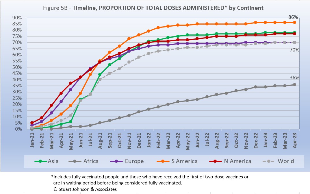
While South America got into vaccinations later and slower than North America and Europe, Figure 5B shows how it steadily pushed its way to the top of total vaccination doses administered by August 2021, expanding its lead through early 2022 before a global slowdown in the proportion of total vaccine doses. Europe had leveled off more noticeably than Asia and the Americas, which continued very slow growth and in the closing months of the pandemic split the deference between Europe and South American. Africa remained on a steady upward slope, though far below the Global levels.
While public campaigns urged higher levels of vaccination, what will provide fodder for research is why each continent, while following similar patterns, seemed to have it own "cap" or saturation point, perhaps related to vaccination resistance, COVID fatigue, cultural/political issues or other causes.
COMPARISON OF USA WITH OTHER COUNTRIES
Cases
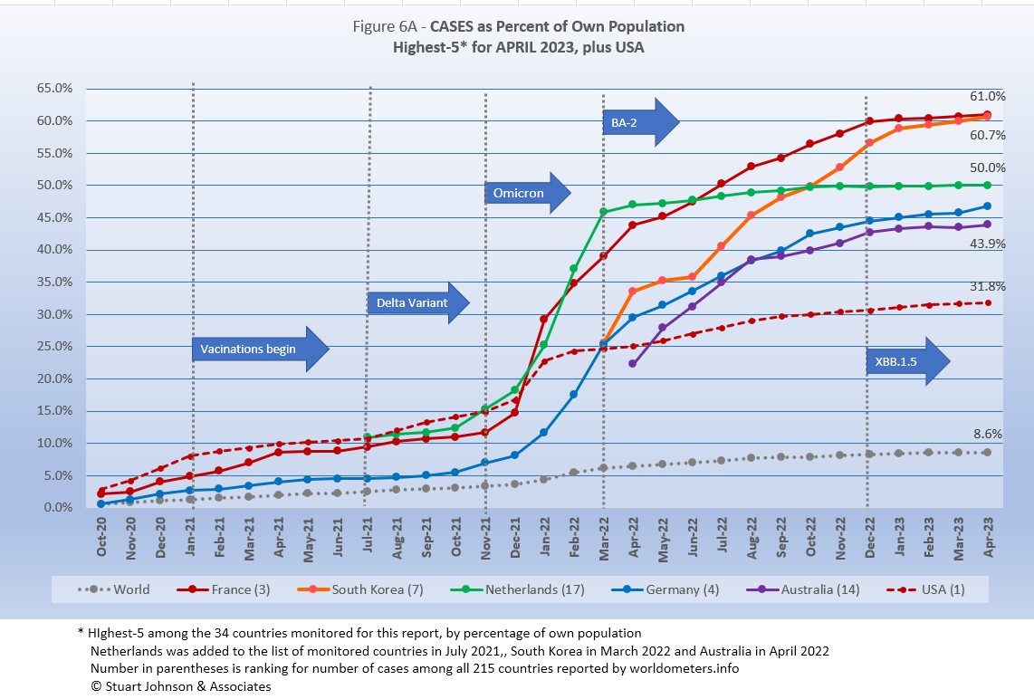
Raw numbers are virtually meaningless without relating them to the size of a given country, so looking at cases as a proportion of population helps get a sense of the relative impact. The countries with the greatest proportion of COVID cases illustrates how they amplify the world trend for cases (bottom line in Figure 6A),
The same five countries were at the top of cases by proportion of population for 12 months, in the same order for the past 7 months, even as South Korea closed in on France for the number 1 position at the official end of the pandemic. All six, including USA (and 13 of the 34 monitored countries) had surpassed the 25% level of global infection in 1918. The significant difference remains the much lower mortality rate than a century ago.
France and South Korea ended well beyond 50%, with South Korea poised to overtake France which slowed very slightly as South Korea forged ahead, well above both the Global increase and the other countries in the top 5. Netherlands had been teasing the 50% level for months and finally hit it in March. USA (number 10 among the 34 monitored countries) had been growing at a rate slightly ahead of the Global pace, but bent closer to it the last seven months, below the pace of Germany and Australia.
Another way to look at population proportion is the measure "1 in." The global figure of 8.6% means that 1 in 12 people in the world had been reported with COVID-19 as the pandemic was officially declared ended (and that only by official record keeping, not including any unreported and likely minor or asymptomatic cases). Because of rounding to a whole number, all five of the top countries are 1 in 2. USA remained at 1 in 3 as COVID moved from pandemic to endemic.
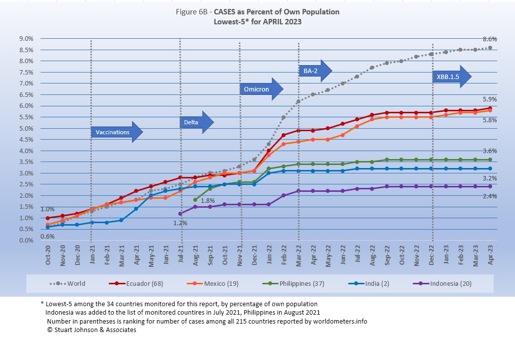
All five countries (of the 34 monitored) in the bottom-5 by proportion of population had been there, in this order, since December 2021, with Mexico still closing in on Ecuador.
At the scale of this chart, the rise in Global case proportion is magnified compared to the previous chart, so it clearly shows the acceleration of cases produced by omicron around the world beginning in November 2021. Al five countries show a rapid upturn followed by a leveling off (with varying impact from BA-2 and its sub-variants as they emerged).
These countries represent a considerable spread in size, from India, the second largest country, to Ecuador, ranked number 67 of the 215 countries tracked by worldometers. For Ecuador, its 5.8 of population means that 1 in 17 had been reported as having contracted the COVID virus; for India it was 1 in 31, and for Indonesia 1 in 41 (all the same over at least three of the closing months of the pandemic).
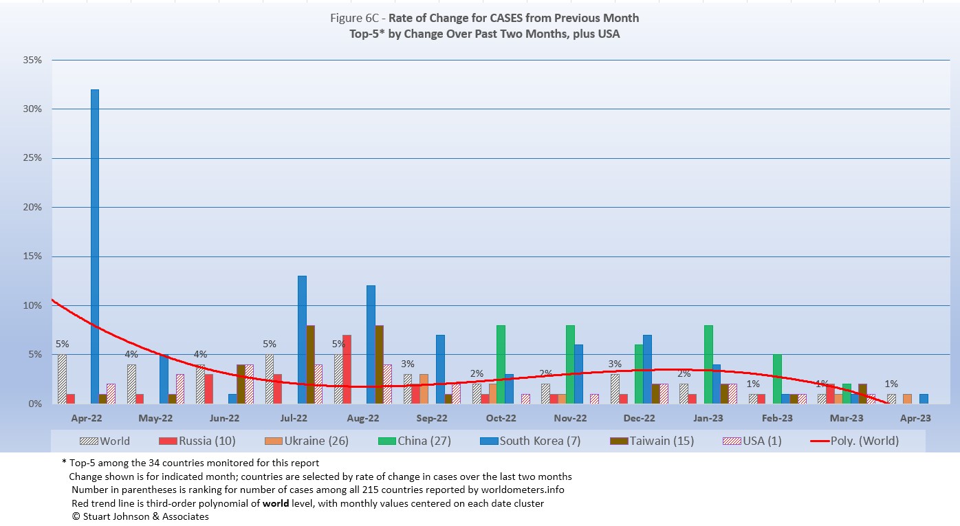
Because the size of countries makes the use of raw case numbers illusory, another measure I find helpful is the rate of change from month to month (Figure 6C). The focus of the selection is on recent changes, but the chart covers 12 months.
For this chart, countries are selected based on the change over two-months (end of February to the end of April). For this final chart in the pandemic, Russia and Ukraine replaced Japan and Mexico.
.
The overall trend (red line, reflecting global level) had been climbing, up to a 31% change in January 2022, reflecting the large impact of the omicron variant. By April 2022, the beginning of this chart, it was down to 5%. Since then the trend was downward, with a small upward bend in November and December as several Asian countries experienced surges, led by China, Japan and Taiwan.
USA had a big spike in January 2022 from omicron, then settled close to or below the global rate since then. While the global trend continued toward 1% in the last three months of the pandemic, matched by Ukraine and South Korea; Russia, China, Taiwan and USA showed no significant change from March to April.
The following chart shows the top five countries by change over 2 months from May 2021 to April 2023 and end of the pandemic. You can see by the color coding the shifting patterns of COVID's impact around the world.
| Month | Top-5 for Increase in Cases Over 2 Months | Note | ||||
|---|---|---|---|---|---|---|
| May 2021 | India | Argentina | Turkey | Iran | Columbia | Asia surging |
| June 2021 | India | Argentina | Colombia | Bolivia | Chile | South America surging |
| July 2021 | Colombia | Iran | Argentina | UK | Bolivia | Delta appears |
| August 2021 | Iran | UK | Mexico | Turkey | Russia | Delta rising |
| September 2021 | Iran | UK | Mexico | Turkey | USA | Delta fading |
| October 2021 | Philippines | UK | Ukraine | Turkey | Russia | Mixed |
| November 2021 | Belgium | Ukraine | Germany | UK | Netherlands | Omicron appears |
| December 2021 | Germany | Belgium | Netherlands | UK | France | Omicron intensifies |
| January 2022 | France | Italy | Spain | Belgium | Canada | Omicron intensifies |
| February 2022 | France | Italy | Germany | Netherlands | Spain | Omicron intensifies |
| March 2022 | Germany | Netherlands | Chile | Russia | Malaysia | Omicron spreads |
| April 2022 | Germany | Japan | Malaysia | Italy | Netherlands | Back to Europe, Asia |
| May 2022 | South Korea | Japan | Germany | Italy | France | BA-2 variants spread |
| June 2022 | Australia | Japan | Germany | Italy | Chile | Disbursed |
| July 2022 | Japan | Australia | Italy | South Korea | Chile | Disbursed |
| August 2022 | Japan | South Korea | Australia | Bolivia | Italy | Disbursed |
| September 2022 | Japan | South Korea | Australia | Italy | Germany | Europe surging |
| October 2022 | Japan | Germany | South Korea | Russia | Italy | Back to Europe, Asia |
| November 2022 | Taiwan | China | Japan | South Korea | Germany | Asia dominant |
| December 2022 | China | Japan | Taiwan | South Korea | Australia | Solidly East |
| January 2023 | China | Japan | Taiwan | South Korea | Brazil | Asia dominant |
| February 2023 | China | Japan | Taiwan | South Korea | Mexico | Asia dominant |
| March 2023 | Taiwan | Russia | Japan | Chile | Mexico | Disbursed |
| April 2023 | Russia | Ukraine | China | South Korea | Taiwan | Heading East again |
| Color Legend: Continent assignment as defined by United Nations and used by worldometers.info | ||||||
| Asia | Africa | Europe | S America | N America | Oceania | |
to other continents, it is included here because of the presence of Australia in the list of monitored countries.
Deaths
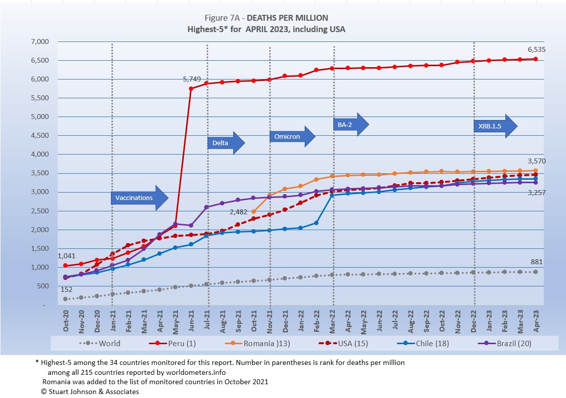
Because deaths as a percentage of population is such a small number, the "Deaths-per-Million" metric shown in Figure 7A provides a comparable measure. It is different than mortality rate, which is a measure bases on deaths as a proportion of cases.
The same five countries were in the top-5 since June 2022, with USA, Chile and Brazil nearly tied for 14 months.
The Global curve for deaths-per-million showed a slow and steady growth, despite surges, vaccinations and variants that had a much more obvious influence on cases. In fact, it had been slowing ever so slightly until February when it bend upward again (put a straightedge on the global line and you will see that it is not straight, but gently curving).
Given lower death rates in European and Asian countries that experienced much higher surges in cases, it is striking that USA—whose case rate had been much more moderate—found itself in the company of countries with the highest death rates as measured by deaths-per-million-population.
That situation should lead to serious consideration of what could have been done better, especially as political and ideological division drove the split between over-zealous use of lockdowns in the name of Science and the ethos of a "don't tread on me" individualism, a division that soured the often heroic efforts of the health care system.
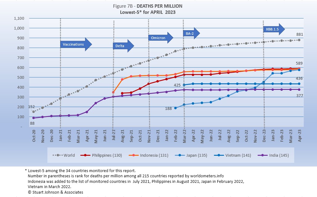
The five lowest of monitored countries by deaths-per-million at the end of the pandemic were all Asian and all five had appeared in this chart since October 2022.
While the other four countries had slowed at or slightly below the global pace, Japan had been climbing steadily since it joined the list of monitored countries in February 2022, before showing a noticeable slowdown in February 2023. By the end of April, Japan was in a near-tie with Philippines and Indonesia.
The Global rate of increase in deaths-per-million was very steady through March 2022 when it began a noticeable slowdown, even as BA-2 and other sub-variants began to emerge, adding to the widening gap between cases and deaths—the bit of good news in this pandemic.
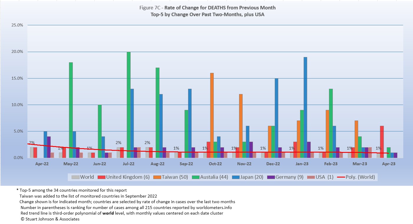
As with the comparable chart for Rate of Change for Cases (Figure 6C), countries for Rate of Change for Deaths (Figure 7C) are selected based on the change over two-months (end of February to end of April) in reported COVID deaths. The focus of the selection is on recent changes, but the chart goes back 12 months for perspective.
While Asian countries had dominated for several months, by the official end of the pandemic, the picture for deaths had become more mixed. Germany moved into the top-5 in March and UK led the top-5 in April.
The global rate of change by month (red trend line) was between 1 and 2 percent all of the last 12 months of the pandemic.
While change among the top-5 countries had dropped noticeably by March and April 2023, with Taiwan showing no change in April, the chart shows how COVID deaths continued to spike in some Asian countries along with the reappearance of Europe in the chart.
The chart below shows the shift toward east Asia and Australia (Oceania) in recent months.
| Month | Top-5 for Increase in Deaths Over 2 Months | Note | ||||
|---|---|---|---|---|---|---|
| May 2021 | India | Turkey | Brazil | Colombia | Argentina | Tilt toward S America |
| June 2021 | Peru | India | Argentina | Colombia | Bolivia | South America surging |
| July 2021 | Peru | Ecuador | Colombia | Argentina | Russia | South America surging |
| August 2021 | Ecuador | Russia | Iran | Argentina | Colombia | South America fading |
| September 2021 | Indonesia | Iran | Russia | Turkey | Malaysia | Asia surging |
| October 2021 | Philippines | Russia | Ukraine | Turkey | Iran | Asia surging |
| November 2021 | Ukraine | Russia | Philippines | Turkey | Malaysia | Omicron beginning |
| December 2021 | Ukraine | Russia | Poland | Romania | Philippines | Omicron growing |
| January 2022 | Poland | Russia | Ukraine | Germany | Turkey | Omicron surging |
| February 2022 | Canada | USA | Poland | Turkey | Russia | Omicron surging |
| March 2022 | Chile | Canada | Turkey | Russia | USA | Omicron spreads |
April 2022 |
Chile | Japan | Germany | UK | Russia | Europe returns |
May 2022 |
South Korea | Chile | Japan | UK | Germany | Asia rising with BA-2 |
June 2022 |
Australia | South Korea | Canada | Japan | Germany | Shifting East |
July 2022 |
Australia | Japan | South Korea | Canada | Spain | Solidifying East |
August 2022 |
Australia | Japan | South Korea | Canada | Spain | Solidifying East |
September 2022 |
Japan | Australia | South Korea | Canada | Germany | Solidifying East |
October 2022 |
Japan | Australia | South Korea | Canada | Germany | Solidifying East |
November 2022 |
Taiwan | Japan | South Korea | Canada | Australia | East dominant |
December 2022 |
Japan | Taiwan | South Korea | Australia | Canada | East dominant |
January 2023 |
Japan | Australia | Taiwan | South Korea | Canada | East dominant |
February 2023 |
Japan | Australia | Taiwan | South Korea | Canada | East dominant |
March 2023 |
Australia | Taiwan | Japan | Germany | Canada | Mixed |
April 2023 |
UK | Taiwan | Australia | Japan | Germany | Europe rising |
| Color Legend: Continent assignment as defined by United Nations and used by worldometers.info | ||||||
| Asia | Africa | Europe | S America | N America | Oceania | |
to other continents, it is included here because of the presence of Australia in the list of monitored countries.
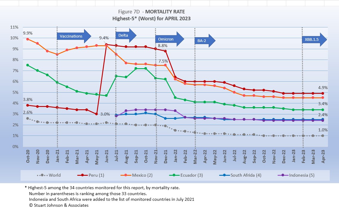
Mortality Rate
Mortality Rates (percentage of deaths against reported cases) had generally been declining. There are many factors, which I have detailed in previous reports, but the most obvious is the gap between cases and deaths. For most of the last year, following the initial surges related to the omicron variant, cases continued to climb while the death rate nearly flattened in comparison. The wider the gap, the lower the morality. In that respect, as long as deaths can be held down, increases in cases should not be as alarming as they are sometimes made out to be.
That is why, I believe, most people felt COVID had become endemic—more like seasonal flu and the common cold—long before the official pronouncement by WHO.
We cannot, however, assume that lower death rates mean they are no longer consequential. As I have pointed out elsewhere in this report, deaths in USA ranked third among the leading causes of death in 2020 and even though the rate has slowed, COVID will remain in the top-10 causes of death for at least another year, if not longer.
The Global mortality rate had dropped from 2.6% in October 2020 to 1.0% by October 2022. The five countries with the highest (worst) mortality rates had appeared since December 2021, with South Africa and Indonesia trading places frequency in that time and still in a virtual tie at the end of April. All five showed some response to omicron, with cases rising faster than deaths, which drove the mortality rate down.
Even with the pandemic officially ended, a very slight uptick in mortality rates in the last three months is evident, possibly a result of the latest variant, nickname "Kracken," that some reports suggest could be far more significant.
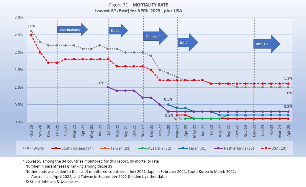
Since these represent the best mortality rates, where low is good, the "rank" order is actually in reverse.
The same five countries have been on this chart since September 2022. All five were well below the global rate of 1.0$ and piling on top of each other at 0.3, 0.2 and 0.1%.
USA was stuck at 1.2% for six months before dropping to 1.1% in July 2022, where it stayed through April. Relatively speaking, that is a good mortality rate, yet one-third of the monitored countries, including Belgium, Germany and Netherlands had rates below 1.0% for 12 months or more, largely because huge omicron-related surges were not matched with a similar increase in deaths. USA should have been able to keep deaths much lower since the surges here were well below those experienced in Europe and parts of Asia. (It is ironic that had USA experienced higher case surges its mortality rate might also have dropped, but that would only happen if hospitalizations and deaths were kept down).
Even so, without a relatively low mortality rate, the USA death rate would be far higher. Compared to the mortality rate during the 1918 pandemic, it could be ten times worse than it is. At its current mortality rate of 1.1%,(above the global level) USA has had more than 1.1 million deaths (out of 105 million cases) by the end of April, As pointed out in Figure 1, however, if USA had cases closer to its proportion of world population, we would be looking at 355-thousand deaths out of 32-million cases. The response of the health care system and availability of vaccines are part of keeping mortality down, but the high case rate points to the conflicts already mentioned between opposing sides of the approach to COVID (extreme lockdowns in the name of science versus extreme individualism in the name of freedom).
How real is the threat of death from COVID? That's where successful mitigation comes in. Worldwide, by the end of April, 1 in 12 people have been reported as having contracted COVID and 1 in 1,167 people died. In USA, while the mortality rate was low, because the number of cases is so high, 1 in 289 have died through April 2023—between Chile (1 in 298) and Romania (1 in 280). Japan and Australia are at 1 death in 1,685 and 1,105 respectively (COVID in both countries, however, has increased to the point that both were added to my list of monitored countries and those numbers, while still in sharp contrast with USA, are moving in the wrong direction). A closer comparison would be neighboring but sparsely populated Canada, at 1 in 735, or Mexico, at 1 in 394, with most European countries between those two.
Tests
The section on testing was reduced in size because of the availability of home testing is widespread and not tracked in the statistics. In addition, the statistics that are reported have shown no meaningful change for the past five or six months.
The point of inequality between countries still exists, however, so I continued to update the following list, which was originally based on the lowest five for testing, but now includes other pairs of similar-sized countries among the 34 I monitor. Remember, however, that the statistics here refer only to officially reported testing and do not include home testing. (Population numbers updated this month, based on "live" estimate from worldometers.info.)
- Mexico: 19.9M tests for 131.8M population, compared to Japan: 101.0M tests for 125.6M population (5.1X the tests)
- Philippines: 35.0M tests for 112.5M population, compared to Vietnam: 85.8M tests for 99.0M population (2.4X)
- Iran: 55.4M tests for 86.0M population, compared to Turkey: 162.7M tests for 85.6M population (2.9X)
- South Africa: 26.8M tests for 60.8M population, compared to Italy: 271.4M tests for 60.3M population (10.1X)
- Poland: 38.7M tests for 37.7M population, compared to Canada: 66.3M tests for 38.4M population (1.7X)
- Peru: 38.5M tests for 33.7M population, compared to Malaysia: 68.3M tests for 33.2M population (1.7X)
- Ecuador: 3.1M tests for 18.2M population, compared to Netherlands: 26.0M tests for 17.2M population (8.4X)
- Bolivia: 2.7M tests for 12.0M population, compared to Belgium: 37.0M tests for 11.7M population (13.7X)
Of the east Asian countries I monitor—most relatively recent additions because of surging cases—only Malaysia and Taiwan reported enough tests to cover their entire population. Otherwise, Japan, Indonesia, South Korea, and Philippines were all at testing levels that would cover roughly a third of their populations. Yet, they remained among the monitored countries with the lowest mortality rates. While they may not have appear high in reported testing, they were all above global rates for fully vaccinated (from 87% for Vietnam and Taiwan, 86% for South Korea, to 83% for Japan).
Vaccinations
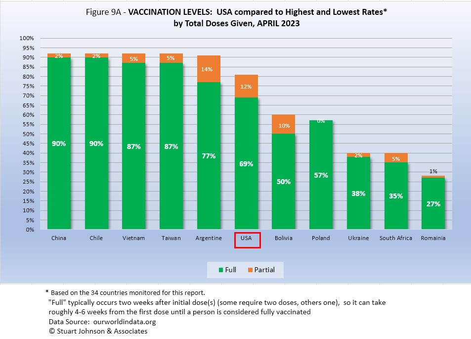
Figure 9A compares USA with the top-5 and bottom-5 of monitored countries by total doses administered. As you can see USA leaned toward the upper countries, but like most of them, its total vaccination rate showed virtually no increase in April*, and that remained below the total doss for all of the top-5 and its total doses was below the full vaccination level for all but Argentina. On the other hand, USA remained well ahead of the bottom five of the 34 monitored countries for both total doses and fully vaccinated.
As pointed out in other parts of this analysis, Figure 9A does not tell the whole story. It's a bit of an apples and oranges comparison, with one major factor being the population of each country.
*Numbers for this chart come from ourworldindata.org. The CDC numbers, used in Figure 11, show similar results, with an increase of less than 1% per month in those fully vaccinated over the past fifteen months, to a total of 69.3% of USA population.
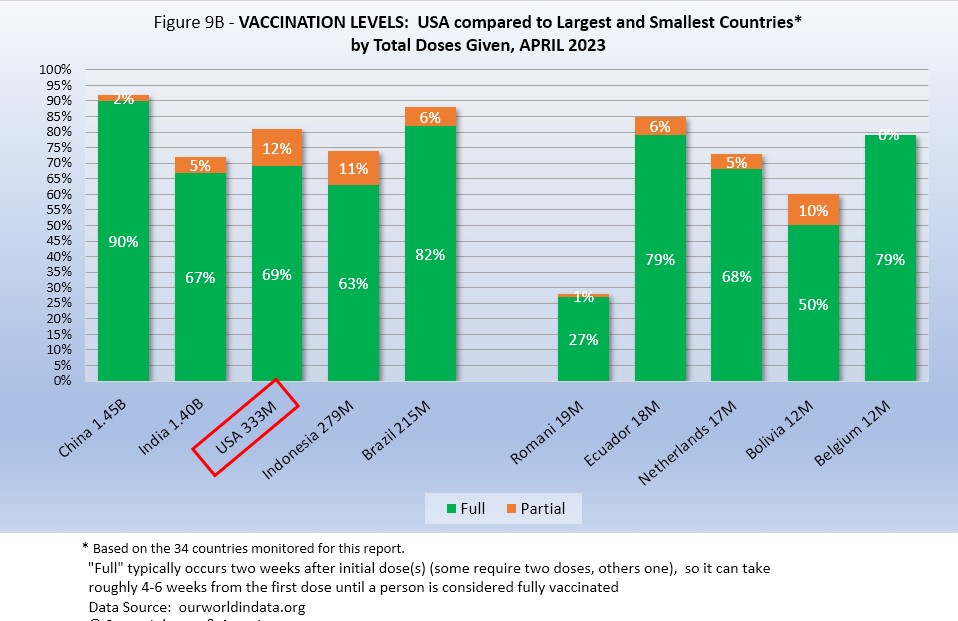
Taking population into account paints a somewhat different picture for USA compared to other monitored countries. In Figure 9B you see the five most populous countries on the left and the five smallest (of those monitored for this report) on the right.
China and Brazil remained ahead of USA, both in total total doses and full vaccination. USA was ahead of India and Indonesia in both total doses and full vaccination.
On the side of the smallest countries, Ecuador was ahead of India, USA and Indonesia. For a time the disparity between large and small countries was narrowing, but with vaccination rates leveling off by the end of 2022 that was no longer the case and any changes in the chart when they did occur were minuscule.
In USA and perhaps in other large countries, individual regions, provinces or states may be doing as well as some smaller countries, while the entire country lags behind the smaller ones.
VACCINATIONS IN USA
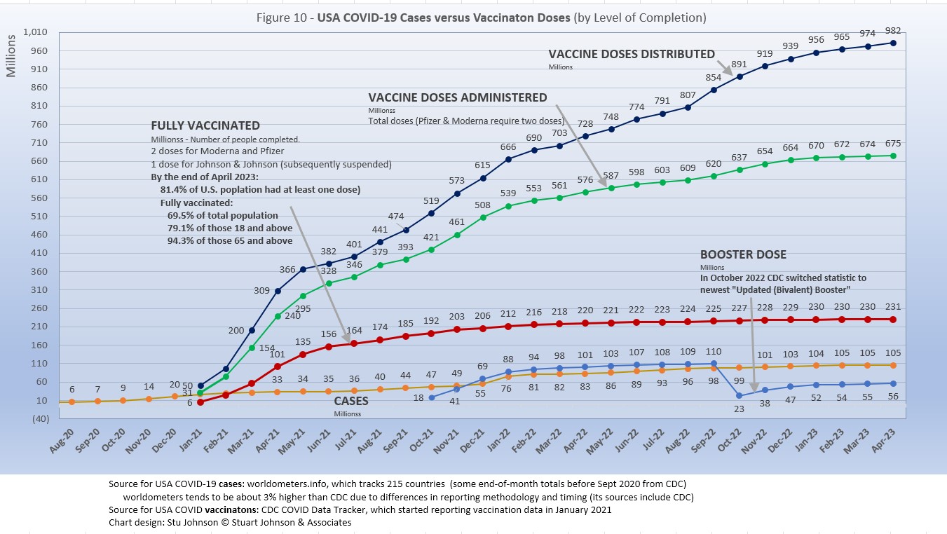
A person is considered "fully vaccinated" two weeks after the final vaccine dose; roughly five to six weeks from the first dose for Pfizer and Moderna.
A booster dose for both vaccines became available in October 2021 and a second booster updated for the latest variants became available late in 2022 (in Fig. 10 the curve for booster shots dropped in October because CDC switched its tracking from the first to the second available booster).
Figure 10 clearly shows that vaccinations began at a rapid pace. The red line for full vaccinations is lower than doses administered because if takes two does to be fully immunized. So, the first few months were on track, but then the curve for fully vaccinated began to flatten and rose by 1% or less each month since then. While the difference is small, the rate of increase for cases continued to climb at a slightly higher rate than those who are fully vaccinated.
On the positive side, doses administered continued to climb at a higher rate than cases, but that only means that more people were getting only a single dose and not going on to become fully vaccinated and then boosted. As we saw earlier, this makes USA's vaccination performance unimpressive compared to other countries around the world. Sadly, it may account for a death rate far higher than i could have been.
CAUSES OF DEATH IN USA
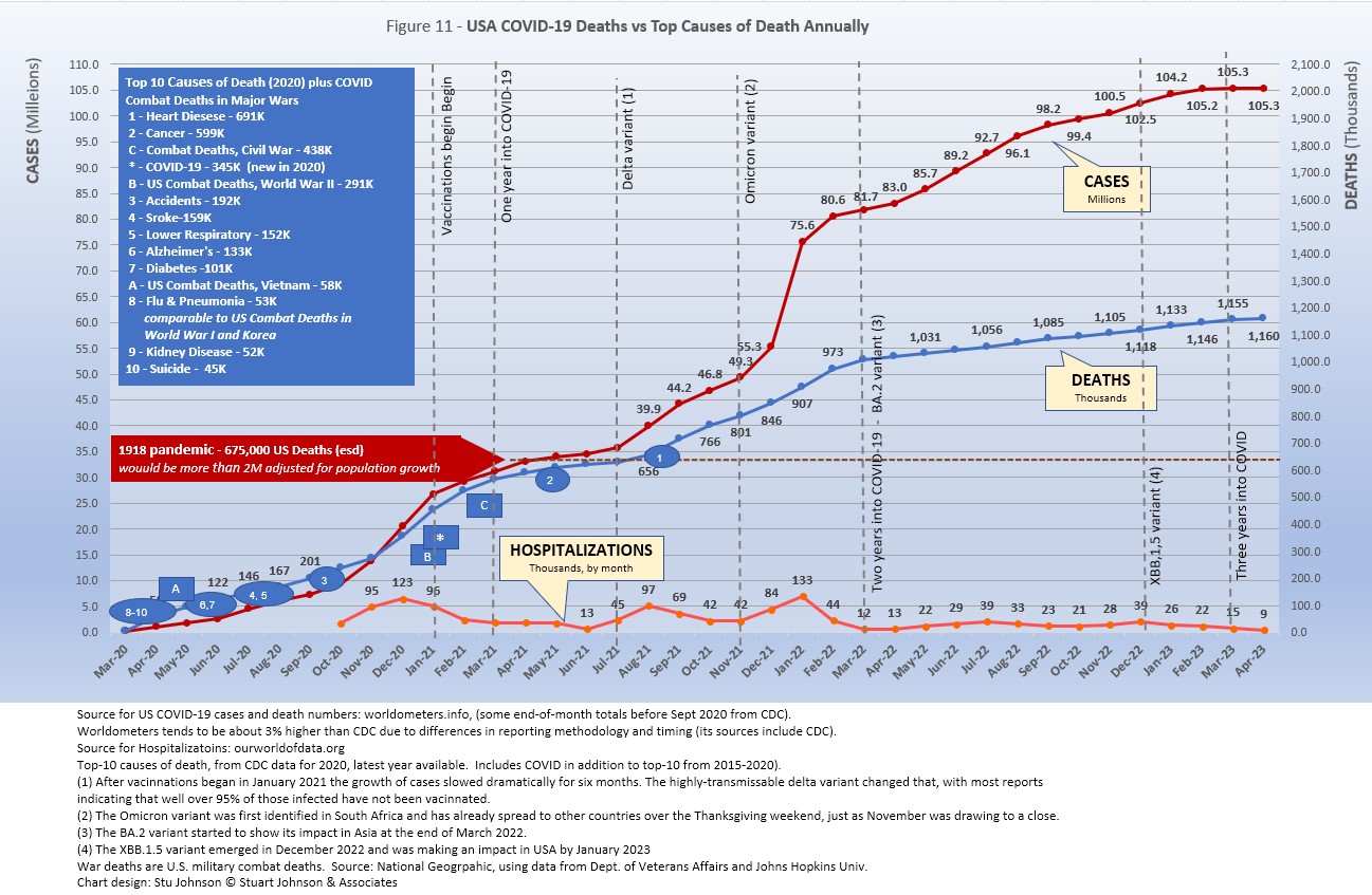
In the first year of the pandemic media attention was focused on numeric benchmarks—causes of death, wars, the 1918 pandemic. When the CDC updated its leading causes of death list for 2020, COVID came in at third place, at 345 thousand deaths (in 10 months), behind heart disease (691K) and cancer (599K). When the table is updated again for 2021, it will show COVID at around 450 thousand for the full year. But by 2022, following the omicron variant, the number will drop to about 270 thousand, still possibly staying in third place. Enough deaths due to COVID will likely continue into 2023 to keep COVID in the top-10 when results for this year are announced. At the same time, cases in USA continued to rise, but until the death rate slows even more, mortality is likely to stay stuck around the 1.1% level when the pandemic officially ended. . . .
Note: As I've referenced in the notes for several charts, data from worldometers.info tends to be ahead of CDC and Johns Hopkins by about 3%, because of reporting methodology and timing. I use it as a primary source because its main table is very easy to sort and provides the relevant data for these reports. Such differences are also found in the vaccine data from ourworldindata. Over time, however, trends track with reasonable consistency between sources.
Perspective
The 1918-19 Spanish Flu pandemic is estimated to have struck 500 million people, 26.3% of the world population of 1.9-billion at that time. By contrast, we're now at 8.5% of the global population. Deaths a century ago have been widely estimated at between 50- and 100-million worldwide, putting the global mortality rate somewhere between 10 and 20-percent. It has been estimated that 675,000 died in the U.S.
IF COVID-19 hit at the same rate as 1918, we would have see about 2-billion cases worldwide by the time COVID-19 was over, with the global population now at 8.0-billion—four times what it was in 1918. There would have be 200- to 400-million deaths. USA is estimated to have had 27-million cases (one-quarter of the population of 108-million) and 675,000 deaths. Today, with a population of 333-million (a three-fold increase from 1918) this would mean more than 80-million cases, and 2- to 4-million deaths. We reached closer to one-third of the population with reported COVID infections, at 105 million; fortunately, deaths remain half that projection, at just over 1.1 million.
At the final rate of confirmed cases and mortality while the total number of global cases surpassed 500 million—comparable to 1918 in raw numbers—that is one-quarter of 1918 when taking population growth into account . .. and with the pandemic outlasting the Spanish Flu, which went on in three waves over a two year period. (We entered a third year in March 2022). We broke the global 500-million case benchmark in April 2022, propelled by delta and omicron surges since July 2021.
While we are not engaged in a world war as was the case in 1918, COVID-19 found the world fighting global fatigue and information overload. While many public officials were duly concerned, their pronouncements sometimes reached the level of "overstated threats" (a term I heard from people concerned about the growing tensions between China and USA) that only added to the fatigue and the growing distrust of our bedrock institutions (see my report on Confidence in American Institutions, an analysis of Gallup Poll data spanning nearly five decades).
Maintaining Perspective
The following section was built up over many months and repeated here to show the important of maintaining dialogue and perspective in the midst of events like the COVID-19 global pandemic that have such far-reaching consequences for so many people.
In the tendency to turn everything into a binary right-wrong or agree-disagree with science or government, we ignore the need to recognize the nature of science and the fact that we are dealing with very complicated issues. So, in addition to recommending excellent sources like the Centers for Disease Control and Prevention (CDC), it is also wise to consider multiple qualified sources.
While there has been much focus placed on trusting "the science," it is important to recognize that science itself changes over time based on research and available data. In the highly volatile political atmosphere we find ourselves in (not just in USA, but around the world), there is a danger of not allowing the experts to change their views as their own understanding expands, or of trying to silence voices of experts whose views are out of sync with "the science" as reported by the majority of media outlets.
In an earlier report, I mentioned the Greater Barrington Declaration, currently signed by more than 63-thousand medical & public health scientists and medical practitioners (and 869-thousand "concerned citizens"), which states "As infectious disease epidemiologists and public health scientists we have grave concerns about the damaging physical and mental health impacts of the prevailing COVID-19 policies, and recommend an approach we call Focused Protection."
For a personal perspective from a scholar and practitioner who espouses an approach similar to the Focused Protection of the Greater Harrington Declaration, see comments by Scott W. Atlas, Robert Wesson Senior Fellow at the Hoover Institution at Stanford University, in an article "Science, Politics, and COVID: Will Truth Prevail?"
Several months ago on SeniorLifestyle I posted an article by Mallory Pickett of The New Yorker, "Sweden's Pandemic Experiment," which provides a fair evaluation of the very loose protocols adopted by Sweden, essentially a variation of the "Focused Protection" approach. The "jury is still out" on this one, so judge for yourself whether Sweden hit the mark any better than the area in which you live. It does make the case that given the overall approach to mitigation, surging cases do not necessarily lead to surging hospitalization and death, but actually result in lower mortality rates.
FROM PANDEMIC TO ENDEMIC: In November 2021 I posted on SeniorLifestyle an article by Sarah Zhang from The Atlantic, "America Has Lost the Plot on COVID." In it, she suggests that America (and the world) is headed not toward the eradication of COVID-19, but its transformation from pandemic to endemic, joining the seasonal flu as something we will deal with for some time. Getting there, she contends, is more a matter of mixed policy strategies than "following the science," but coming to grips with its inevitability could help lead to more effective strategies.
Zhang mentions Denmark as a counterpoint to what is happening in America, saying
One country that has excelled at vaccinating its elderly population is Denmark. Ninety-five percent of those over 50 have taken a COVID-19 vaccine, on top of a 90 percent overall vaccination rate in those eligible. (Children under 12 are still not eligible.) On September 10, Denmark lifted all restrictions. No face masks. No restrictions on bars or nightclubs. Life feels completely back to normal, says Lone Simonsen, an epidemiologist at Roskilde University, who was among the scientists advising the Danish government. In deciding when the country would be ready to reopen, she told me, “I was looking at, simply, vaccination coverage in people over 50.” COVID-19 cases in Denmark have since risen—under CDC mask guidelines, the country would even qualify as an area of “high” transmission where vaccinated people should still mask indoors. But hospitalizations are at a fraction of their January peak, relatively few people are in intensive care, and deaths in particular have remained low.
Crucially, Simonsen said, decisions about COVID measures are made on a short-term basis. If the situation changes, these restrictions can come back—and indeed, the health minister is now talking about that possibility. Simonsen continues to scrutinize new hospitalizations everyday. Depending on how the country’s transition to endemicity goes, it could be a model for the rest of the world.
Both Sweden and Denmark, illustrate a seeming irony, pairing super high case rates with extremely low mortality rates. Does this prove the point of Zhang's observation about focusing on the prevention of hospitalization? Or the Greater Barrington Declaration's "focused protection."?
Also see "How you'll know when Covid-19 has gone from from 'pandemic' to 'endemic'" by Sigal Samuel, in an October 2022 article on Vox.
Resonating with the growing discussion over the impacts of severe lock downs, columnist Debra J. Saunders wrote about the impact of school closures and the turnabout in thinking by some politicians who had been its strongest advocates. Her column was titled "Worse Than a Crime, a Mistake."
Perhaps it's a bit of 20-20 hindsight, but it is another perspective on the "Focused Protection" idea that may help us better shape responses to future pandemics or similar widespread crises.
How we evaluate the many approaches used to deal with COVID will determine how we prepare for and approach the next global event—including the eventual transition from pandemic to endemic.
My purpose in mentioning these sources is to recognize that there are multiple, sometimes conflicting, sometimes dissenting, voices that should be part of the conversation. The purpose of these monthly reports remains first and foremost to present the numbers about COVID-19 in a manner that helps you understand how the pandemic is progressing and how the U.S. compares to the world—and how to gain more perspective than might be gathered from the news alone.
While the global pandemic has been declared over, COVID has no been eradicated. It will still have an impact as a pandemic in some countries and for most the world will continue as an endemic, added to the list of seasonal viruses we have to content with. There will be considerable reflection and analysis of this pandemic in years to come. My hope is that humility and wisdom will prevail over finger-pointing where mistakes were made, either by those blinded by their own inflexible views. In crisis as in everyday life, we need to be open-minded and flexible, realizing that situations change, understandings deepen, and we need to admit when we were wrong while building on what we got right to help us face the next extraordinary global event.
Profile of Monitored Continents & Countries
(Data from worldometers.info). - Updated January 2023 after world population announced to reach 8 billion
While there was upward movement in population, density and median age remained the same at continental levels.
| Rank | Country | Population | Share of World Population |
Density People per square km |
Urban Population |
Median Age |
| WORLD | 8.0B | 100% | -- | -- | -- | |
| Top 10 Countries by Population, plus Five Major Continents See lists of countries by continent |
||||||
| - | ASIA | 4.64B | 59.3% | 150 | 51 countries | 32 |
| 1 | China | 1.45B | 18.4% | 153 | 61% | 38 |
| 2 | India | 1.41B | 17.7% | 454 | 35% | 28 |
| - | AFRICA | 1.34B | 17.1% | 45 | 59 countries | 20 |
| - | EUROPE | 747.6M | 9.6% | 34 | 44 countries | 43 |
| - | S AMERICA | 654.0M | 8.4% | 32 | 50 countries | 31 |
| - | N AMERICA | 369.9M | 4.7% | 29 | 5 countries | 39 |
| 3 | USA | 335.9M | 4.3% | 36 | 83% | 38 |
| 4 | Indonesia** | 281.0M | 3.5% | 151 | 56% | 30 |
| 5 | Pakistan* | 232.2M | 2.8% | 287 | 35% | 23 |
| 6 | Brazil | 216.4M | 2.7% | 25 | 88% | 33 |
| 7 | Nigeria* | 219.8M | 2.6% | 226 | 52% | 18 |
| 8 | Bangladesh* | 168.9M | 2.1% | 1,265 | 39% | 28 |
| 9 | Russia | 146.1M | 1.9% | 9 | 74% | 40 |
| 10 | Mexico | 132.4M | 1.7% | 66 | 84% | 29 |
| *these countries do not appear in the details because they have not yet reached a high enough threshold to be included **Indonesia was added to the monitored list in July 2021 Other Countries included in Analysis most have been in top 20 of cases or deaths Rank is based on 2020 UN statistics, Population is "live" estimate in January 2023, so you can see a few instances where population shifts will impact ranking slightly |
||||||
| Rank | Country | Population | Share of World Population |
Density People per square km |
Urban Population |
Median Age |
| 11 | Japan (5) | 125.5M | 1.6% | 75 | 92% | 48 |
| 13 | Philippines (2) | 113.3M | 1.4% | 368 | 47% | 26 |
| 15 | Vietnam (6) | 97.3M | 1.3% | 314 | 38% | 32 |
| 17 | Turkey | 86.7M | 1.1% | 110 | 76% | 32 |
| 18 | Iran | 86.8M | 1.1% | 52 | 76% | 32 |
| 19 | Germany | 84.5M | 1.1% | 240 | 76% | 46 |
| 21 | United Kingdom | 68.8M | 0.9% | 281 | 83% | 40 |
| 22 | France | 65.6M | 0.8% | 119 | 82% | 42 |
| 23 | Italy | 60.3M | 0.8% | 206 | 69% | 47 |
| 25 | South Africa (1) | 61.2M | 0.8% | 94 | 67% | 28 |
| 28 | South Korea (6) | 51.4M | 0.7% | 527 | 82% | 44 |
| 29 | Colombia | 52.3M | 0.7% | 46 | 80% | 31 |
| 30 | Spain | 46.8M | 0.6% | 94 | 80% | 45 |
| 32 | Argentina | 46.3M | 0.6% | 17 | 93% | 32 |
| 35 | Ukraine (1) | 43.1M | 0.6% | 75 | 69% | 41 |
| 39 | Poland (1) | 37.8M | 0.5% | 124 | 60% | 42 |
| 39 | Canada | 38.6M | 0.5% | 4 | 81% | 41 |
| 43 | Peru | 34.2M | 0.4% | 26 | 79% | 31 |
| 45 | Malaysia (3) | 33.4M | 0.4% | 99 | 78% | 30 |
| 55 | Australia (7) | 26.3M | 0.3% | 3 | 86% | 38 |
| 57 | Taiwan (8) | 23.9M | 0.3% | 78 | 73% | 42 |
| 61 | Romania (4) | 18.9M | 0.2% | 84 | 55% | 43 |
| 63 | Chile | 19.5M | 0.2% | 26 | 85% | 35 |
| 67 | Ecuador | 18.3M | 0.2% | 71 | 63% | 28 |
| 69 | Netherlands (1) | 17.2M | 0.2% | 508 | 92% | 43 |
| 80 | Bolivia | 12.1M | 0.1% | 11 | 69% | 26 |
| 81 | Belgium | 11.7M | 0.1% | 383 | 98% | 42 |
(1) Added to the monitored list in July 2021 |
||||||
Scope of This Report
What I track
From the worldometers.info website I track the following Categories:
- Total Cases • Cases per Million
- Total Deaths • Deaths per Million
- Total Tests • Tests per Million (not reported at a Continental level) - statistics still tracked but charts no longer used (see noted above)
- From Cases and Deaths, I calculate the Mortality Rate
Instead of reporting Cases per Million directly, I try to put raw numbers in the perspective of several key measures. These are a different way of expressing "per Million" statistics, but it seems easier to grasp.
- Country population as a proportion of global population
- Country cases and deaths as a proportion of global cases and deaths
- Country cases as a proportion of its own population
- Cases and deaths expressed as "1 in X" number of people
Who I monitor
My analysis covers countries that have appeared in the top-20 of the worldometers case and deaths categories since September 2020. This includes most of the world's largest countries as well as some that are much smaller (see the chart in the previous section). Vaccination data is taken from ourworldindata.org and CDC. Hospitalization date is found at ourworldindata.org.
This article was originally posted on my InfoMatters blog.
Search all articles by Stu Johnson
Stu Johnson is principal of Stuart Johnson & Associates, a communications consultancy in Wheaton, Illinois. He is publisher and editor of SeniorLifestyle, writes the InfoMatters blog on his own website and contributes articles for SeniorLifestyle. • Author bio (website*) • E-mail the author (moc.setaicossajs@uts*) • Author's website (personal or primary**)* For web-based email, you may need to copy and paste the address yourself.
** opens in a new tab or window. Close it to return here.
Posted: May 12, 2023 Accessed 1,001 times
![]() Go to the list of most recent Health & Wellness Articles
Go to the list of most recent Health & Wellness Articles
![]() Search Health & Wellness (You can expand the search to the entire site)
Search Health & Wellness (You can expand the search to the entire site)
![]() Go to the list of Most Recent and Most Popular Articles across the site (Home Page)
Go to the list of Most Recent and Most Popular Articles across the site (Home Page)